Sally Wheat Decorates: The Brick House
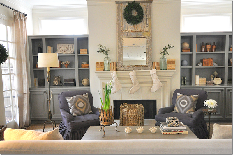
Stalking the Wheats- The living room (second version.) The third version of this room is being worked on right now!
Without a doubt, some of the most popular stories on Cote de Texas are the ones about Sally Wheat’s house. I think after the Something’s Gotta Give house, The Stalking the Wheats stories, part I and II, get the most emails. I’ve featured her house twice – and her beach house, once – and all three times, the amount of interest from you has been amazing! So, when Sally told me she was just finishing up some work on a house in West University – I jumped at the chance to show it to you! I didn’t even need to preview it – I knew I would love it, and you would too. So, please join me as we tour the house which I have nicknamed The Brick House (as you will soon see why!) I hope you will enjoy it as much as I did. And just a side note, the above living room in Sally’s house has gone through yet ANOTHER redo! In its third decorative scheme (which Sally swears is the last time she is going to redo it – sure, Sally!) – the look is now more contemporary. I can’t wait to go photograph it, too.
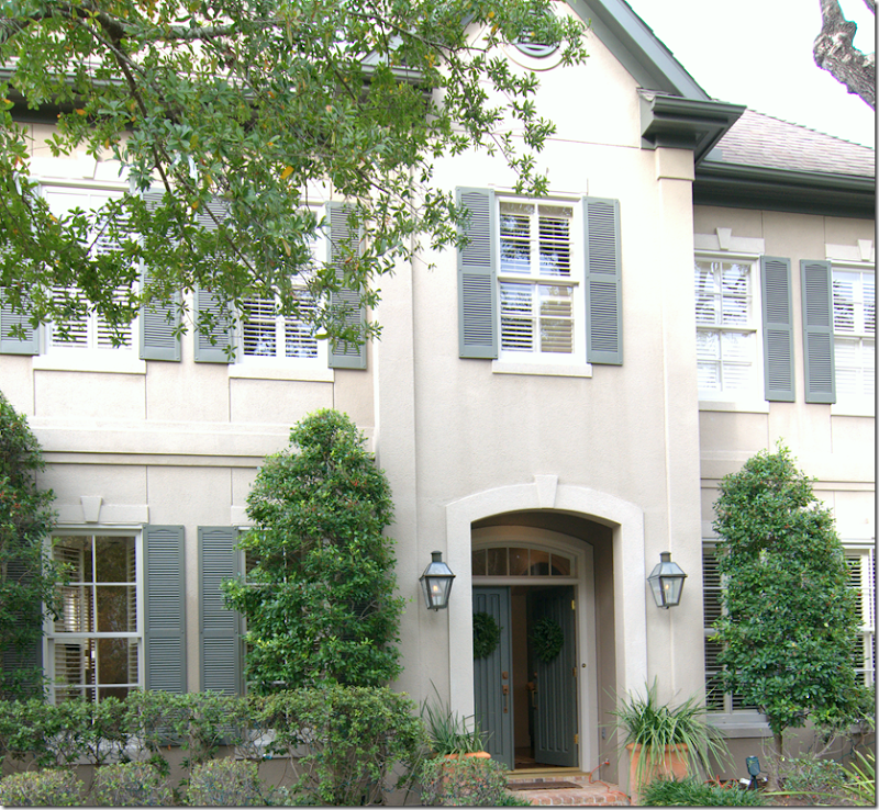 Made of stucco: so why is it called The Brick House?
The Brick House is located in West University – the charming, small, all-American town encircled by the big city of Houston. It’s three stories – as many of the newer ones are: the third floor is usually a big media or play room. And like most of the newer West U houses, it is creamy stucco with shutters and gas lanterns and lots of curb appeal. The young couple who live here are friends with the Wheats. Their children go to the same school – and so, when it came time to hire a new designer, Sally was given the nod. Probably because like everyone who sees Sally’s house, the owner also is a big fan.
The Entry Hall.
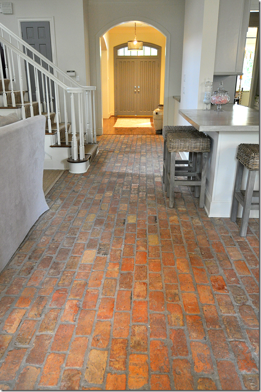
Walking through the double front doors into the foyer – the dining room is on the left and the living room is on the right. Straight ahead lies the family room and stair hall, with the walk in bar and kitchen, to their left. The front part of the house has the more typical West U dark hardwood floors, but instantly your eye is drawn to the unusual – gorgeous brick floors that run throughout the more casual areas of the house. The brick floor is so gorgeous, so unexpected, and such a rarity – that they take your breath away for an instant. Suddenly, the house becomes not some everyday, new construction West U house – but rather a Belgian-esque flavored one. The house is in the middle of a total redecoration under Sally Wheat’s direction. The living room is still a work in progress, as is the master bedroom. But, a small kitchen fire forced a rushed timeline in that room. The family room, the sun porch, and the Princess’ room are all completed – except for a few pieces here and there.
The Living Room.
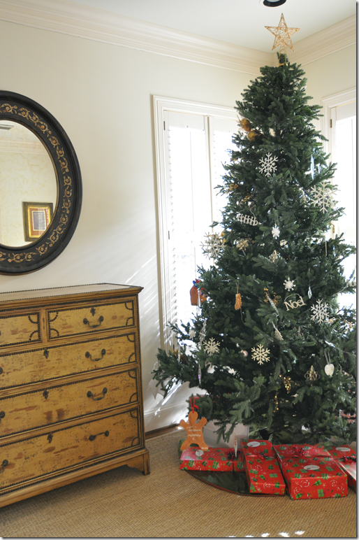
The Christmas tree – so pretty and subtle with white snowflakes is the star of the living room, which is still waiting its finishing touches. Of course there is seagrass – this is West University, after all!
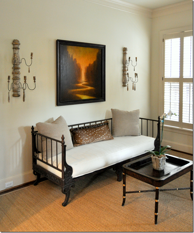
Though the owner and Sally balked at me showing this room - I think it looks pretty good right now. As soon as Sally has worked her magic, I promised them I would show the finished project. For starters, Sally has added the sconces and new seating and curtains are being ordered.
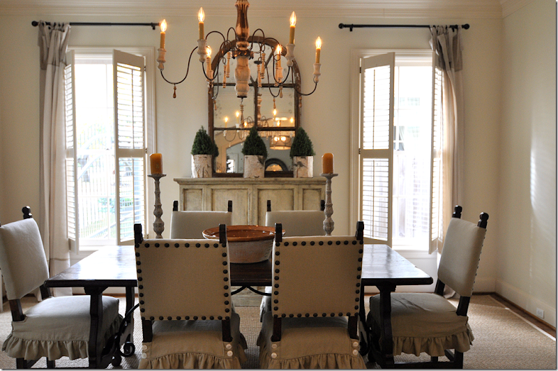
Entering the dining room through the entry hall – I am in love!
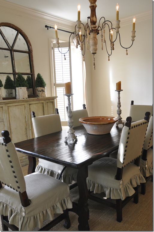
The dining room is long and wide – allowing plenty of space for the large Spanish styled wood table with its scrolled iron brace. The chairs are fabulous – also Spanish styled, with ruffled slipped skirts and button detailing. But – it’s the extra large nail heads that define the chairs and set them apart. The chandelier is Italian styled, with a candlestick base and wooden tassels –a style that is so popular today. Curtains are sheer, see-through linen with simple tab tops. The room is soothing in its monochromatic color scheme and the buffet matches the color of the chair’s linen. Of course – the seagrass acts as another, large expanse of the linen color. An arched window styled mirror reflects the sparkle of the chandelier lights. The walls throughout the downstairs are painted Martin Senour’s Linen Weave – the paint de rigueur for chic Houstonians.
The Spanish styled table is simply furnished with wood candlesticks and a large French pottery bowl. A trio of tiny evergreen trees continue the Christmas decorations.
Leading into the family room, two carved French panels flank the arched opening. The stairs have painted white wooden banisters and handrails along with a seagrass runner. The beautiful Belgian inspired brick floor begins in this section of the house.

Past the open stairwell, is the family room with a fireplace flanked by two built-ins. A long sofa faces the arm chairs, and a wall of windows looks out onto the screened-in porch and backyard. The kitchen and breakfast room are opposite the family room. Painted in the white Linen Weave, a surprise dark gray paint shows up in the bookcases.
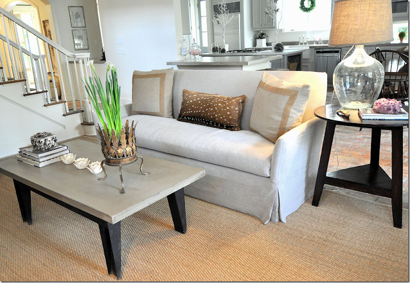
Looking the other way, behind the sofa is the kitchen and breakfast room. The stairs and the wet bar are to the left. The tight back sofa, dressed in a gray Lee Jofa linen, has contemporary lines and is simply tailored with a beautiful waterfall or dressmaker skirt. Trimmed pillows with an accent skin continue the sedate, Belgian feel in the house. A wood cricket table is mixed with a more industrial leaning coffee table. Tara Shaw’s cachepot holds the just starting to bloom Christmas paperwhites.
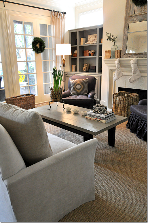 Looking towards the wall of windows - you can see the beautifully tailored sofa with its slender arms from which the fabric gracefully falls unimpeded. Perfect.
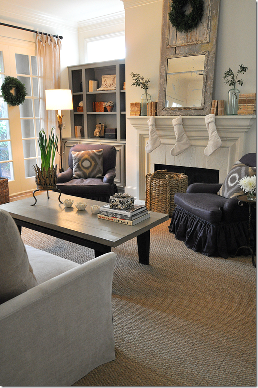
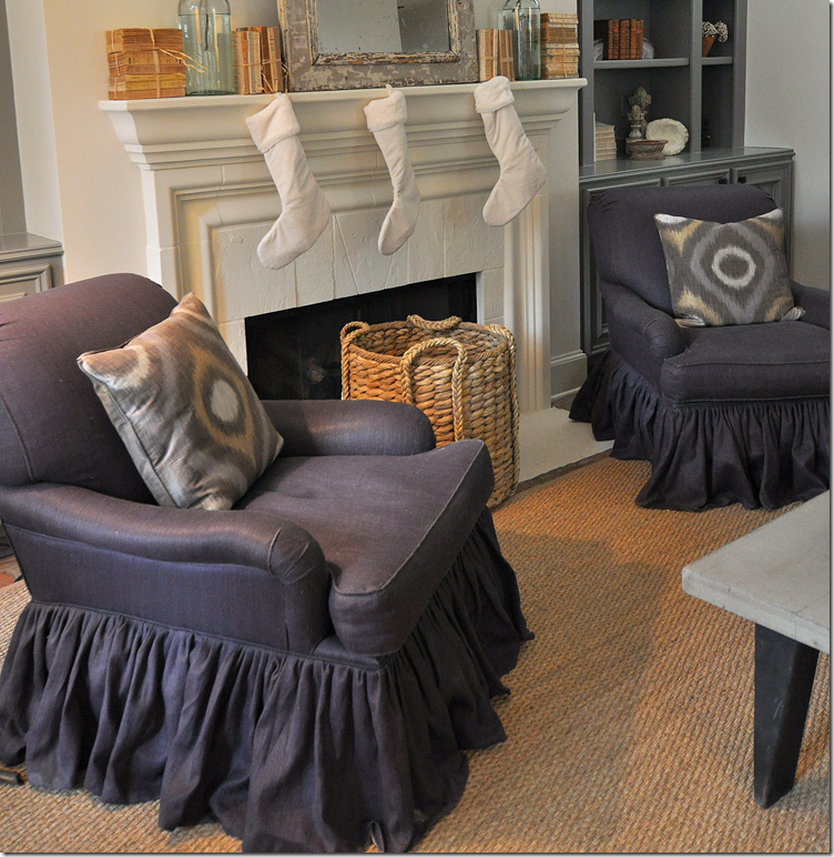 The tight back English saddle arm chairs were recovered by Sally in an elegant eggplant colored linen with just the slightest of sheen. Double ruffled skirts add a soft touch. The ikat pillow fabric is contrasted against all the gray and linen shades.
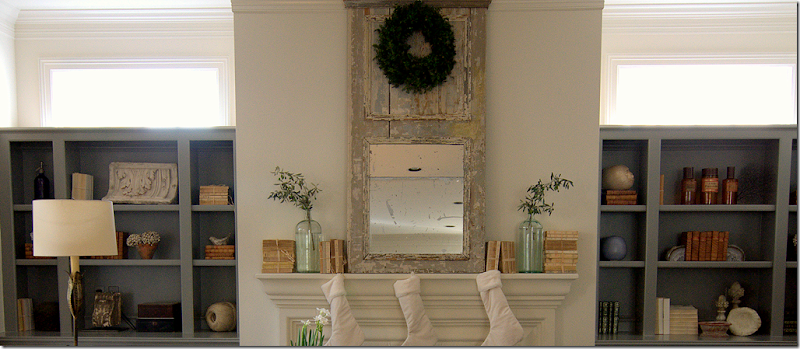 The focal point of the family room is the fireplace flanked by two bookcases. A large peeling paint trumeau shares mantel space with old books, some with covers, some without. Simple jars hold greenery.
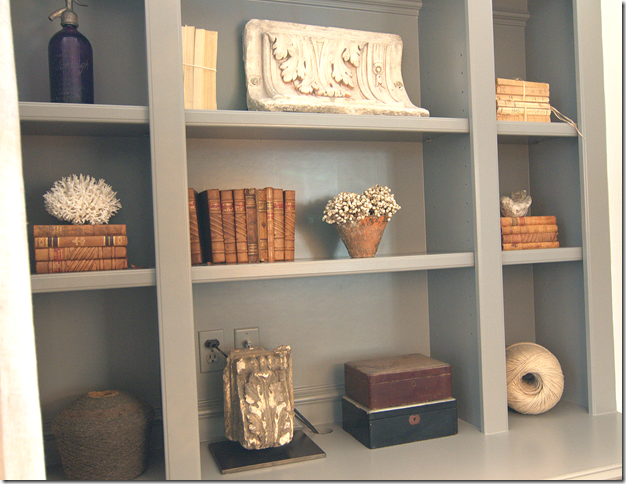 Sally styled the deep gray painted shelves with a mixture of textures: large spools of twine become decorative objects, caramel colored antique books match terracotta pots. Shells and carved stones provide light pops of white.

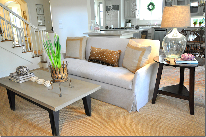 Heading from the family room into the kitchen and breakfast room – where the color gray becomes even more prominent.
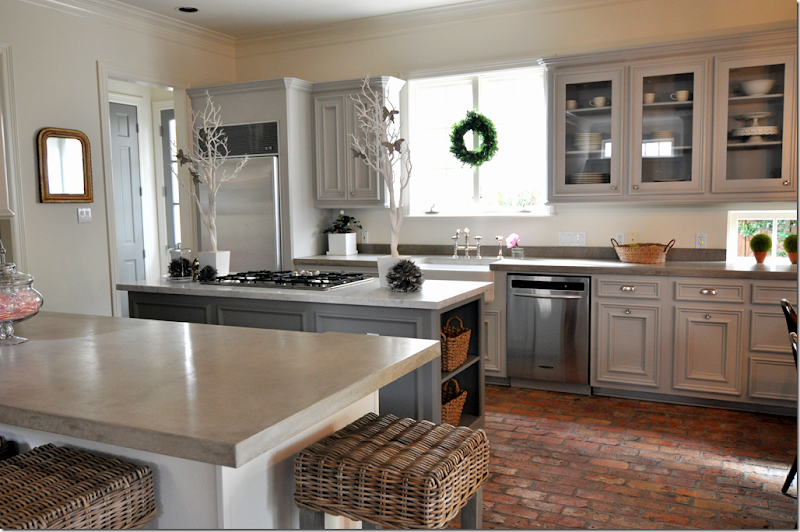
A small kitchen fire pushed the remodeling up – luckily the owners had been planning an update, now they had to finish it quickly. Sally changed the Corian countertops to a mixture of gray concrete with Carrara marble on the island. The slate backsplash was eliminated for just a small lip of concrete – all much more streamlined. The cabinetry remained – it was just painted, while upper cabinets received glass insets in their doors. Wicker stools were purchased for the bar area. The gray on the cabinets is Martin Senour Owlet. The deeper gray on the kitchen island and family room shelves is Martin Senour Baby Hippo. Also, all the wood doors throughout are painted in the darker Baby Hippo too.
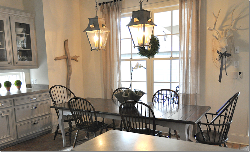
Looking towards the back wall of windows and the screened-in porch – you can see the breakfast room. The gorgeous lanterns are from M. Naeve (yes, I have the same ones too! – great minds think alike, no?) The chairs are still to be changed out, Sally and the owner were quick to tell me – though I thought these looked just fine! In this view of the kitchen, you can see the Carrara marble on the island here. Also, all the hardware was replaced in the remodeling. How pretty is this?!!!?
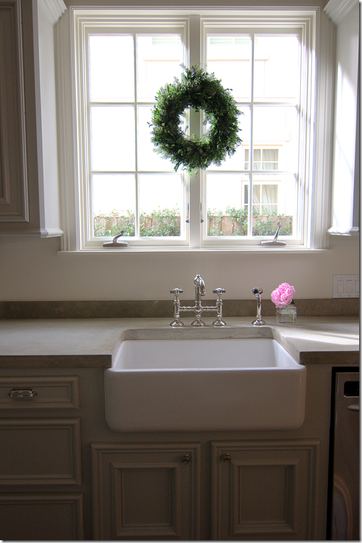 A kitchen must: casement windows, farm sink, and polished nickel faucet – perfection!
Here you can see the Christmas decorated white painted deer head and Sally Wheat’s own driftwood cross that she creates. To order one – email me – she makes all different kinds of driftwood art. The curtains here and in the family room are the same as those in the dining room. Olivine in Houston carries these, and Restoration Hardware has similar ones.
Leaving the kitchen to go outside and see the screened-in porch – another rarity for a West University town sized lot.
Screened-In Porch.
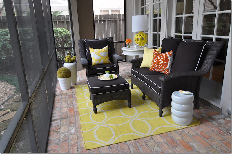
The screened-in porch, also with brick flooring, allowed Sally to have some fun. Sally is a conflicted interior designer – as we all are! She is torn between quiet, monochromatic palettes and the bright pops of color with contemporary accents that the younger set is drawn to. The porch gave her the opportunity to express her younger side – with the bright yellows and oranges. The brown cushions were piped in bright white to tie in with all the pots and tables. But it’s the lamp and rug that really set the vibe here.
Are we in Houston? Doesn’t this look like a European house?
Heading back inside to go upstairs – notice the closet door painted dark gray. While I like to paint interior doors black to give them more of a presence, the gray is softer alternative. There’s one more Sally Wheat designed room to see today: The Princess’ room. While the master bedroom is still being finished – I think you’ll like their daughter’s bedroom just fine!
The Princess’ Room.
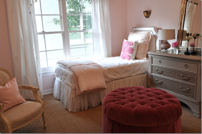
So precious! With walls of pink, the focal point no doubt is the round, tufted raspberry velvet ottoman. Perfect for a throne! The bed is done in whites and light pink ruffles, while the headboard is all white and nail heads. Pillows are Hable Construction. Wall to wall seagrass covers the floor – notice the pattern: the basketweave is a thicker and somewhat heavier seagrass than the traditional weave.
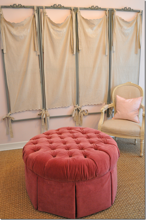 This charming gray painted screen with linen tied curtains came from The Fab Flea in Houston.
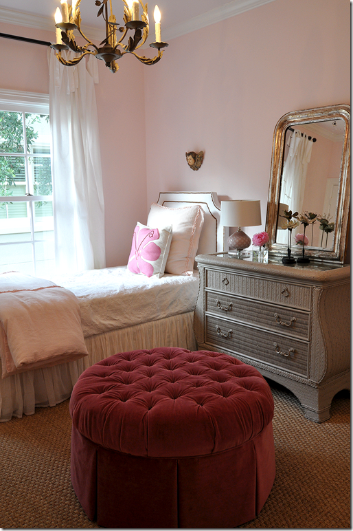 A gray painted metal chandelier from Olivine hangs from the ceiling – while an antique Louis Philippe mirror sits atop the rattan chest.
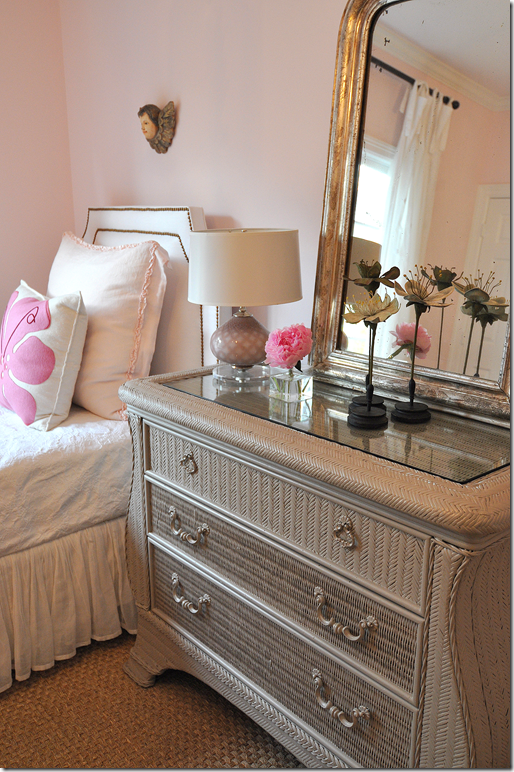 I love the little angel santos above the bed!
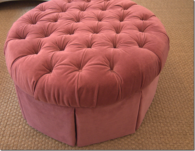 But THIS is my favorite!!!!! I absolutely love this!!!!!
I hope you have enjoyed the tour of The Brick House designed by Sally Wheat. To see other work by Sally go HERE, HERE, and HERE. Sally has an antique booth at Antiques and Interiors on Dunlavy HERE and is available for interior design projects. Just email me and I”ll pass them on to Sally! And Sally is working other projects that she is just finishing up – so hopefully I’ll be bringing those to you soon!







0 comments:
Post a Comment