Laman

Dallas Trade Mart


Visiting the Dallas Trade Mart, with over 14 floors of To The Trade Only showrooms filled with everything imaginable for the home can be just a little intimidating and tiring to say the least. This week, Patricia Gray and I attempted to do just that. Suffice it to say, we didn't make it to too many showrooms - you could take a week and still not see it all. We quickly decided to forgo shopping in any showroom that looked gift-y and headed for the floors that specialized in home accessories and furnishings. Still, even though limiting our scope tremendously, we managed to see only a few of the biggest names in the business.

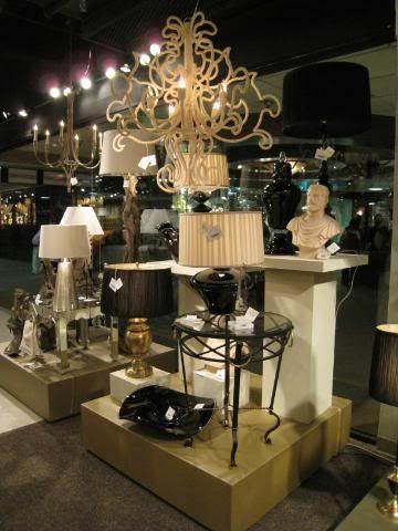
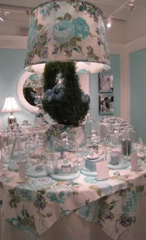
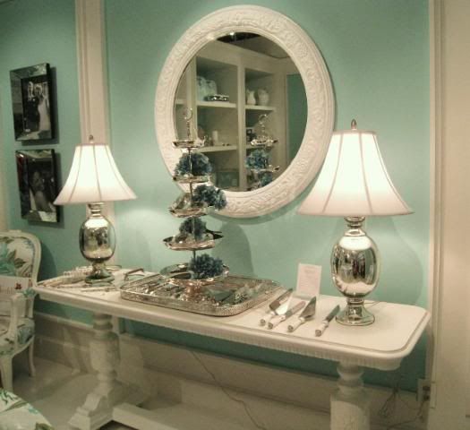
Just as in a real shopping mall, the window displays and outward appearance of the showroom was what caught our eye and drew us in. There were plenty of tired, dull looking showrooms filled with the last decade's faux Italianate and Old World goods. Those showrooms looked so dreary, passe, and empty - totally devoid of any energy at all. Who still buys that stuff, we wondered? Cyan, the first showroom that caught our attention, had a bright turquoise facade (naturally). You actually could find that showroom with your eyes closed, it was so bright. Inside, the merchandise was equally bright, lots of mirrored tables and shiny surfaces.

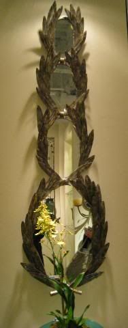
Mirror from Cyan Showroom that Patricia really liked.

Next we made our way to the In-Detail showroom. This is a super sized business that carries lots of labels. One label really caught my attention: Guildmaster - all cream painted furniture, very casual, lots of natural wicker, and an oversized chair that instantly reminded Patricia and me both of that gorgeous red chinoiserie chair by Ruthie Sommers. Was this the same frame of her chair? Couldn't it be taken into a paint shop and lacquered, we wondered? At less than $400, it's a steal compared to the $3,000+ price tag of the famous red chair.

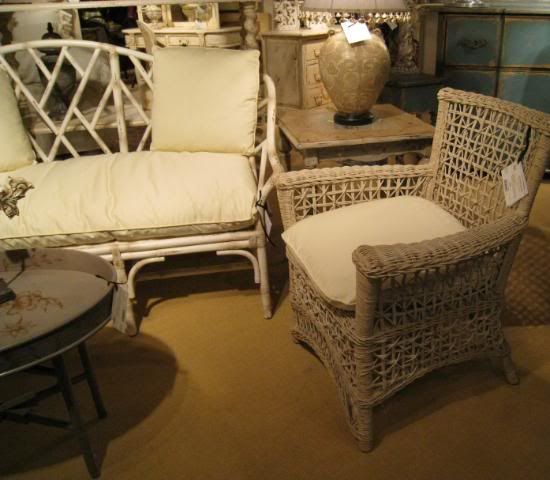
Guildmaster furniture: great wicker items.

More Guildmaster cream painted furniture. Light furniture was hot at this year's market.


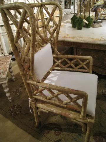
Oversized chair - frame is similar to Ruthie Sommers' lacquered red chair.

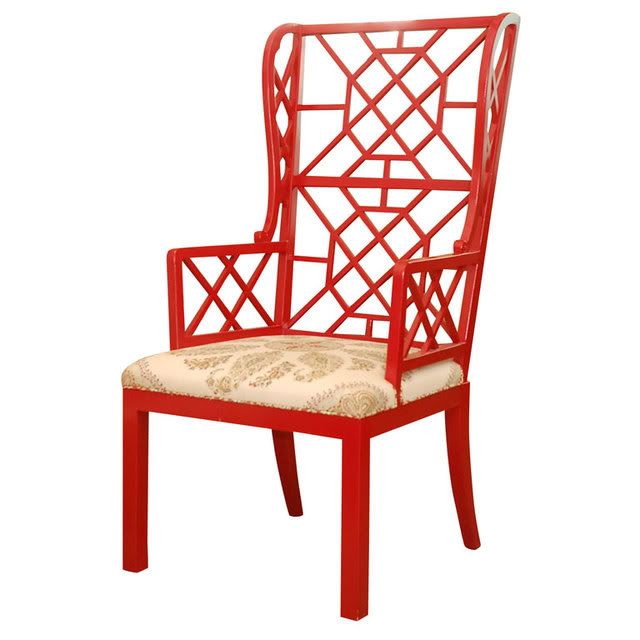
Ruthie Sommers' famous chair.

Shine Home was next. Lots of bright, contrasting colors - heavy on the Kelly Westler look. We both decided that it suddenly looked a tad dated and the end of the Westler reign seemed very apparent. There wasn't a lot of buzz around the merchandise either, another sure sign of buyer fatigue.

Shine Home, bloggers buzzed about this line all year.


Close up of Shine Home furniture.


Next, Patricia and I both noticed Lacefield Designs, a slipcovered upholstery and softgoods company, whose fabrics were a flagrant knock-off of Raoul Textiles, at a 1/10 of their cost. The color of their window display, chartreuse and brown, was bright again, but toned down in intensity. I particularly loved their gray-brown toned zebra patterned fabric. We both were taken with the line. Chartreuse was a hot color this year at Market and gold was the metallic shown everywhere.

Lacefield Designs window display. Note how similar the front fabric looks to Raoul Fabrics.

More Lacefield Designs. I loved the color of this fabric, muted grayish-brown.

The next showroom we stopped at was Two's Company/Tozai. Tozai is the higher end division of what has to be the most successful accessories company ever. My showroom rep (who happened to be there) told us that the Two's Company showroom space is completely redone with each market. It shows. It was a knockout. At Tozai, the blue and white porcelains caught my eye, of course. Patricia lusted after a set of gray toned botanicals. We both loved just about everything in the space.

Next door, Two's Company was all bright chartreuse and Tiffany's blue and white. Stunningly beautiful. Just wonderful. Each division of Two's Company was showcased separately and the decor matched the merchandise, of course. Their garden room merchandise was delightfully displayed, as was their Paris line - all pastel pinks and mauves and lilacs. But the icing on the cake was the Tiffany Blue Wedding Room. Done up in a Dorothy Draper vintage style with oversized blowzy flowers in blue and greens, it was impossible to not stop and ooh and ahh over merchandise that Two's Company has carried for years. The draw of their display was just that strong.

Two's Company Garden Room in chartreuse.

Two's Company - everything is artfully displayed in this showroom that is completely redesigned with each market, unlike most of the more boring showrooms.

The showstopper: Two's Company Tiffany blue wedding room - A nod to vintage designers like Dorothy Draper.

More Tiffany blue wedding room. All the items displayed in this room is mainstay Two's Company merchandise that they have carried for years and years.

Our final stop was the Global Views showroom, which I dragged Patricia to see. Global Views is a favorite of mine and I've blogged about this company before. They make the most wonderful accent tables and accessories and I think every one of my clients has a piece of theirs somewhere. Their prices are just unbeatable. The front of the showroom was all ready for Valentines Day - red and black and roses. High contrast to the max. As you walked through the showroom, the tone shifted to fit the merchandise. Patricia loved Global Views and was really disappointed they don't ship to Canada. We both decided we'll figure a way around that somehow. I pointed out to her merchandise I had bought for clients or myself and we met my rep who noticed from my huge name tag that I was from Houston. Everyone at the market was overly friendly, as Texans always are.

Hollywood Glam merchandise at Global Views.

The merchandise at Global Views was stacked to the ceiling. This center hanging console is new, supersized from their previous version pictured left and right.

By this time, it was after 4:00 pm and we were both exhausted and in need of coffee and a bite to eat. No big surprise - but I had to order room service that night, I was that tired. This was the first time I had been to the Dallas market in a long, long time. I'm not sure I'll go back again so soon though. With the internet, all companies have their inventory online and ordering in cyberspace is so much easier. It was fun, though, to see the merchandise in person for once, but I think it will hold me for a few more years.

Read More

The Women Then and Now

The movie The Women from 1939 is a bit of a cult classic in New York. Based on the 1936 play by Clare Boothe Luce, it follows the lives of a group of backstabbing, gossipy, spoiled New York socialites. Many fashion designers have admitted to watching it for inspiration so when I heard they were planning a modern remake, I was curious as to how they were going to do it considering that most of the movie centers on the characters traveling to Reno for divorces, which is no longer necessary in this day and age. But then I just read in Vanity Fair that the women in the new movie would be traveling to a "ashram-style retreat." Perfect! I can't believe it didn't think of that. Below is a photo of the new A-list cast.


The funny thing about the original movie was how modern the women seemed. You see them exercising and taking care of themselves just like today's New York socialites. Pretty funny then that they are remaking a movie that was already ahead of it's time. My suggestion is that you rent the original before you see the remake this fall.
Read More

Intercambio para San Valentín

Hoy estoy contenta. Hace un soleado sábado , ¡ya era hora! , el día está por delante y Leena , que organizó un intercambio de adornos para San Valentín, ya ha recibido los míos .Ella los enviará a otra compañera .
He incluído aquí una pequeña nota porque están hechos con tela , pero toda la información está en Alterado

¡ Buen fin de semana !

Read More

A Meeting of the Blogs


Well, well, well - look at this: who are these two gorgeous looking ladies? ok, ok, well maybe not gorgeous, but for their age (mumble) - they're looking pretty good, if I do say so myself!

The story behind the picture goes something like this - after months of endless emails getting to know each other, it seemed impossible to believe that someone from Canada would get together with someone all the way from Texas. Well, impossible things do happen sometimes. The main event took place this week: Patricia Gray, interior designer extraordinaire and author of the Patricia Gray Inc. blog, managed to make her way down to Texas to meet up with me, Cote de Texas. This high-powered blogger rendezvous took place on neutral ground (sort of) in Dallas, not Houston - my hometown.

Personal business at the Dallas Trade Mart drew Patricia from the frozen environs of Vancouver (even though it actually was colder in Dallas than Canada!). Many meals, long talks, laughs (and tears!), screwed up hotel plans, a talkative GPS lady, lots of Starbucks coffee, a broken tooth, crowds of Market shoppers, and confounding traffic detours later -- Patricia and I decided that we:

1. Actually like each other.
2. Get along really well!
3. Have similar temperaments.
4. Don't get on each other's nerves, AT ALL!
5. Have compatible tastes.
6. Possess about the same amount of stamina (not much!)
7. And travel very well together.

We spent a day at the Dallas Trade Mart visiting the showrooms of places that bloggers have buzzed about all year - the Shine showroom in particular! And we spent a day just clothes shopping in Highland Park Village. But I think Patricia will agree with me, that the best time we had was late last night when we discussed our blogs together over the computer. We realized how competitive we were about our stats! A word of advice to bloggers - never, never, EVER look at your readership or Technorati stats with a fellow blogger - your friendship might not survive THAT test! But despite this, it was really great fun to finally share the blogging experience in person after sharing it for months via back and forth emails. This experience is one that I highly recommend. We looked at magazine pictures and web sites of designers we both admire and just talked about blogging in general until late into the night.

So, you might be wondering, (probably not, but I'll tell you anyway), will Patricia and I ever get a chance to meet up again? As I pulled away in my car, Patricia informed me that she was going to force me to go to Paris with her. Ok, so twist my arm, I'm game! Name the date, Patricia!

Power purses on parade! Outside the Tory Burch store in Highland Park Village.


Inside the Tory Burch store.

Ikat print shorts by Tory. Needless to say, we didn't buy these!!


The velvet tented dressing room area.


Inside a wallpapered dressing room.


Patricia's beautiful and charismatic daughter who joined us in Dallas. I thought she looked adorable in Tory's pink T shirt, but apparently she didn't agree - she didn't buy it.


Major shopping purchases!!! That's Charmaine reflected in the mirror to the right.

Patricia Gray buying shirts at Anne Fontaine beneath an antique French gilded mirror.


Read More

David Jimenez Does It Again!

Kansas City non-professional interior designing wizard, David Jimenez, has been at it again. This time it's at his vacation home in Palm Springs where he has gone wild with color and pattern. He also has an amazing new website where you can check out more photos of his interiors and event designs. It's a good thing he's still working at Hallmark and hasn't decided to go professional because if he had, he'd surely give a lot of interior designers a run for their money! Enjoy!


Read More

Chic Pencil Cups

I came across the photo of Peter Som in his office above and thought it was very clever that he had used old Diptyque candle jars to hold his colored pencils. Then I saw he photo of Alexander Wang's New York apartment in the February issue of Domino and on his desk was an old Diptyque candle jar holding pens and scissors. Do all fashion designers think alike? Regardless, it's a fun way to reuse something that would otherwise be thrown away. Just clean out the old wax first so you don't ruin your pencils by freezing the jar or soaking it in hot water. Then enjoy your chic new pencil cup!

Read More

Apartment and Photos by François Halard

Anyone who reads my blog knows that I love the photography of François Halard so I was very excited when I opened my February 2008 issue of Vogue to find the most amazing article about his home in Arles, France and his loft in New York, with photography of course by Monsieur Halard. I've posted a few of his New York apartment photos here and I don't think they will ruin anything for you since there are many more in the magazine.

The loft was designed in a former warehouse by his nephew Bastien Halard who is an architect and it's apparent that creativity runs in the family. The new space was designed to look old with a patina of age and to be an extension of his home in Arles. I love the mix of objects including an African mask on the faux plaster mantel above. You can just imagine François Halard collecting amazing souvenirs on his travels to photograph the most beautiful interiors of the world.

In the dining room, the tabletop is placed on two plaster column planters from the thirties and the wood chandelier is copied from the original in Halard's home in Arles. I also love how he mixes modern photography, not all his own, into every room, including the kitchen below.

The article was a wonderful surprise and so interesting to read. Definitely pick up a copy of the new Vogue and I guarantee that you will be just as in awe as I was!
Read More

While I darn Sewing set. SAL Objetivo 8

Por cuestiones personales, ayer fue imposible cumplir la fecha de publicación de este Sal. Lo siento . Con un día de retraso ya estamos de nuevo aquí para avanzar en el próximo obejtivo...... y es que ¡ ya hemos conseguido terminar el bordado del bolsito!

Espero que hayáis superado con éxito esta etapa que hemos cerrado bordando con un hilo sobre una hebra de la tela. En un par de ocasiones he tenido que deshacer un par de puntos.....¡ ufff, lo que cuesta ! Pero reconozco que me encanta verlo terminado.


No me digáis que no está quedando precioso.......


Ya he estado echando un vistazo al montaje de este bolsito. Aguardaremos a tener el resto bordado para empezar a cortar

Comenzamos ahora el bordado de los accesorios interiores en el resto de la tela .


Ahora deberemos hacer los bordes en Nun´s Stitch con el color Gingersnap con una hebra.
El objetivo siguiente será bordar el Needle Book - cuadrado con pajarito-

Os recomiendo que empecéis en el lado más a la derecha, es decir , cerca del borde de la tela dejando algo de margen. Así viene en el esquema y nos servirá para dejar el resto de los márgenes y dejando espacio alrededor del bolsito bordado.

Como ya viene siendo habitual , tendremos quince días. Por lo tanto , será el próximo 1 de febrero cuando nos volvamos a encontrar.

Para las que no habéis hecho este punto especial en el borde , estad tranquilas, que siguiendo el esquema con sus numeritos la cosa se hace fácil. Ya hablaremos de lo de cortar, que sé que algunas le da más miedo.
Para que veíais cómo queda , podéis ver una muestra en un accesorio que hice de la diseñadora Ellen Chester y del que mostré un paso a paso , con su permiso , hace ya bastante tiempo.

Este es el borde que nos quedará .


Se tratra de Swan Stitcher´s Etui Otro trabajo bordado sobre 1 y que es uno de mis tesoros favoritos.

Ultima hora Jueves 17. Haz una muestra cuadrada en otro lino , del punto Nun´s Stitch y recorta el borde según las indicaciones, así cuando tengas que hacerlo sobre la tela original , ya tendrás más experiencia
Read More

Operación : un hogar más agradable

Hoy os voy a dar una pista del trabajo que estoy haciendo y que tendré terminado la semana que viene.
Ya sabéis de mi afición por recuperar lo que va directamente a la basura. Estamos en un mundo de reciclaje y ese es mi objetivo en este nuevo proyecto, más que nada porque me viene que ni al pelo para colocar los " trastos" que necesito para los collages .
Asi que cuando mi hijo iba camino de dejar una parte de este carrito , para llevarlo al contenedor , me lancé como una posesa corriendo y gritando detrás de él "¡ No ! ¡ Eso no , que me hace falta !
¿ Quién no ha tenido alguna vez uno de estos escuálidos carritos en casa ?


Estos son los primeros pasos.


¿ Cómo quedará ? Ni yo misma lo sé de momento. Alguna idea ya está flotando en el aire.
¿ Y vosotras ? ¿ Alguna novedad después de las fiestas ?
Read More

Love Walking Through Your Front Door

I went onto Nate Berkus' website yesterday to look for photos of his West Village apartment for inspiration for Black gloss trim, his turned out to be blue-black. Anyway, while there I stumbled onto his portfolio for his interior design firm, Nate Berkus Associates, and all I could think was wow! When you think of Nate Berkus, you immediately think of him making over tired and sad spaces for maximum impact on The Oprah Show but what I saw was simple yet elegant, refined yet comfortable and sophisticated but not stuffy.


My litmus test of a great interior designer is if I could see myself moving into their finished design and being completely at home without making any changes and Nate Berkus passed my test. One of the quotes says, love walking through your front door and I would love to walk through the front door of any of his designs.

This photo above is one of my favorites. I wish I knew where all the homes were located but to me, this is the perfect look for a more sophisticated beach house. Not every weekend getaway home needs to be super casual, especially if that's not the way you usually live your life.

This is a detail from the room above and I am in love with those chairs. I wish I could find something similar at the flea market so I could upholster it in a similar fabric.
I think one of the reasons that I'm drawn to Nate's work is that he doesn't seem to use a lot of bright colors or patterns. It's funny that I love looking at fun prints and crazy patterns but in my own home, I like calm and soothing tones. I think it's one of the results of living in a crazy city. When you come home, you want a sanctuary of peace.
Nate may not use a lot of pattern but he does use a lot of great textures and color combinations. There are a lot of colors in the room above but it's still harmonious and soothing.
Great artwork also seems to be a Nate Berkus hallmark. Who knows if he or his clients picked it out, it all seems to flow beautifully into his designs. I love the gallery walls he creates.
The porcelain Nymphenburg rhino on the mantel above looks like the one Nate has on his desk in his New York apartment. I wonder if it's a coincidence or if they borrowed it for the photo shoot.
When you think of beige, you usually think boring but there is nothing boring about the room above. Again, it's the use of textures and tones that keeps it interesting.
The bedroom above and the bathroom below I think are from a private home but they have the look of a fine French hotel like the Ritz in Paris. That bed is to die for and so is the chandelier above the bathtub. Amazing!

And if his great designs and friendship with Oprah weren't reason enough to want to hate Nate, he's also dating the hottest shoe designer around, Brian Atwood. Brian not only designs his own eponymous line but he was also just tapped to turn around Bally, and if anyone can do it, he can. Talk about a designing duo. I look forward to seeing what these two have up their sleeves next!
Read More
DISCLAIMER
If you are the copyright owner of any of these articles or image and don't want me to share them, please, write comments on pages and I will gladly remove them.