Many times in the emails I receive, there will be pictures of readers houses – usually fresh from moving in, or a recent remodeling. Rather than keep the pictures all to myself, I have decided to share them with you in an ongoing series called Readers Houses. Some of the houses are small and full of wonderful DIY projects and others are larger and look more professionally decorated – both are wonderful in their own way. Today – the reader’s house comes from Deerfield, Illinois – just north of Chicago. The owners are a builder and his wife who is an interior designer. The couple sometimes collaborate on projects and their own house is the result of one such partnership. Their house was a true labor of love that they both enjoyed creating from the very first blueprint. The result of all their hard work is truly amazing. The photography itself is gorgeous which makes the house sing! I think you will thoroughly enjoy this newest Readers Houses installment! To see the pictures in their entirety – be sure to open your browser on maximum view – they are B-I-G!
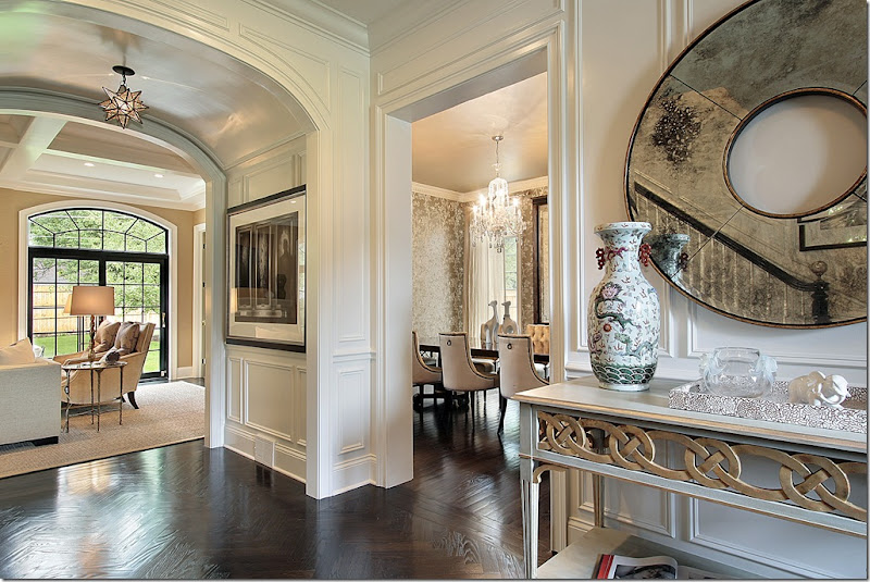
The entry hall: from this paneled space – with its beautiful herringbone wood floors – you can see straight into the living area and on the right, into the dining room. The house is transitional – slightly contemporary and slightly traditional with a muted, quiet color scheme throughout (except for the children's rooms!) In the mirror on the right – you can see the banister of the staircase with its glass topped newel post leading upstairs. Unfortunately, there is no other picture of the stairs. Let’s take a right first – into the dining room.
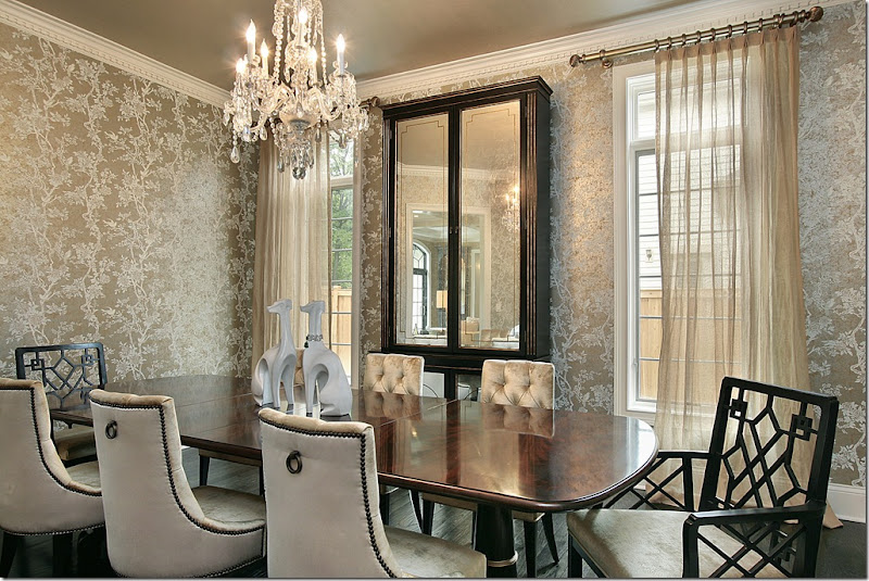
The dining room has beautiful wallpaper – all in soft taupe's and whites. A large mirrored cabinet between the two windows reflects the crystal chandelier. Remember – mirrors should always reflect something beautiful! Notice the ceiling, a soft metallic taupe, the same color as the wallpaper. The owner used a combination of chairs - tufted velvet mixed with host Chippendale styled painted wood chairs. The curtains are a loose weaved fabric that continue the shimmering quality of the room. What a beautiful dining room – so soothing!
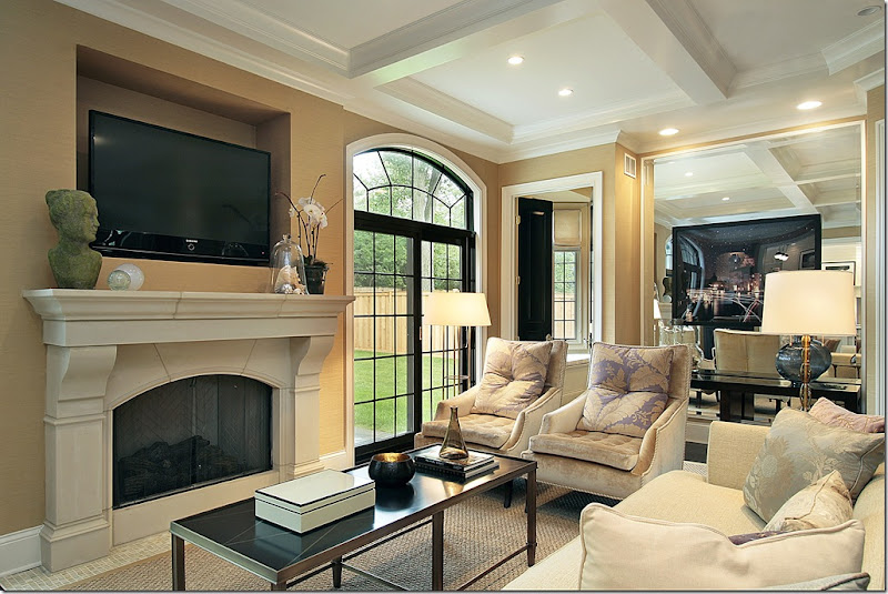
Straight off the foyer is the living room. The mood from the dining room continues here with the soft taupes and accents of black. Here there is more velvet tufting, with the only pattern found in the silky pillows. The large seagrass area rug helps to tone the room down from being too dressy – but the overall atmosphere is one of tastefulness and sophistication. To the right of this room, through the black double doors is the computer room (see pictures below.) The wall next to the doors is mirrored which makes the entire living area appear larger.
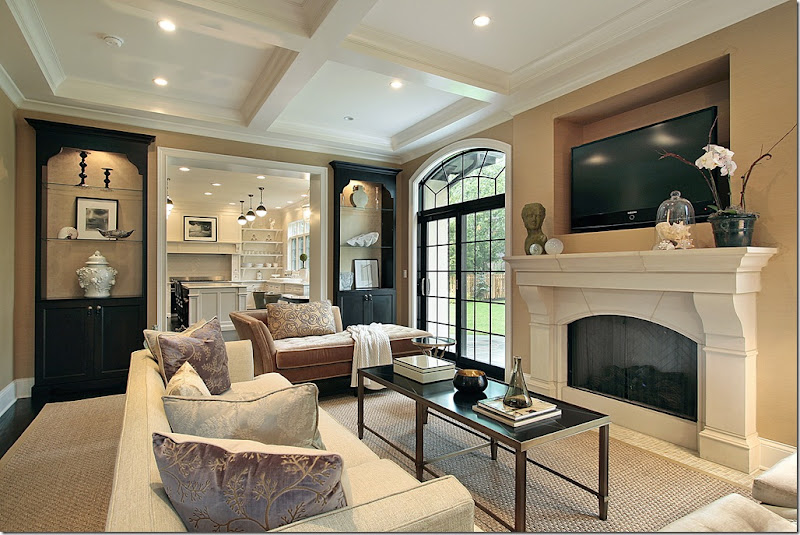
The view of the living room that faces the left side of the house – here you can see the built in painted black cabinets and the pretty chaise lounge. The kitchen is through the opening here.
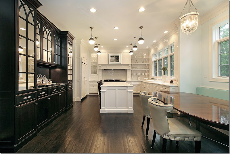
The kitchen is a large area with an adjoining breakfast area, dominated by a gorgeous built-in cabinet, painted black. Again, the same soothing feel is found here, but the taupe color is now replaced with white. Isn’t that built-in gorgeous? I love the mirrored doors with the faux arches. The contemporary styled chairs are on one side of the long wood table and a banquette is on the other. And I love the series of light fixtures over the island – so effective!!!!
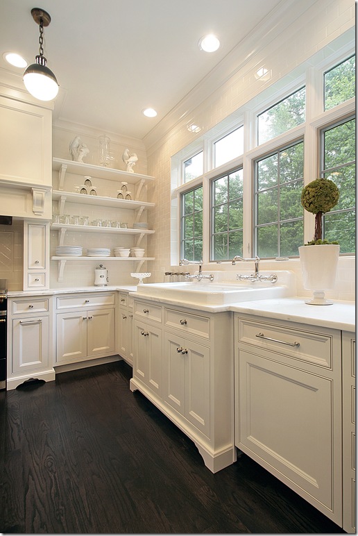
In the kitchen, the right side has no overhead cabinets – instead there is one long series of windows overlooking the back yard. The sink is incredible – so large it has two faucets! Amazing! And I love the open shelving filled with white dishes. The dark wood flooring helps to warm up the space which could have been too cold looking without it.
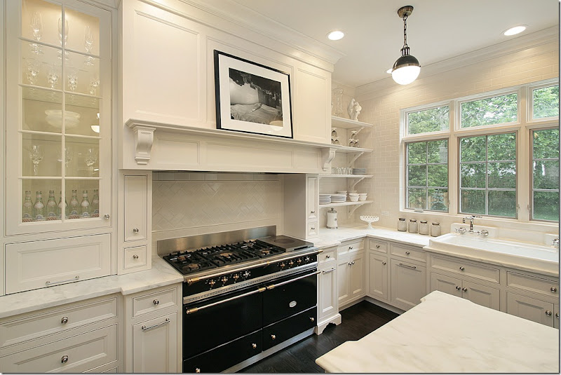
The range is another incredible part of the kitchen. Whoa. Pure lust – it’s like a piece of jewelry in the kitchen!! The countertops are white marble. This kitchen is truly beautiful!!!
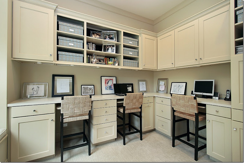
To the right of the living room, there’s a wonderful computer room for the couple and their two daughters. Beautiful chairs! Notice how the children's art work has been framed and is placed around the countertop. Must make the girls so proud! All the boxes stored with crafts and paperwork are neatly labeled. Someone who lives here is seriously organized!!! And extremely neat - the house is spotless. This room is painted in the same soft taupe of the living room.
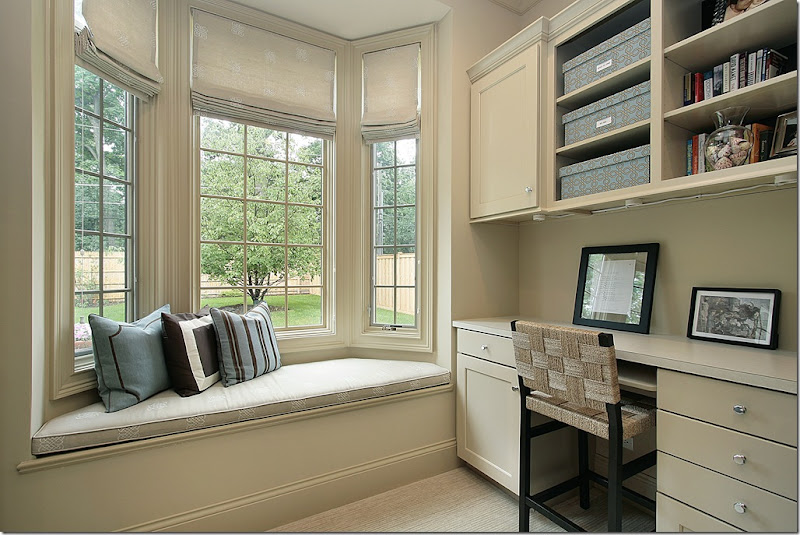
The computer room has a beautiful bay window, overlooking the back yard, which is fitted out with a cushion and pillows. Very pretty fabric shades at the windows. Such a nice tranquil space for homework and computer surfing. Wall to wall carpet helps cut down the noise level.
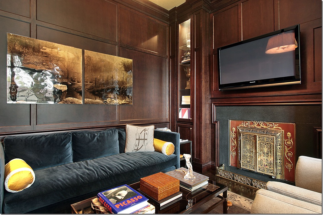 In the library, the color scheme changes and gets deeper with a dark blue velvet sofa and dark wood paneling. But the show stopper here is the fireplace! What a screen! It looks like a piece of art itself!!!
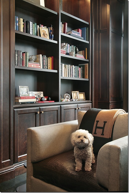
In the library two chairs face the velvet sofa. You may think the blanket is H for Hermes, but it is really H for Hunter, the adorable dog! Of course there would be an adorable dog in this house, everything else is!

Upstairs, the oldest daughter’s room has a large scaled blue and green wall paper. I love the chaise in here – perfect for when friends spend the night. All the upstairs bedrooms have vaulted ceilings.
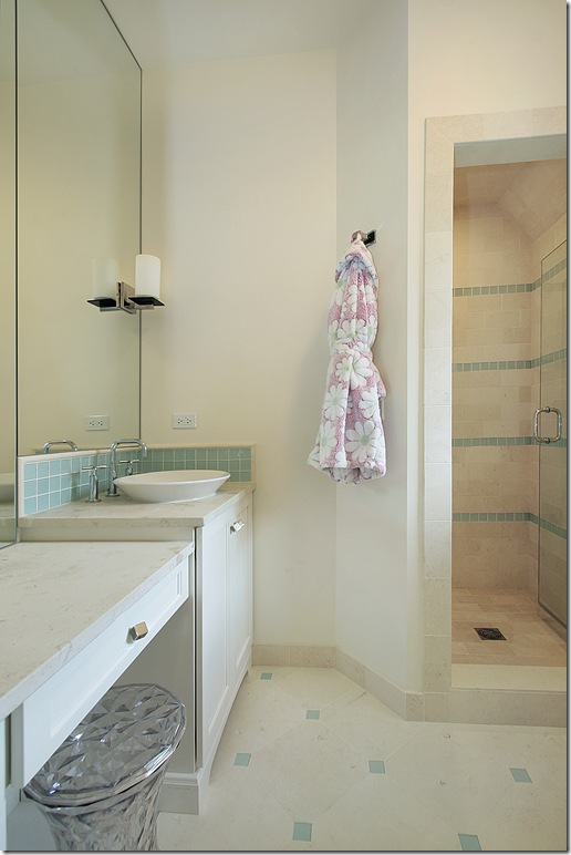
Daughter #1’s adjoining bathroom has seafoam colored tiles and a charming little make up chair.
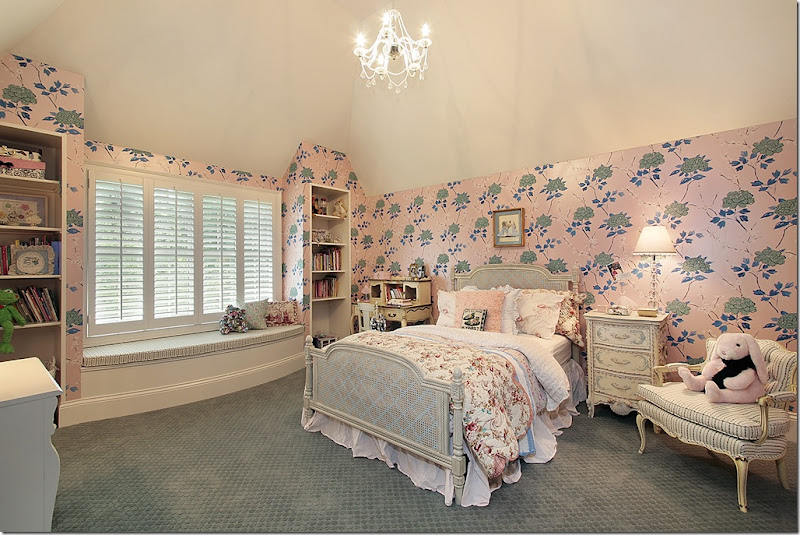
Daughter #2’s room is more traditional – pink and green with a beautiful French caned headboard and side tables. She gets a window seat in her room for friends.
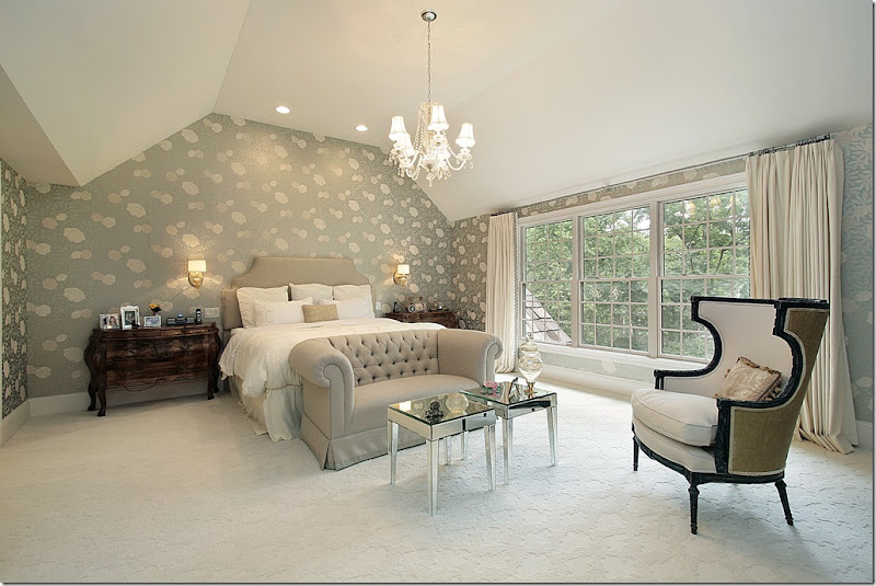
The master bedroom also has a large scaled wallpaper, but it is, of course, much more sophisticated than the daughters paper. A sitting area fills up the space in the large taupe and seafoam colored suite. Notice the scale of the upholstered headboard – brought up higher than usual so that it can be seen over the euro sized shams. A beautiful crystal chandelier lights the room, along with sconces instead of lamps.
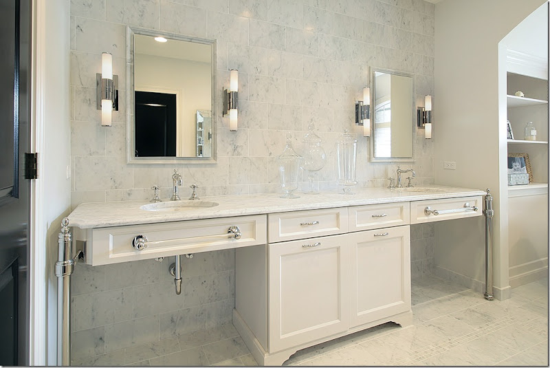
The master bathroom is filled with white marble - and, as in the kitchen, there is beautiful cabinetry and very gorgeous hardware.
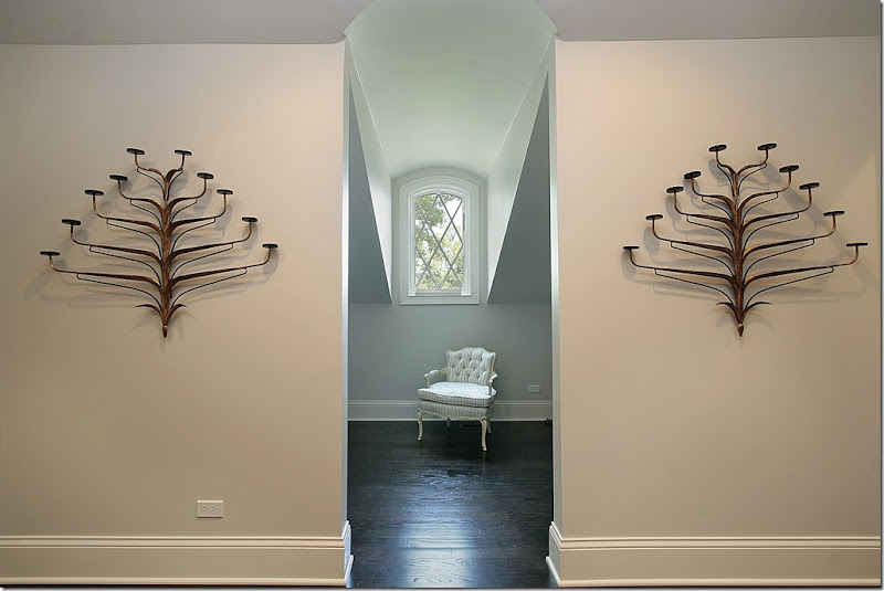
And finally – a view of the dormer window on the second floor. What an interesting vignette and what a beautiful house! It’s so interesting to see what readers houses look like - they are all so different, yet share one quality – the owners all have a deep love of interior design.
Thank you so much to the homeowner who shared her beautiful house with us today! If you live in the Deerfield area and are interested in hiring her for interior design work, email me and I’ll pass on your information to her. And remember – if you have a house you want to share with us online, send me the pictures!
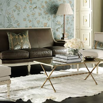 Suzanne Kasler
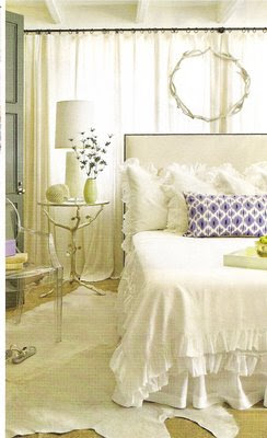 Southern Accents
 Jan Showers
 Cote de Texas
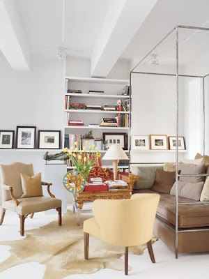 Veranda


 unknown


 In 1992, I was newly engaged. I bought a stack of house magazines, excited about someday owning my own home. I was flipping through a magazine and was struck by a advertisement by Anderson Windows. What was this gorgeous clock with such shapely and graceful lines and light, beautiful wood? I was was awestruck. Here is the ad above. (the middle one - yes, I still have the ad!)
  In 1993 my husband and I moved to Munich, Germany. In Bavaria, I was exposed to beautiful painted pieces and lovely stripped and waxed country style antiques.
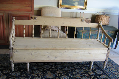 Meanwhile my sister was living in Copenhagen, Denmark and we spent many weekends exploring old barns and antique shops, searching for the "Holy Grail", but also finding other wonderful treasures.