Summer in our garden!
Here in Belgium it will be a wonderful long weekend! The weather will be great!!
So I am in the mood for relaxing in our garden !
And…time for a barbecue party!!!
This morning sunshine was early and I couldn’t resist taking some sunny pictures of our garden.
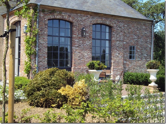
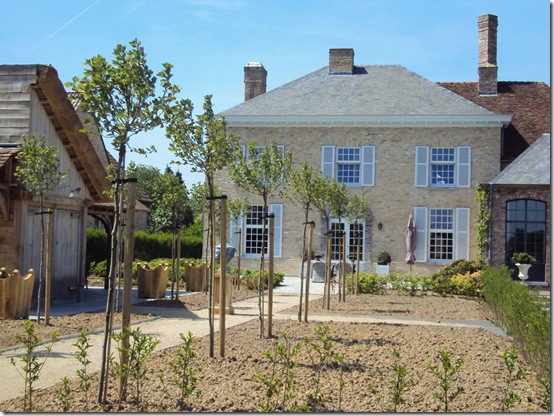
As you can notice we are not finished yet!!! In the picture above you see the spaces were we have to plant flowers. On the right site I would love to have a lot of old French roses, because roses make me happy! They do! And on the right site, close to the outbuilding I want something else. I am still looking to find the right flowers of plants.

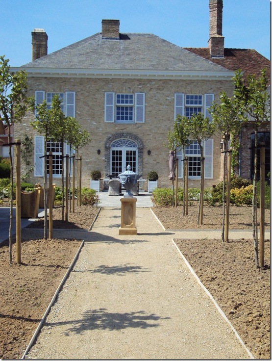
We are so happy with the plane-trees we planted last year. Look at them now! They are still very young but won’t they be beautiful within a few years?
Now you can see where we will spend our weekend.
I asked my friend Trish from TROUVAIS some information about roses because she is a rose lady and she knows a lot about antique French roses. You really should visit her post ANTIQUE FRENCH GARDEN ! Beautiful!
She was so nice mailing me a few of her favorite roses that I posted here beyond.
Thank you so much Trish!
I

Madame Ernest Calvat. c.1888
Or white roses as
Tea Noisette Gloire de Dijon. c.1853
Or
Frau Karl Druschki
So I will think about all these beauties and I will post you later about my choice!
Have a wonderful sunny weekend!
xx
Summer in our garden!
Here in Belgium it will be a wonderful long weekend! The weather will be great!!
So I am in the mood for relaxing in our garden !
And…time for a barbecue party!!!
This morning sunshine was early and I couldn’t resist taking some sunny pictures of our garden.

As you can notice we are not finished yet!!! In the picture above you see the spaces were we have to plant flowers. On the right site I would love to have a lot of old French roses, because roses make me happy! They do! And on the right site, close to the outbuilding I want something else. I am still looking to find the right flowers of plants.

We are so happy with the plane-trees we planted last year. Look at them now! They are still very young but won’t they be beautiful within a few years?
Now you can see where we will spend our weekend.
I asked my friend Trish from TROUVAIS some information about roses because she is a rose lady and she knows a lot about antique French roses. You really should visit her post ANTIQUE FRENCH GARDEN ! Beautiful!
She was so nice mailing me a few of her favorite roses that I posted here beyond.
Thank you so much Trish!
I

Madame Ernest Calvat. c.1888
Or white roses as
Tea Noisette Gloire de Dijon. c.1853
Or
Frau Karl Druschki
So I will think about all these beauties and I will post you later about my choice!
Have a wonderful sunny weekend!
xx
Chic in the Hamptons
 I'm off to the Hamptons this weekend and you know this trip wasn't without some serious outfit consideration. While the city calls for sophisticated ensembles for meetings and business, the Hamptons allows me to get my Prep on. It's also about 10 degrees cooler which requires layers which is why I pulled out my navy Ralph Lauren Slim-Fit Cable Cashmere Crewneck. I'll be pairing it with my favorite white jeans, striped J.Crew buttondown and old pink ribbon belt. Of course, I couldn't resist blinging myself out with some gold Jack Rogers Navajo Sandals. All that's missing now is a Bermuda bag and rope bracelet! Bon Weekend!
Otra bolsita
Bon Weekend!
 Hope whatever you do this weekend brings a smile to your face and puts a spring in your step!
 Photos by Paul Costello
Kitchen Flattery
One of the more frequently asked question by clients that I get is about kitchen remodeling. As with all interior design, in 10 years time, a kitchen can become dated. Clients are forever wondering what countertop will look best and untrendy for the next decade or two. The answer is truly – none. Everything dates, especially countertops. I suppose that classic black granite or white marble is perhaps the least trendy, except both, especially the white marble, are so in right now that the years 2000-2010 may always be associated with these gorgeous materials. Many people are faced with a kitchen that needs updating – yet they don’t want to tear out all their cabinets and start over from scratch. They want a small update, something to take their kitchen out of the 80s or the 90s: think light oak stained cabinets that seemed to be in every kitchen in the 90s. I myself was one of these people.
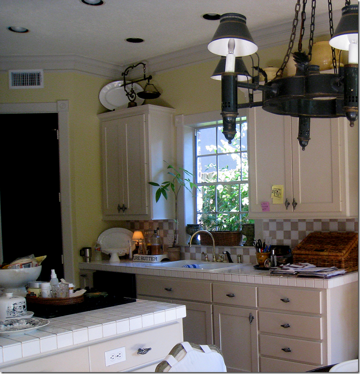
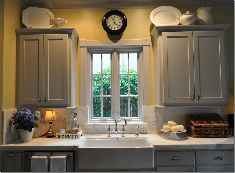
My Kitchen Before: taupe and white checkerboard tiles that used to go with the cafe-au-lait wall color, until I had the house painted a soft yellow. Brass plumbing no longer went with the new hardware I had put in the house. The entire space was tired, outdated and a total mess.
When my kitchen was 15 years old, I was so tired of it, I wanted to rip it all out and start over. Yet, like so many of my clients, I didn’t want to spend the money on a new kitchen with all the bells and whistles. Plus, since I don’t really cook, I was aiming for an update for appearances sake only. Still, I could not look at those taupe and white checkerboard tiles another day. Having a combination of black and white appliances didn’t help things either. For a relatively small amount of money, I ended up with a redone kitchen that brought it into this century.
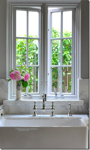
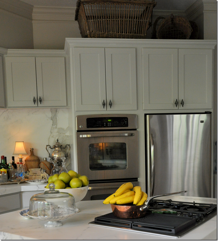
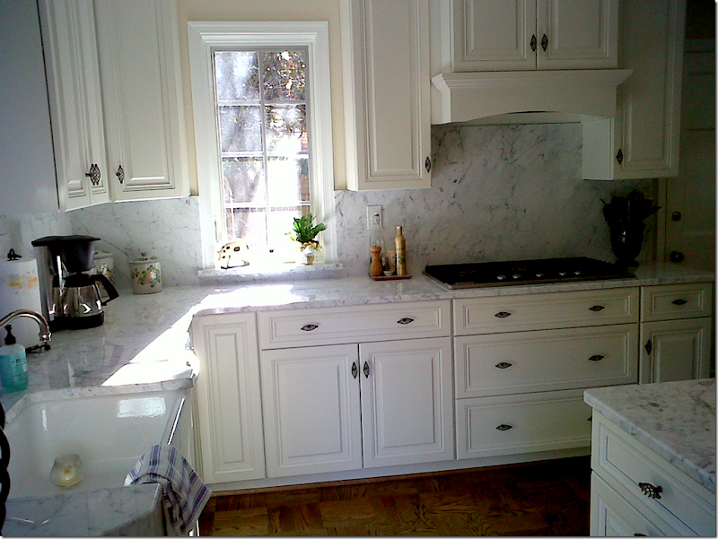
AFTER: The biggest change was the white marble countertops and backsplash, new stainless appliances, the new casement window and the Shaw’s sink and faucet in polished nickel. I’ve joked that I love my sink so much, I would marry it if Ben and I ever divorced. Seriously – it’s more than fabulous, as sinks go. I painted the cabinets a light gray and called it a day. Of course, I knew all along the yellow paint had to go, but it took me another year to settle on a gray that was warm enough to blend with other parts of my downstairs decor. The bathrooms all could use the same updating as the kitchen, but my pocketbook (or Ben’s I should say) is waiting for the economy to pick up a little before I tackle that issue.
AFTER AFTER: I finally got around to repainting the walls downstairs – 15 paint samples later, I decided on a color that turned out to be same color as my existing trim. Go figure. Pratt and Lambert – Feathered Gray.
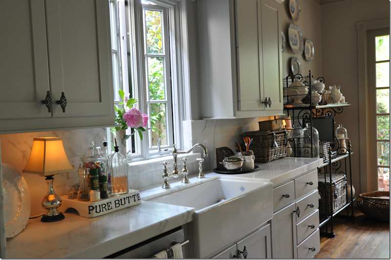 The sink is long and deep – you can hide so much in there. The day I took this picture it was filled with lunch dishes – yet you can barely see just one dish peeking out!
I bought all the appliances online from Best Buy – and sprang for the least expensive ones I could find – as long as the handle was good looking. That was my criteria – good looking handles.

A few months after I showed my kitchen redo on the blog HERE, a reader sent me pictures of her kitchen. She was just about to embark on her own kitchen remodeling – using a lot of the same elements I had. She told me that when her redo was complete, she’d send new pictures of it. Look at the reader’s kitchen before:

Sorry for the out of focus – I didn’t take these pictures!

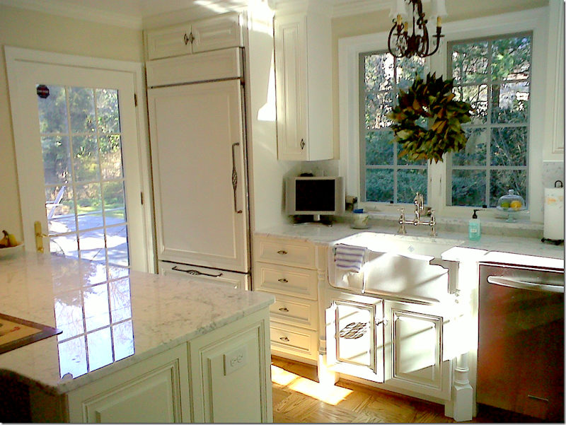
READER’S KITCHEN AFTER
The final reveal - as opposed to my remodel, this reader went all the way with new cabinets and flooring. As you can see, she replaced the table with an island – thus increasing her working space dramatically. Her kitchen does remind me of mine in so many ways. Like me, she got a Shaw’s sink, the same faucet, and almost identical hardware. The white marble is very similar – hers is Carrera and mine is Calacutta Ora. Along with the new cabinets, she got new stainless appliances, although her refrigerator is white to blend in with the cabinetry. I love the way the sink cabinet has legs!
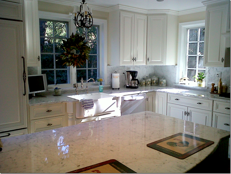 In this picture, you can really see how much extra counter space she gained from adding an island, rather than keeping the table.

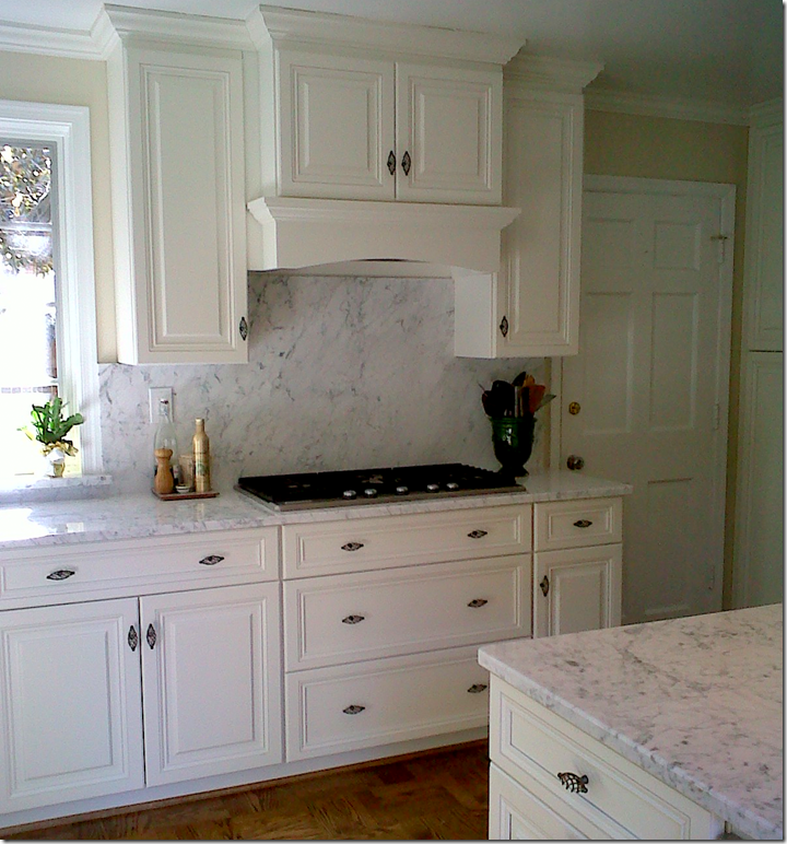
Instead of the range, she added a cooktop with a trendy hood. I wish I had this myself – I don’t care for my cooktop being on my island.
I love the marble backsplash – instead of tiles. White marble is so beautiful – why not use as much of it as you can?

And, finally, next to the double ovens, glass doors and a marble counter were added to break up the bank of cabinets that was previously there. I think this reader did a great job with her kitchen. While she did a much more extensive redo than I did – she stayed within the footprint of her space – choosing to keep the room the same size. Unlike me, she needed more counter space and greater efficiency – so new cabinets were needed which added to her price tag. Still, I was struck at how similar our kitchens looked, which really wasn’t an accident – the reader told me she chose many of the same elements I did after seeing my redo.
Thank you so much to this reader for sending in these pictures!!! I love to see reader’s houses – so keep them coming!!!
The bells and whistles: writing about kitchens got me thinking. If I did have the budget for a totally new kitchen, would I want a kitchen like this? Would I want all the extras and the luxury? Do I like banks and banks of closed cabinetry? What is my dream kitchen? What is your dream kitchen? I suppose if you are a chef or like to spend time in the kitchen, your answer would be different than someone like me who uses the kitchen to cool diet cokes and refrigerate take out Chinese dishes.
Several Houston kitchens have spoken to me – this one is beautiful for a large budget space. I adore the limestone mantel – so French! The red lanterns and the toile fabric curtains are wonderful too. The cabinetry though is especially appealing – the curved armoire door styling, the chicken wire. This kitchen would be as fancy as I would ever want.
One of my favorite kitchens in Houston is Donna Brown’s. Donna owns The Gray Door in Houston, one of the better antique stores here. She bought a townhouse and then ripped out the brand new kitchen. Next, she went shopping at The Gray Door and brought home her kitchen. Amazing. The sink is located in the shop cabinet behind the chair. Cages double as cabinets. I love these kind of kitchens and wish I had the huevos to do this in my house!
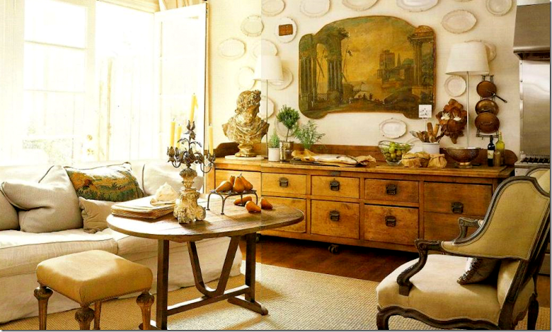
Another picture from Donna Brown’s kitchen. Past the range, she placed a long cabinet to store dishes and silverware. The wine table doubles as a coffee and breakfast table. This space is the family room/breakfast room. The French doors lead to the landscaped terrace. Donna’s entire townhouse is wonderful – she took a rather traditional townhouse and turned it into a house you might find in Paris.
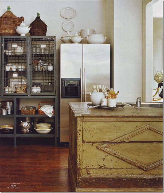 The sink and refrigerator in Donna’s non-kitchen kitchen.
Another fabulous non-kitchen kitchen is this one done by Pam Pierce, also from Houston. Of course it helps that the lady of the house, Ruth Gay, owns Chateau Domingue, Houston’s finest architectural elements (antique and new) shop. Hard to believe this kitchen is in a once proper Houston house that Pierce and Gay have totally redone with antique architectural building elements from France and Europe. The stone walls are gorgeous!!!
I mean, look at this sink!!!! True, Gay has a traditional farm sink, but she also has this trough in her kitchen. This kitchen makes all the traditional bells and whistle cabinetry kitchens look so fuddy-duddy, imho.
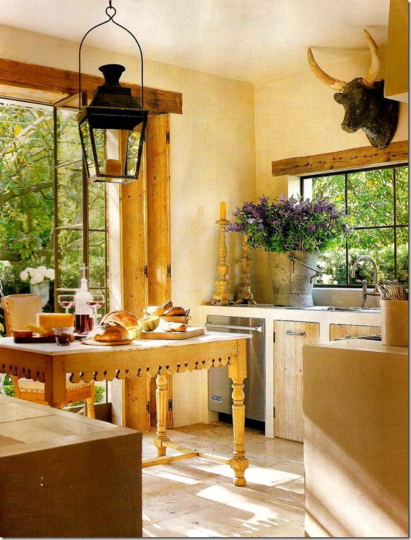
Pam Pierce’s own Houston kitchen is another one I lust after time and time and time again. I love the way the cabinet doors are inset into the stone countertops. So French!!! And these Houston designers would never use a regular island – their islands are ALWAYS antique – either an old butcher block (the real thing) or an old store cabinet display piece, or a tailor’s table, or – well you have the idea. Their islands make their kitchens so much more interesting – adding texture and an element of surprise.
Looking from Pierce’s kitchen into the breakfast room. Those shelves – could they be more perfect?????? I’m sorry, but interior design like this depresses me! Makes me feel so inadequate!!!!!
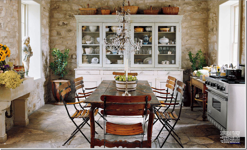
More Houston interior design, via Fredericksburg: This “kitchen” is owned by an antique dealer/real estate tycoon from Houston. Again, no built in cabinetry, instead a large antique piece holds all the dishes. The crystal chandelier mixed with the rustic stone walls and floor is a fun touch. This is Fredericksburg???
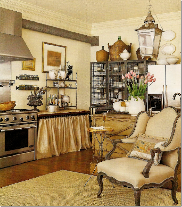
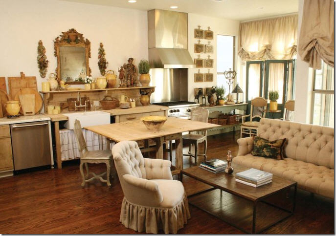
Another Houston connection via Dallas: native Houstonian Shannon Bowers’ kitchen is again a non kitchen kitchen. Notice the unusual elements: her island, no upper cabinetry, open shelving, the skirt under the sink – all nontraditional choices in a kitchen. The lantern is the cherry on top. Bowers’ entire house featured in Veranda is to die for.
And finally, Jane Moore’s non kitchen kitchen – filled with Swedish antiques and painted consoles. Too cute! Do you think Houston designers are influencing each other? I hope so – we have such great talent in this city as you can see from their kitchens.
I’m curious. Do you prefer a large, bells and whistle kitchen, filled with closed cabinetry and the finest in appliances? Or do these Houston kitchens appeal more to you? I know that for me, seeing all these non-kitchen kitchens really makes me wish for one!


