Memories of Christmas' Past


.
 We do not have much money. We have just exchanged "Sister Gifts", small things we have bought or made for each other. Exchanging them on Christmas Eve makes them seem more magical and important.

 (cyndeelynds)
 I will be spending Christmas with my sisters and their families, as my parents have been gone for quite some time now. So I send on my Christmas wish for you: To be surrounded by people who love and care about you. Thank you, my friends, for allowing me into your homes for another wonderful year.
I am sending you all very heartfelt wishes for a joyful holiday from my family to yours.
xoxox - Gina
The Stockings Were Hung...
Before and After Lessons
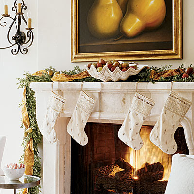
December is a lonely month for Jewish bloggers. All the other bloggers are busy showing off their holiday finesse, while we sit in the darkness literally and figuratively. Who knew that when we signed that covenant with God all those eons ago, we were forever signing away our right to evergreen trees and twinkling lights? Even though I can’t indulge in the fun, I certainly appreciate its beauty. One of this season’s prettier, yet very understated and modest holiday displays, was seen in this month’s Veranda.
Poor, lonely Hanukkah Harry!
The cottage shown in Veranda was designed by Lisa Luby Ryan of Dallas, Texas. An interior designer, Lisa is also the well known owner of the décor shop Vintage Living HERE, and is a designer for Arteriors. Through the years, Lisa has garnered much press – her own house has been published several times, beginning when she was into the cluttered English Country Manor look. Today, Belgian and Sweden are her countries of choice.
Lisa Luby Ryan’s Vintage Living features Swedish and Belgian furniture, new and old.
The Veranda holiday house only shows glimpses of the cottage designed by Lisa – not nearly enough to satisfy. The closely cropped photographs leave you wanting to see more of these quietly elegant rooms. Luck would have it that the Vintage Living web site does show the entire house – before and after – a sort of tutorial as to what to do when remodeling a bungalow with priceless antiques.
The house, built in 1951, is located in Highland Park West, in Dallas, Texas. It is a mere 1,600 square feet with just one bedroom – a second bedroom was turned into a dining room. The new homeowner was recently divorced from a man who didn’t like antiques, so this house was her first chance to decorate for herself and herself only. She chose Lisa Luby Ryan to help after visiting Vintage Living, where much of the furniture and accessories were ultimately purchased. The pair also took two trips to the South of France in search of antiques. The change is substantial, only four pieces remained from the homeowner’s previous possessions. The house also underwent structural changes with a new dining room, kitchen, bathroom, and back porch – along with its own fireplace. The homeowner is thrilled with her new décor – she stayed at a hotel for a few days while Lisa put it all together for the “big reveal.” Lisa also installed the Christmas finery at the same time to coincide with the magazine photoshoot.
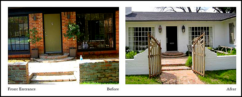
From Lisa’s web site: the bungalow started out with red brick which Lisa painted white. A wooden gate was added to create a front courtyard.
The Veranda spread opens with a tantalizingly unfocused Swedish desk and chair.
Veranda: next, this glimpse of a peeling painted Swedish day bed leaves you wanting to see more!
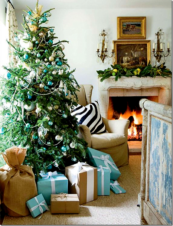
The tree and presents were color coordinated to the house décor. Lisa was insistent there be no typical red and green scheme.
I love the burlap bags and the Tiffany blue boxes – so cute!!!!!
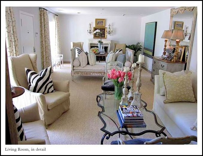
Here is a picture of the entire living room. Long and narrow, the soothing room is broken into two sitting areas by the Swedish day bed.
Another pair of matching arm chairs are seen on the opposite side by the fireplace.
The chairs’ tall backs bring a much needed vertical element to the long horizontal room.
Veranda: a close up of the blue chest that sits opposite the front door in the middle of the living room. I love all the holiday flower arrangement – they aren’t the typical usually seen.
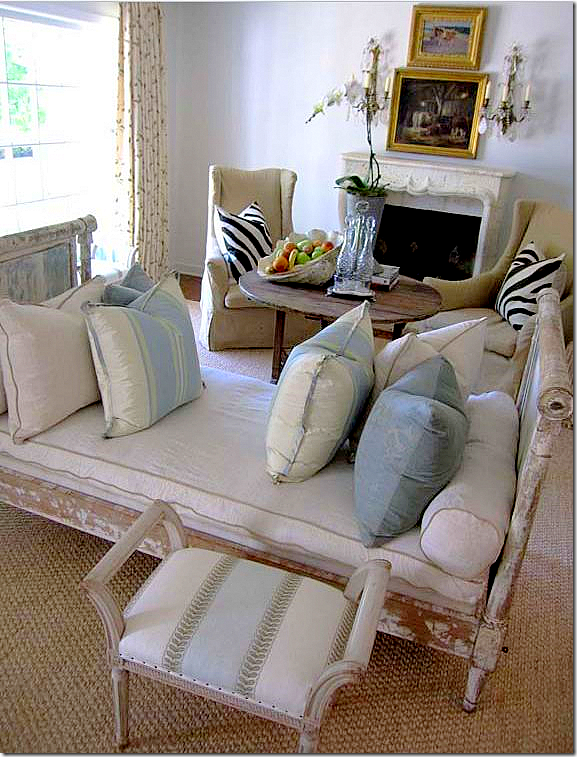
The Swedish day bed divides the room into two seating areas. A large seagrass rug covers the hardwood floors. At the window are printed fabric curtains – the same fabric is used in the living room and dining room for continuity.
Here you can see the antique French wine tasting table used as a coffee table.
The surprise is the modern art work – whose colors are just perfect in this room.
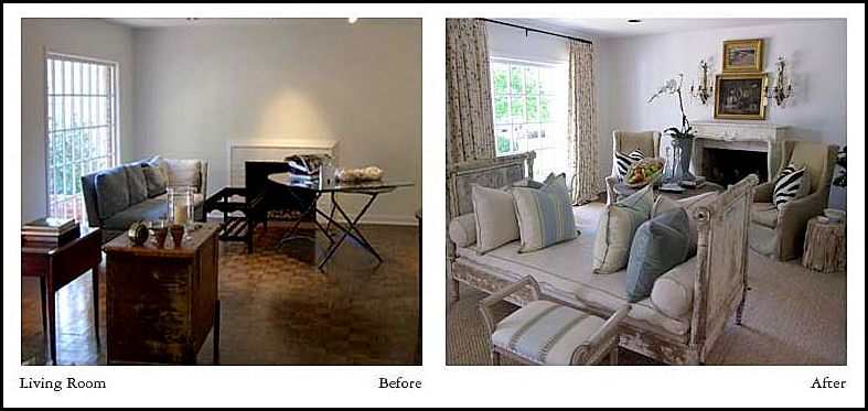
In these pictures you can see exactly what Lisa did to transform the room. The mantel is an addition, as are the window treatments. The walls appear to be painting a very light blue.
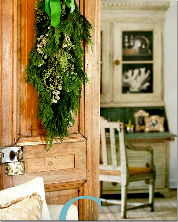
The opposite end of the long living room. Here you can see the dining room through the antique wood doors purchased in France.
The dining room was once a bedroom. Pictured here are the two other wing chairs, along with a beautiful pair of antique Swedish arm chairs.
I love the pop of zebra against all the muted colors – Lisa is really great at accents.
VERANDA: we only got this one small look into the dining room.
I love the blue and white vases filled with white flowers – such a refreshing change from red and green decoration.
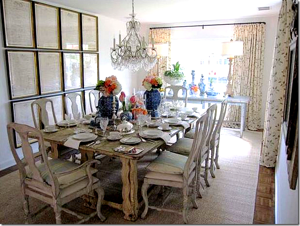
Notice the framed documents that take up one wall – so interesting.
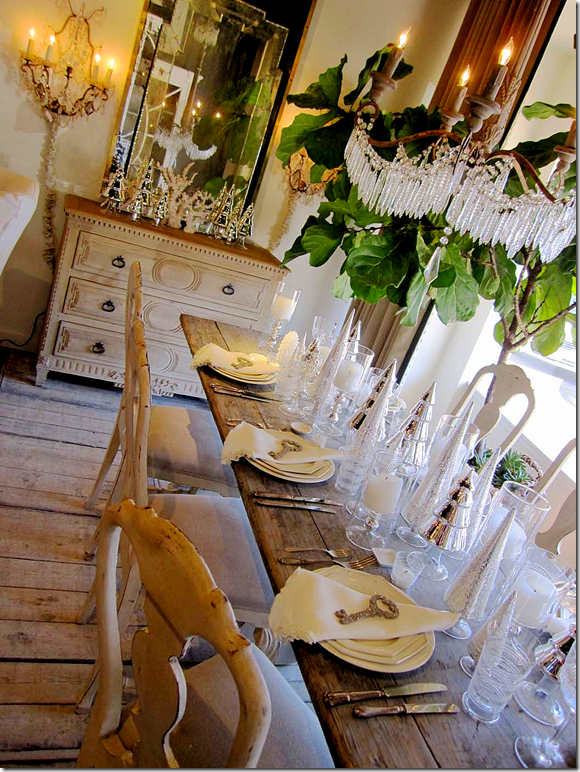
Here you can see the Belgian styled table with the Swedish dining chairs.
I love the crystal chandelier used with all the rougher elements.
This room is just so pretty.
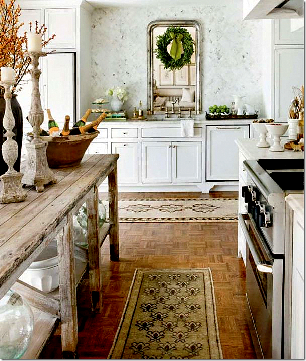
Veranda: Lisa gutted the existing kitchen turning it more into a room with its beautiful cabinets.
The rough wood table is fabulous paired with all the white marble. I especially love the silver Louis Philipe mirror over the sink!
The back wall is perfectly symmetrical - another great detail Lisa added.
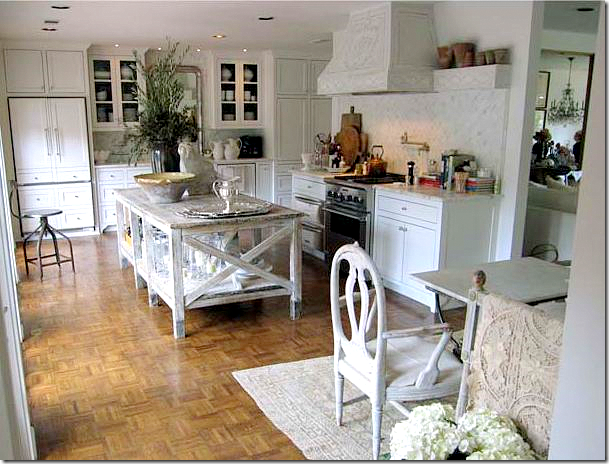
In this picture you can see more of the layout. The wood table is so large and is a very important element in the room.
Just beautiful!
The kitchen before. Here you can see the windows and how they have been changed into doors.
One more before and after of the kitchen. An amazing transformation!!
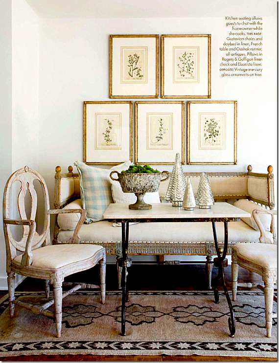
Veranda: The breakfast room as shown in the magazine. I just love this!!!
Here’s another look at the antique Swedish sofa and chairs, along with a marble topped iron table. Beautiful!!!!!!!!!!
From Lisa’s web site – a view of the breakfast area, before and after. It is so elegant!
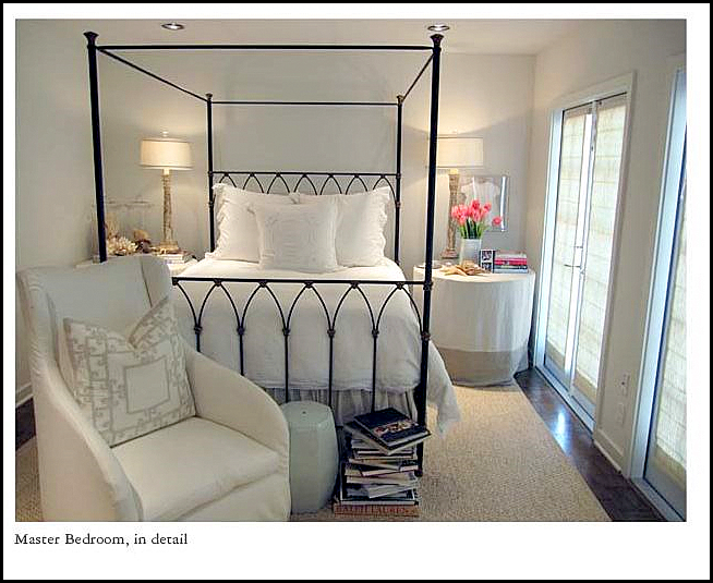
From Lisa’s web site – a view into the lone bedroom in the house. Simple elegance.
Again from Lisa’s web site, the bathroom is remarkable. Notice the antique doors that close off the vanity area.
The chair wears a darling slipped cushion with ballet leg ties. Great vanity skirt.
The vanity has a sink recessed into a Swedish chest. Notice the wall treatment – so muted.
And finally, the bath yard with its fabulous fireplace!!!!! This is like a room itself. Just wonderful!
Lisa Luby Ryan: Before and After
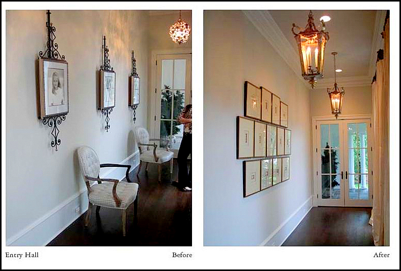
On Lisa’s web site, there are many pictures from other houses showing before and after. I really enjoyed seeing these pictures because Lisa is not afraid to make small changes that other designers might let stand and not bother with. For instance – in this hallway, the décor is fine and doesn’t really need much changing. But Lisa didn’t agree and went the extra step, which really is much, much nicer: new lanterns, a set of intaglios, and curtains make a hallway come alive.
In this dining room – the décor was fine, but not to Lisa. She had the walls painted in a Swedish inspired mural. She moved the chandelier to another room and installed crystal lights instead. Next, she slipped the chairs. The lamps were changed out, as was the screen. Many designers would have probably kept the dining room as is, but Lisa changed it to bring it up to date.
In this vignette – she removed the red and blue oriental rug in favor of a muted textured one. The TV cabinet was changed out for a painted French version. The hanging screen from the previous dining room was moved to this room. Notice in the next room, the brown stone was painted cream. These changes Lisa made really brings this room up to date.
In this room, Lisa didn’t just redecorate – she changed out the fireplace to make a huge statement. Then she added antique paned doors. The bookshelves were updated by adding louvered doors instead of plain cabinet ones. Many designers would have just changed out the furniture, but Lisa changed the architectural elements to truly make a huge difference.
The same room. I love her slipcovered furniture. Notice how she fauxed the cabinets to make them look like Belgian limed wood.
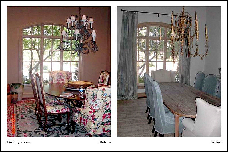
Here - a new muted rug, a raw wood table, new velvet slipped chairs, new chandelier and curtains – what a huge change!!!! The new table makes such a difference in updating the look for today. Notice the wing chairs – how the pointed wings look so much fresher than the rounded wings from the before picture. A small detail that makes a big difference.
In this living room – four chairs surrounded an ottoman. Again, the décor was not bad at all, but Lisa brought it up to date by changing out the rug accented with the zebra. The framed documents add so much more warmth than the mirror – which I never thought I would say. The four chairs were moved to the family room – and a sofa and two chairs were added here, along with a Mora clock.
Another view of the same room. The fireplace looks so much better without that screen!!!
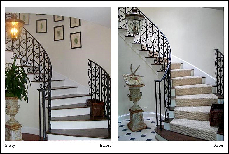
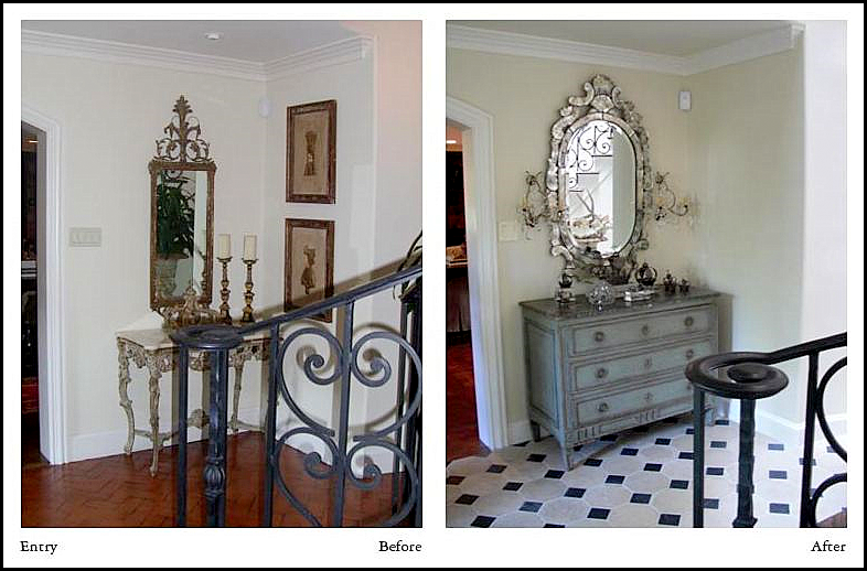
Finally, look at the changes in this entry hall. The wood floor becomes elegant marble tile. A muted rug on the stairs tones down the contrast. The plant is changed out for a collection of shells. The small pictures are removed to declutter the look. Small solutions that make up a big difference.
Looking at the other wall – this made me really think. Would I have made the changes that Lisa did? The console and mirror aren’t bad. Would I have just let it go because the owner already owned these pieces? What Lisa replaced the furniture with – a much larger chest that fills out the space much better – a more substantial mirror with sconces – there is no doubt that the space looks much better with what Lisa did. I would love to see how she presents these changes to her clients: “what you own is pretty, but I can make it prettier!” I really admire her work and her skill with her clients. It’s not easy working with clients, but Lisa certainly knows what to say and knows how to get the job done.
And finally – we are off to the country to celebrate Christmas with Ben’s family. Here’s wishing you and yours a healthy, happy and safe holidays!!!!


