I had a little excitement at my house a few weeks ago: a photography crew came and took pictures to put in a national magazine next October. The editor picked two rooms for their publication: my family room and the guest room. Actually, the choice of rooms was strange to me. While I do love my family room, it's not really "decorated." I think my living and dining room would have been better picks. And my guest room????? That choice is really beyond me - I like my master bedroom much better!!
The history of our guest room is a long one, starting when it was used as my daughter's nursery. At that time, it was wallpapered in an English paper of pink and white dots and it was decorated with a Waverly (remember Waverly?) pink and green chintz and a cotton pink and white ticking. There was an iron daybed and a dhurrie rug that I liked to pretend was really a high end needlepoint.
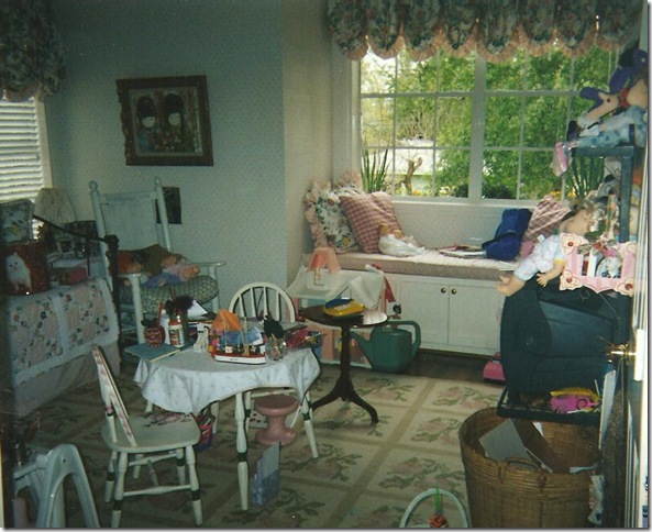
The guest room as it once was, a nursery.
What a dump! Well, if I could go back 14 years, I would certainly style this mess!!!! This is definitely the room of a very active little girl who liked to play with dolls and toys, instead of with boys like today. Oy! I even spy a play telephone sitting ready on the side table - a hint of things to come!! The iron daybed is on the left with its pink and white ticking bedspread. Covering it was a quilt my mother in law made for my baby. The window seat's cushion was also in the pink and white ticking and all the pillows and curtains were in the Waverly chintz. The dhurri, or, faux needlepoint rug, is shown. Trust me, this room used to be really cute before "the Princess" starting growing up and making a mess of everything. As it turned out, my daughter grew bored with this room (more hints of things to come) and moved into another bedroom, leaving this room to slowly languish, unused. In order to get the redecoration of the nursery rolling, I knew that first, the wallpaper had to go. So one day, I had my painter remove it and paint the walls a color very similar to Restoration Hardware's Silver Sage. The iron day bed was given away, as were all the pillows, the ticking, the chintz and the faux needlepoint rug. My daughter moved on too - to Ikea and West Elm. A few years ago she redecorated her new room, by herself and with very little help from Mom. Yes, it was hard for me to relinquish that control, but Elisabeth is willful and very independent. Here's what her room looks like today:

The Princess' room today.
The bed, bookcase, and tables are from West Elm. The mirror and desk are from Ikea. I had the softgoods made for her from what she picked out: silk purple for the windows and a crushed silk velvet for the duvet. The walls are a silvery lilac and the ceiling is a deeper purple - both from Pratt and Lambert's faux paint line. The light fixture is made from trendy capiz shells. She's been hinting lately that she wants to move back into her old room, which is now the redone guest room. I am hinting back too, "I don't think so."
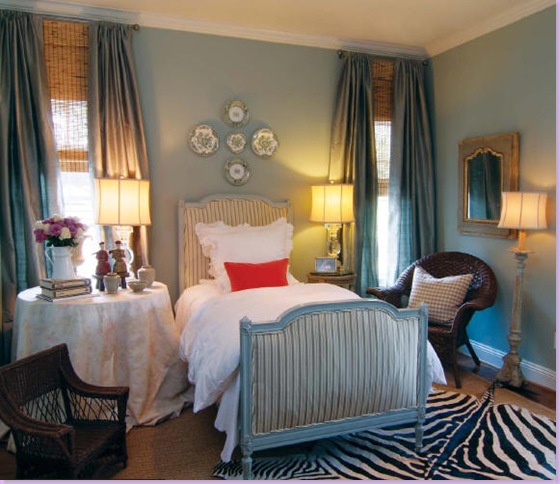
The guest room as it was photographed last year for Houston House and Home magazine (read the article here.)
Last year, you may remember, my home was photographed for a Houston magazine: Houston House and Home. Above is how the guest room looked then. I was given a very short time to get the empty and mostly junked out room into shape last year. The bed, an antique french day bed I bought on sale from Maison Maison, was luckily already upholstered in a green silk stripe. I bought some white linens, curtains and lamps from Restoration Hardware. The skirted table is Bennison - a nice left over from a client who rejected it. The zebra was new, bought at Round Top and layered over seagrass. The day before that shoot last year, I ran out and bought two orange pillows for a color pop from Area. I thought it looked ok. Apparently, the national magazine thought so too - they wanted to put it in their own magazine. After last year's physically tiring and mentally exhausting photo shoot, I swore I would never do it again. But, somehow, here I was, less than a year later, again welcoming strange photographers into my house. Of course, nothing is ever easy.
Exactly one week before the big photoshoot, I received news from the local scout. She had a list of things the editor wanted changed for the shoot. Oh? Really? The editor and art director wanted a new window seat cushion (made out of the Bennison fabric, no less!) The zebra rug HAD to go - apparently their readers object to zebra rugs, the suzani on the chair also had to go (suzanis are too bright) and the neon orange pillows must also go to be replaced by other pillows (like what other pillows, I wondered?) Now understand, I had known this shoot was going to happen for about three months - three months that I could have gotten all these changes done with no problem. Instead, the editor gave me one week to get the new cushions and pillows made. Luckily I had a little fabric in the garage left over from a few jobs, so I didn't have to order the Bennison fabric which never would have arrived in time, never mind how expensive it is. I called my trusty assistant Monica, from Custom Creations by Monica, and she ran over that night to measure. In the end, she got the workroom to rush the new window seat cushion, 7 new pillows, a new seat cushion for the wicker chair, and two new cushions for the two child's chairs. I ran out and bought a new Blanc d'ivoire desk and lamps to take the place of the hideous TV stand in the room. Monica showed up exactly 6 days later with her bounty, thank God.
When they all arrived. the scout and the photography crew seemed happy with the new changes. It was a much different shoot than the one done last year. This time, each photograph took over an hour to complete - the attention to detail was that time consuming. The crew was uber professional and fun at the same time. They overtook my small house like an army at headquarters. It was an interesting learning experience and I am anxious to see the finished product. I've been told that my family room will be shown in October and the guest room will be in another month's issue. I'll be sure to share the details as soon as I know them. As for the changes the editor asked for - I'm happy with most of them and plan to keep them. In the end, the editor and art director, the scout and the photographer all knew better that me, I guess.
And one last note: apparently the magazine scouts are always on the look out for homes to nominate for publication. If you think your house is "photo ready" or could be with a little help, please email me. I'd love to pass on prospective homes to them! Don't be shy!
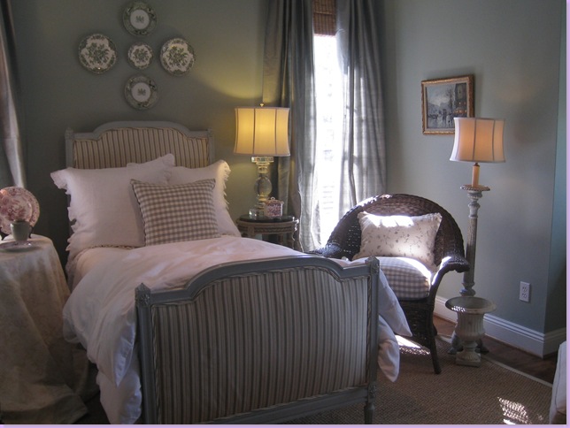
Here's how the guest room looked for the new photoshoot. Chelsea Editions check and vine pillows replaced Area's orange ones. I added the cushion and pillow in the wicker chair. Zebra rug was pulled out. Everything is softer, the colors muted - no bright colors or contrasts.
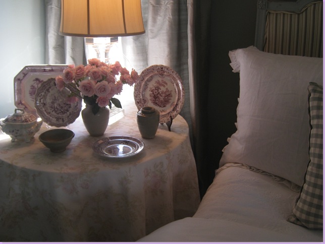
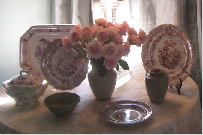
The mulberry transferware used to be on my entry hall table but now is permanently in the guest room where it looks much better on the Bennison skirted table.
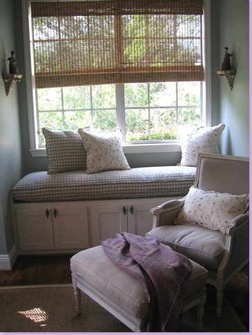
The new check window seat cushion with new pillows. The chair and ottoman are from Blanc d' ivoire. A softer lilac pashmina replaces the bold suzani that the editor asked me to remove. I like this much better and plan to keep this change.
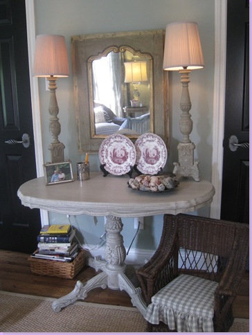
I took out the hideous tv stand and added this table from Blanc d' ivoire along with their lamps. The mirror is from Joyce Horn. Cushion was made for child sized chair.
Now, the big question is - should the zebra rug go back in? I can't decide - so please leave me a comment with your opinion - yes or no! I'm just not sure I like it in there anymore. What do you think? Here are some pictures to help you decide:
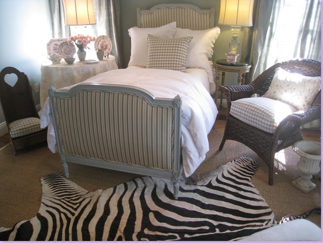
The zebra rug back in the room - yes or no?
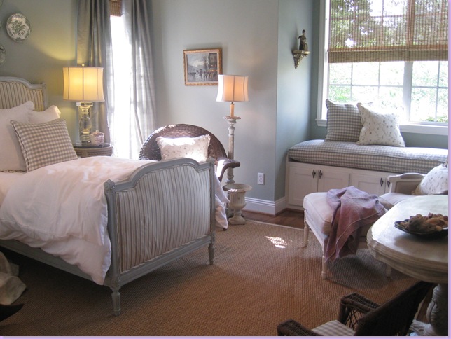
With or Without?
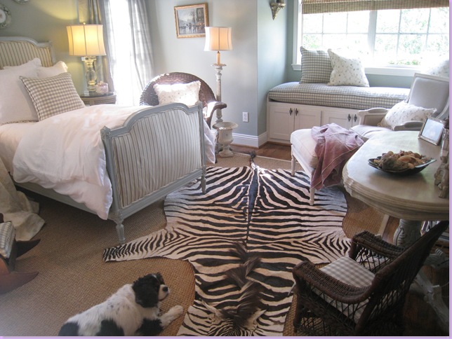
Sammie Jo loves it, but I'm not so sure - what do you think? Too much?
There were lots of changes in the family room too - I'll show you those in a few days. Remember - email me if you think you have a house worthy of a magazine shoot. Seriously!
 I love Steve McQueen. He is the epitome of cool. A man's man who loved to drive fast cars and have a good time. I even dated a few boys just because they reminded me of him. So when I was at the Taschen warehouse sale yesterday, I just had to pick up a book of photographs of him taken by his friend William Claxton for just $9.99. Because they were friends, Claxton had close access and his photos have a sense of intimacy that today's paparazzi photos will never have. Claxton was also married to model Peggy Moffitt who did a few photo shoots with the actor. Hope you enjoy the photos as much as I did!


.jpg)


 I did however take the opportunity to inform our showroom rep that since I was going to be ordering such an expensive item that she should finally get me a replacement knob for the Equilibrium lamp that she had yet to find for another client. That lit a fire under her! Of course the knob is now costing $5,000 but at least we're finally getting it!
 I won't tell you exactly what piece I am ordering yet but it is part of the


