We starting building our house when our daughter wasn’t quite 3. She’s almost 18 now. We were young (well, not that young, we married late), and had just moved back to Houston after living a year and 1/2 in Ft. Worth for Ben’s job. We bought a lot in West University to build our dream house on and in order to save money on architects, we drove around the neighborhood and found a house we liked and copied it. We made a few changes – put in a bathroom where there was originally a laundry room, and added a bank of French doors to the back wall – where before there had been only one, along with a few windows and a bay for the breakfast room. The bank of French doors really added value to our house and picked it up a notch, design wise. The rest of the windows were aluminum – I begged Ben to let me put in wood windows – he said we couldn’t afford them, they cost $10,000 extra. Now, I was naive back then, and didn’t think to figure out how little $10,000 over the life of a 30 year loan would have cost us. He did promise me though, that once we moved in we would slowly replace them, one by one. We actually did replace one – a year after we moved in we took out the aluminum windows in our dining room and installed a set of French doors. But the rest of the house, 15 years later, still has all the old windows! I did hold my ground on the hardwood floors and Ben actually agreed to put them in, both downstairs and up. A baby, two cats and a dog were his incentives.

Before: white tile countertops and a taupe & white tile backsplash. When we moved in , our walls were taupe and perfectly matched the taupe backsplash color, but that has long since changed. Even then, I wasn’t a granite girl for some reason. I was going for an informal, country look with the tiles.
Most houses in our revitalized inner-city neighborhood are newly built, taking the place of the old house on the lot. Today, they are building beautiful stuccos in West University, but back then, the typical new house was a red brick Georgian, with a living room and dining room flanking a center hall with a staircase; the family room and kitchen made up the back and brass hardware was a must. We prided ourselves that our house was different because our floor plan wasn’t like the Red Georgians. The ceilings in our front room were quite tall and we had a large entry hall with a winding staircase. The back wall off the entry hall is angled, which causes my kitchen to have an angled wall. You can guess how much I like that angled wall today! I look at it and wonder - what was I thinking? Over the years I have decorated, God, have I decorated, and changed the furniture and paint and window coverings, to0 many times to count. We’ve made other small changes, but we have never updated, our house always seemed new to us. Until, that is, the hardwood floors’ stain started to go dull and white in paths around the house like a dog does to the grass outside. Overnight, it seemed, our house became dated and in need of a major overhaul. Writing a blog and seeing everyone’s newly bought and remodeled houses didn’t help much either.

Before: back and white appliances mishmash. Last year, we finally replaced all our brass hardware for iron.
The problem is we love our house, despite the fact that there is no storage and the bathrooms are terribly in need of a fix up and that Elisabeth’s room is about a foot bigger than a jail cell, and our backyard is actually a courtyard. Poor thing – Lizzy never had a trampoline or a swing set, or even a place to chase her dogs around, instead she’s had a life of hiding from the neighbors’ prying eyes, a hazard of living on a town lot just 50 x 100. Yet, we’ve been happy here, very, very happy and hopefully we’ll be happy here for quite a few more years, even though I am a different person than I was then. I’ve changed dramatically in what I want in a house and what my design aesthetic is and sometimes that and my house don’t gel. We aren’t poverty stricken anymore like we were back then when we begged my parents to buy our lot for us. We could move now, we could probably afford something a little bigger and something a little nicer and more Kurt Aichler-ish. But, our house is like an engagement ring – today, you could afford to buy more carats than you could as a newly wed, but it’s your ring, and it means something deeply to you, more than just bling. Like Ben says, in another one of his favorite sayings, the only way he’s leaving this house is in a big box. It’s us.

Before: the bar area. The cabinets had to be painted after the marble went in. Though they were gray, they had too much of a yellow tone for the marble. Love that checkerboard backsplash!! When we moved in – I thought my backsplash was the coolest thing.
So, if we are going to stay here, I want marble in my kitchen and bathrooms. I want nickel faucets and stainless appliances and I want a new window in my kitchen too, after all, it was promised to me 15 years ago. Ben admits it’s time for a little remodeling and he agrees to let me update my no-straight-wall kitchen that really could use a total gut job. We should gut it, I know in my heart. We should add new cabinets and remove the island, close off the opening to the family room and put in a gorgeous range with a hood fashioned after a fireplace, but really, why? We barely use the kitchen as it is and who wants to spend the money to fix up something that would be overkill for a house? I mean, truthfully, I want that magazine-ready kitchen as much as the next person, but with today’s economy, I feel grateful for a small makeover. Very, very grateful. So, that’s what we decide on, a minor remodeling. A hunt for white Carrara marble began and began and began and lasted over six months. I’ve written here before that quarries aren’t producing the crisply veined, white Carrara right now and in Houston there wasn’t a decent slab anywhere. I was beginning to think the remodeling wasn’t going to happen until one day I was out and ran into the talented, interior designer Lisa Epley. Telling her how much I loved her just published kitchen and it’s beautiful Calacutta slabs, she tells me that she had just seen a new shipment of gorgeous slabs across town. I sped off to go see them for myself and once at the stone yard, seriously hyperventilating over excitement, I signed off on three slabs off Calacutta Ora that cost 3 times the price of the Carrara. Yikes! Over budget before we even begin. Lisa also gave me the name of her fabricator and after six months of waiting to find the marble, her Jorge changed out my tiles for the Calacutta in just one day. Even more amazing was that I ordered everything for the kitchen makeover online and never had to leave my house: the appliances, the sink, the faucet and the window were all bought on the computer.

Lisa Epley’s dressy kitchen with her beautiful Calacutta Ora countertops – a chance encounter with her led me to my marble slabs.
The entire process took just a few days and the only mess was the dust left in the cabinets. It was amazingly easy going. Sweet Erika from Urban Grace helped me immensely with the decision to hone the marble and I’m so glad I listened to her. White honed marble is much easier to maintain as it doesn’t etch, or lose it’s polish, because there isn’t any! Now that the kitchen is finished, we would like to update our bathrooms and put the white marble and nickel there too, but with the economy, the bathrooms are on the back burner until things turn around. Ben is really happy with the kitchen and proudly shows it off to anyone who comes over. I am thrilled too even though I still go over the debate of a total gut job vs. minor remodeling in my head. In the end, I’ve moved on. Now, I’m obsessed with our floors that are badly in need of refinishing. There’s always something that needs to be fixed in an older house, because, after all, our house isn’t new anymore. I start to think, maybe it would be easier to move. I’m just not ready for that big box yet.
AFTER:

My very favorite part of the kitchen – the Shaw farm sink, the Perrin and Rowe polished nickel bridge faucet, and the new casement window – that I can actually open!!

The wall with the sink. My new dishwasher is extra quiet, which I love. And we got a new, extra quiet food disposal too.

Looking from the island to the sink wall.

And looking across the island towards the family room and bar area. This was the major decision - should we remove the island, close off the opening to the family room, and create a range with a hood alcove where the bar area is. It certainly would update the look of the kitchen. The project would have been much larger if we did this though – the gas line would’ve had to have been moved and we would have lost much needed storage space, all while incurring high carpentry costs. I go over this in my mind and seeing how easy our makeover was, I think maybe we should have done it after all. But truthfully, not a lot of cooking goes on in this kitchen, so why bother? Plus, it’s nice and open now, whereas it would be so much more closed off the other way. Oh well – we’ll never know! And yes, I hear you – what do you mean, not a lot of cooking goes on here? Well – Ben likes, make that loves, to eat cereal every night for dinner. So I eat a salad while he eats his cereal. Writing this, I know I’ve just totally aggravated and disgusted my father – sorry Dad!!!!

At dusk, looking towards the breakfast area.

At night, looking towards the appliances.

My bar area.

The breakfast room.
Now that the kitchen is done, we’re facing the next big project. The stain on our hardwood floors is gone, done, finished. Something needs to be done about it and soon – we’ve put this job off for a while now and each day, the situation gets a little worse. When we first stained our floors I never thought they were dark enough and for years and years I’ve dreamed of ebony stained floors. But now that the reality is here, I want a change - I’m thinking that I want light floors, painted floors, to be exact. Like this:

Suzanne Rheinstein painted these floors – I love this look but without the checkerboard pattern. I would paint my walls like this, a more creamy and less yellow tone to go with the floors. I would steal this furniture too while I’m at it. I love everything about this room!!

Another painted wood floor, also by Rheinstein, though I would paint mine without the stripe. I like each color here – the gray and the cream. That’s the big decision now, go with more gray or more cream?
So, the floors are the next Cote de Texas project. Oy! The problem is – the hardwoods are downstairs and upstairs, so the job will be large, rather we paint or restain. So, we procrastinate and live in denial. We’ll have to move out for a week while the job is done. We’re thinking we might rent a room at the hotel in the Galleria. Can you imagine how much fun that would be for Elisabeth to just walk out the front door and be in the Galleria!!! Maybe too much fun, on second thought. I dread this project, and wish I could be Samantha and just twitch my nose and have it all finished in a second. But the more I look at these pictures, the more excited I get! The change would be so great, I think it would be like living in a new house – without having to leave in that big box!


 I would never have guessed that Ryan Korban's kitchen is painted in Benjamin Moore Chalkboard Paint. It looks fabulous and he can write himself a note to buy milk if he needs to. It's also inspired The Bachelorette to have her kitchen repainted in a darker color but I think we are going to go with Benjamin Moore Soot (2129-20) which is what Ruthie Sommers used in her kitchen below. It's also one shade down from Midnight Dream (2129-10) that was used on the front door of the apartment so it will coordinate perfectly. Now I just have to call the painter.
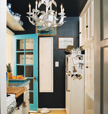
 A reader asked the name of the fabric that


 I'm so glad I posted about Fabrice Diomand recently because it led
  I've enjoyed not only checking out his portfolio online but also his