Good Money for Nothing!
A story in a recent magazine really left me puzzled. The last few months, I have become acutely aware of the lack of design magazines available. We’ve all watched as one by one, titles have fallen victim to our economy – I don’t need to list them all here again, but a trip to the book stores really opens your eyes to what is left. Not much. We’ve lamented their loss together and expressed shock as one after another has folded. The reality is now here. Thank God for House Beautiful and Southern Accents, Metropolitan Home and Veranda, Traditional Home and Elle Decor. And……? See what I mean? It’s slim pickings. Which puts the spotlight on those remaining. Magazines aren’t cheap, take a $10 bill to the counter and you might walk out with two – maybe. The current mags should be fabulous now – they have their pick of houses to publish. Scouts are telling me that they keep getting turned away with stories that normally would have been snapped up. There’s a glut of houses deserving of publication – yet they’ve been rejected. Which should mean that the ones that are published, are wonderful houses with interiors that could make a grown man weep from the beauty. But still, it’s not quite happening. Each issue arrives stuffed with mediocrity and junk. Some make you laugh, others draw a wince.
I don’t usually go “negative” here – but I am going to today. So forgive me this rant. I’ll be back to normal tomorrow – all chipper and happy. For now, I’m confused. Is it me? Am I the only one who feels this way? Do others see what I see?
The story that caused my head to shake shows a house in Los Angeles – the owner is the wife of a famous rock star. She also was the interior decorator, one of her many talents the magazine informed us of. Other prolific talents are photography and lyric writing for her husband’s songs. Her ambitions for their house were certainly lofty. The new construction abode was designed to look like an authentic Wallace Neff. The pool house was inspired by a photograph from David Hicks’ book – My Kind of Garden. The staircase was modeled after one found in Nancy Lancaster’s Mirador, Neff, Hicks, Lancaster – let’s drop some names. This is going to be stunning, no? Their master bedroom is quite lovely – that I will admit. And their kitchen is very nice too. When these pictures were first seen – bloggers went ga-ga over the house and I’ll admit at my first cursory glance I did too, even leaving comments saying “beautiful!” I finally had some extra time to leisurely pour over this house and all I can wonder is “Am I crazy, here? What am I missing?”
I try to never do this – never focus on the negative, and maybe I am wrong here. Maybe this is wonderful and I should get my hands slapped and go re-enroll in design school and hey, maybe even join ASID! With so little competition out there, shouldn’t we be seeing the best that interior design has to offer? Is this house all that? Was there nothing else to show us last March?
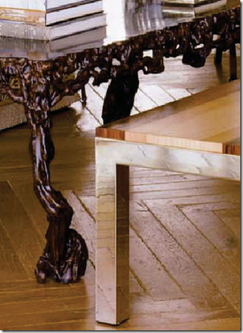
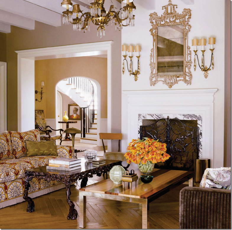
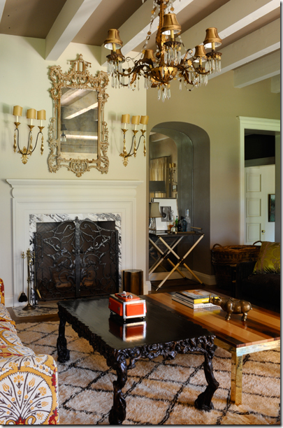
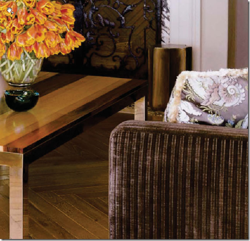
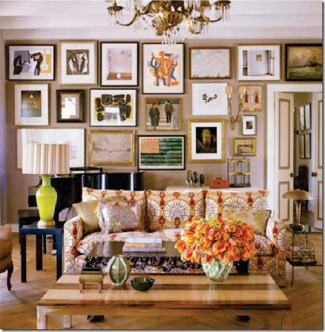
What drives me crazy about this room: two coffee tables. Why? Why? And if you DID want two coffee tables – shouldn’t they relate either in size or style? I understand eclectic – I get it. I just do not get THIS. If for some really good reason you needed two coffee tables side by side, shouldn’t at least ONE be attractive? Finding attractive coffee tables is hard, I know that, I live that. But to pick two of the ugliest coffee tables in the world, now that takes some work. Actually, let me correct that, the shorter table was designed by the home owner – who has launched her own furniture line. Yes, I did just say that. But, two coffee table - am I wrong? Am I missing something?
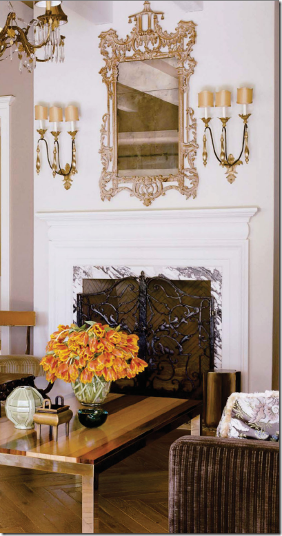
There’s more. The mantle is so high, I’m guessing it’s over 5 ft tall. The mantel is a vertical element. It’s tall, it’s narrow. The designer then adds a long, skinny, goopy, fancy mirror, further extending the vertical line. The mantel is crying out for something more horizontal – something wide to balance out the tall vertical element of the fireplace. What is especially amusing is that the designer proclaims: “I wanted everything to have a human scale.” Human scale? For whom – the Jolly Green Giant? A simple, round convex mirror would have been nice. A wide painting propped on the top would have been nice. A line of short porcelains would have been nice. My neck aches just looking up at that mirror.
And if the fancy Chippendale styled mirror and the two coffee tables weren’t enough – add to this a pair of oversized three armed French sconces. What a mixture. Again, the sconces are elongated – with a vertical appearance, where something horizontal is desperately needed here. The entire marble fireplace vignette truly baffles me almost as much as the two coffee tables do. When my house was photographed for a magazine – the stylists really edited it , they changed things around, they brought in props – did that not happen here? Does this stylist really leave houses exactly the way he found them?
Should I even address the upholstery? The exuberant Brunschwig & Fils print on the sofa is nice – I like it, actually. But look across at the other sofa, covered in a striped brown velvet, along with a floral accent pillow – I don’t see a connection here. And yes, I understand that kind of decorating, where nothing really matches – but things should at least blend, no? Again – am I missing something?
The other picture of the living room shows the two coffee tables again, the sofa, the unmatched lamps (to each other and anything else in the room.) Where to start? What I suppose is the focal point of the room – though two side by side coffee tables would be a focal point in any other room - a large picture gallery wall, filled with lots of expensive art, takes the room off in another direction. What direction – don’t ask me. I just paid for the magazine, I didn’t pick the house. There’s no area rug and I’m not sure what the purpose of the pillows is, certainly not to enhance. Oh – and be sure to notice the solo, two armed sconce in the middle of all the art work that somehow balances out the green lamp next to the sofa. I doubt that was intentional.
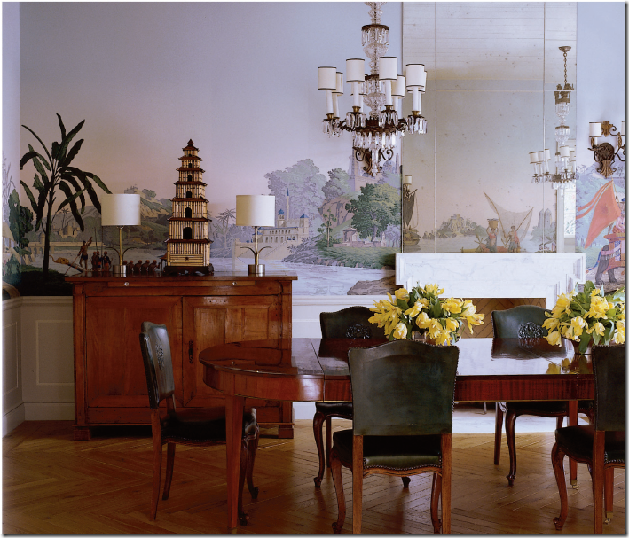
In the dining room, the table is surrounded by leather chairs from the designer’s own furniture line, that seem oddly short to me. No? The walls are wallpapered with a gorgeous Zuber pattern, yet the mirrored chimney piece creates an odd effect on the wallpaper’s scene. It stops the eye where it should freely move across the wall. The mirror almost has a magnifying effect on the wallpaper. Why put the built in mirror there? I don’t understand that – do you?
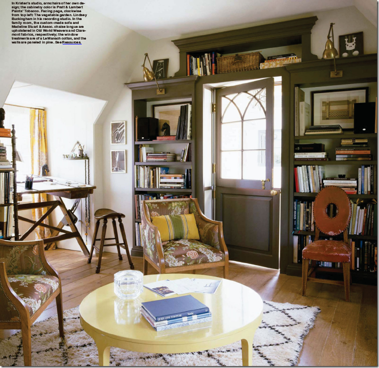
The designer’s own studio is nice enough – I adore the cabinetry with the Dutch door. And I love her drafting desk. Here, finally, is an area rug, yet could it be any smaller or any trendier? This room could be a knock-out, instead it looks like it was decorated with Salvation Army specials. Am I wrong here?
The den with its sofa, and odd one armed chaise, is fine, a typical mixture of things chosen to look edgy – while using classic fabrics. Again, I never quite understood, why in order to be “chic” or “hip” – one has to pick things that don’t seem to relate to each other. It’s like the curtains were found there, and the furniture moved in around them. It’s me, I know that. But I like pillows that mean something. Pillows with definite shape – full, robust, oversized. Jeffrey Bilhuber makes the most perfect pillows I think I have ever seen. Go here to see how pillows should look.
The kitchen is one of the prettier rooms in the house, though I don’t understand why the range is in the breakfast area, but hey, I don’t cook – maybe the range SHOULD be in the breakfast area.
The bedroom is a beautiful room – if only for its wonderful curtains, made of Bennison linen. How could anyone go wrong with Bennison? I’ll tell you – they put dark chocolate trim around it’s edges, that’s how. I give up.
I’ll admit it, I’m getting older. I’m past middle age now, and maybe that’s the reason I can’t join the chorus of bloggers who loved this house. How do you feel about it? Does the kitchen and bedroom make you forgive the living room? Do you yourself like two desperate coffee tables side by side? Are you one to put any materials together, without regard to color or pattern, and declare the room “designed?” Am I not hip enough, not eclectic enough, not chic or trendy enough? Am I crazy? This house in person is probably beautiful. And it’s a beloved family home, so who am I to criticize it? I certainly am no better designer, and not at all in this league. And I’m certainly not as beautiful. But, when I buy a magazine, I expect something wonderful, maybe even perfect. Something that makes me dream and go all green with envy too. I want to learn something - I want to see how the greats do it and maybe emulate them one day. Come on editors – give us your best shot. You’ve got a captive audience here. Hit us with something that will stun us, motivate us, inspire us.
I do know one thing, I feel ripped off. I don’t want to pay good money for nothing anymore.









 Artist Hunt Slonem donated a work