Laman

Say It Isn't So!

One of my readers just informed me that Charlotte Moss is closing The Townhouse and WWD confirms the story.
Almost a year and a half after opening her East 63rd Street flagship to much hype, interior designer Charlotte Moss is closing the shop at the end of next month. “This was a difficult decision based on personal considerations,” Moss said. “While the interest in the store was gratifying, the demands of running the boutique and at the same time maintaining my interior design practice, licensing product and other aspects of my business were crowding out all of the other facets of my life — time for myself, my family, and my philanthropic and community work.”

So sad that she has to close before Christmas. I was looking forward to heading over there to do some holiday shopping. I wonder what will become of the space...but what I really want to know is if there will be a closeout sale!
Read More

Running on Car Batteries and A Prayer!

image

Just  a quick note to tell everyone that we survived intact! We're fine!  I'm writing a longer post and will hopefully get it online in just a little bit. 


Thank you, everyone, for all your prayers and thoughts and well wishes.  Your prayers worked, that is for sure! I can't thank you enough.  


Joni

Read More

Fashion is Everywhere

"Fashion is not something that exists in dresses only. Fashion is in the sky, in the street, fashion has to do with ideas, the way we live, what is happening.” - Coco Chanel
This is one of my favorite quotes because I always think the same can be said of art and design. Learn more about this amazing designer and her rags to riches life story when Lifetime finally airs Coco Chanel staring Shirley McLaine this Saturday night. Or set your TiVo since you probably won't be home. Why they chose to air this on the biggest going out night of the week is beyond me but...c'est la vie!
Read More

Hunkering Down With Ike!

image


Greetings from Ikeland!   I've gotten so many great emails today with well wishes from you all,  that I thought I would do an update on "Life Spent Waiting For A Major Hurricane."   I hope to be able to answer all of your emails, but until then - here's the story of Cote de Texas under siege.  I must say that I have the sweetest readers in blogland.  I'm going to design an award and pass it out to each of you:  Bestest, Most Sweetest Readers!!!   Seriously, a person can get really spoiled from all the love.  Thank you, all of you, for your wonderful, caring, emails.  They are very much appreciated.


Evacuations  and Hurricane Ike:    There was a mandatory evacuation called for Galveston and outlying parts of Houston that border the Ship Channel.  We don't live in those areas and so, we aren't under a mandatory evacuation.  Because of that, Ben, Elisabeth and I decided to stay put in our house in Houston.    The last big hurricane that passed through Houston was Rita.   It came just days after Katrina so everyone here was terrified and just about the entire town  (except us, of course!) decided to evacuate Rita.  There was a traffic jam the likes of which have never been seen before.   The death toll of evacuees on the road was over 100.  The death toll from the storm was in the single digits.  Statistically, you were better off staying put and "hunkering down" than leaving.    This time around with Ike, there hasn't been that massive evacuation from Houston, and it seems like the majority of people have stayed, including my entire family.  


Preparing for Ike:   How did we prepare for the storm?  I have a hurricane fascinated husband, so we already had a lot hurricane preparedness items in the house.  Every time he sees a sale on batteries, he picks up more, so batteries and numerous flashlights we have.  We also have small, battery powered fans to help cool the house when the electricity goes out.  We have weather radios and battery powered flood lights for inside.  We even have a battery powered television - this purchase brought much personal happiness to Mr. Hurricane Man.  I took out all my old laptops, of which I have a few, and charged up the batteries so that I'll be able to use my computer for a while at least after the electricity goes out (hopefully it won't be off for days - or else I'm checking into a hotel with a generator).     We have lots of candles, unfortunately they are the scented, expensive kind, but that's alright - at least the house will smell good. 


image

The eye of Ike - kind of looks like the head of a baby duck here.


What To Eat During A Hurricane:    Yesterday Mr. Hurricane Man announced he wanted to go the grocery store and look around for more batteries and other hurricane gadgets and get the last minute food items we would need.   Stupidly, I agreed to let him go.  He came back home, all excited about the food he bought that's going to sustain us after the refrigerator is off:  sliced turkey, assorted cold cuts, and cheese!!!!!    He was so proud, poor thing.  When I asked him about canned  goods like tuna and salmon, he had a blank look on face and wanted to know why would we need that?   hmm.    Don't worry though, I went to Wendy's and bought a few days worth of Caesar salads.  Plus our stove is gas, so we'll be able to eat noodles and soup and macaroni and cheese, lots of nice, fattening foods.  I'll probably come out of this hurricane with a 10 pound weight gain.


 image

Galveston, around 12pm this afternoon.  The waves are crashing up over the seawall which is 13' tall.  Imagine what will happen when the eye hits and the surge is over 20 feet.


News Updates, Always Updates During the Long Wait:       The storm is now just reaching Galveston.  It's 3:30, Friday afternoon.  The island city is going to flood, there is no doubt about that.  The water is now over the 13' seawall.   Ike is a Category 2 and is expected to be Cat 3 when it lands.  The Galveston Mayor just announced that 40 percent (2o,ooo souls) of the people who live there did NOT evacuate and are still on the island.  The city is going to be completely underwater  and these people will be forced up into their attics by tonight.   Wow.  That 40% figure shocks me and everyone else too.  The police chief from Galveston just announced that the last emergency calls they will take today are at 9:00 p.m.   Then they will be "hunkering down" at the San Luis Resort Hotel and everyone is on their own then.  "Hunker Down" is code word in a hurricane for being scared to death inside your home while the storm rages outside.    The chief also said a house just burned to the ground on the West End because they couldn't reach it to put it out.  Things are getting bad in Galveston.    They have opened a Shelter Of Last Resort for people who get too scared to Hunker Down and change their mind at the last minute.      At this point, I'm really glad that Houston is 50 miles away from the Galveston and the Gulf of Mexico. 


Humor in the  Face of a Hurricane:   My best friend just  instant messaged me with this - her last will and testament: 

GOD FORBID - I WANT TO BE BURIED AS CLOSE TO MY MOM AND GRANDPARENTS AS POSSIBLE- I THINK STAN WOULD CHIP IN FOR IT AND WHEN IM GONE -  - ALSO- THANKS FOR ALWAYS BEING THERE FOR ME AND SO MUCH AND I LUV YOU AND ELISABETH AND BEN!!     SO LONG TO GEORGIE AND SAMMY (my dogs) AND RALPH AND BETTY RAE  AND CATHY (my parents and sister) =  GOD BLESS!!!!    OK ==  SO LONG--FAREWELL-- YOUR BEST FRIEND----LISA----

(I'm just relieved that apparently Stan and Marcia are being asked to pay for her funeral - not me!)


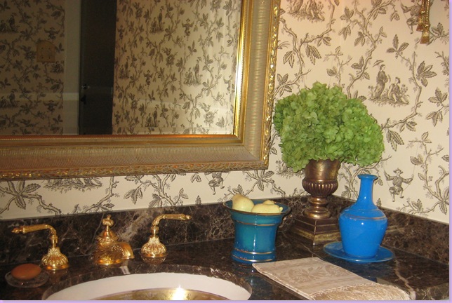
Major Worries and Fears In a Hurricane:      It's the windows everyone is worried about.  Tornados and high winds accompany hurricanes and with that comes broken windows.  My parents are in a high rise and they've been instructed to go to their bathroom in case their windows start breaking.   Us too.  The only room in our house without a window is the powder room.  We'll go there if our windows start popping.  At least there's new wallpaper in there.  Very pretty wallpaper, Colefax and Fowler  Chinese Toile in brown and cream:  so I'll be happy. 


011

My Powder Room with the Colefax and Fowler Chinese Toile Wallpaper - Refuge in the Storm.


Our biggest concern though, is that our huge oak tree will crash through the house as the tree  is "in stress"  and is weak.  That's our main worry.    Now, my personal main worry is coffee.  Starbucks closed last night for good until God knows when.   I  made a pot using premium coffee beans, but it's just not the same.  I even have a little apparatus that whips hot milk into foam.  Just not the same.  I've decided its the flavored coffee beans that are so terrible.   Why didn't I get just plain Folgers?      Pray for Starbucks, people. 


Hunkering Down and Other Boring Things:    At this moment in my house, we're all hunkered down.    Elisabeth is upstairs on the computer.  I'm still on the patio with my laptop.  It's not raining at all, just a little windy.  My neighbors are even BBQ-ing steaks on the grill outside.  Smells soooo good.    Mr. Hurricane Man is, of course, laying on the couch, monitoring the news, with a migraine.  He got one this morning - his eyes weren't focusing and he lost his peripheral vision - so he knew the  migraine was coming and managed to take his medicine correctly - before the migraine becomes painful, and it seems to have helped him a bit.  I'm hungry from smelling the steaks and can't decide if I should eat the famous turkey and cheese or just make a peanut butter sandwich.   I'm saving the salad for tonight.  SO exciting!     The storm will hit at 9:00 tonight.   Mr. Hurricane Man  just announced he thinks it's not going to be that bad.   He's "watching it" on the news  - "keeping an eye on it" -  and thinks he can see something in the radar pictures that the professional weathermen do not see.  He thinks that the storm is breaking up.    Help me, please.    It's going to be a very, long weekend.


image

The eye of the storm is still hours away and look how flooded it already is near the Cote de Texas, or in  English, the Texas Coast. 

Read More

Corazón de melón, melón , melón........

Entonando esa canciocilla me he quedado después de dejarlos colgaditos.

Ha sido una forma de aprovechar esos restos de telillas de patch que van quedando.
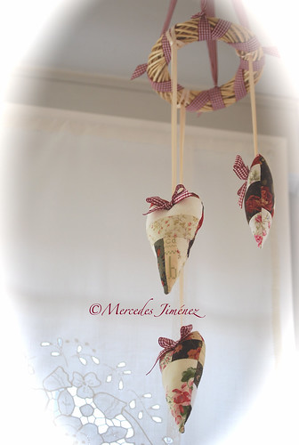
Uní los trozos y luego recorté el corazón a partir de una plantilla que saqué a ojo . Coloqué las cintas de raso a una medida adecuada para ser luego colgados . Ningún lado es igual. Un lacito sujeto con un alfiler de cabeza blanca fue el toque presumido.

Móvil de corazones

Me encantan estas cintas de cuadritos y me parecieron ideales para el estilo de éste móvil. Asi que las entrelacé por la anilla de mimbre ( comprada en Bricor , apartado de manualidades ) y luego añadí otro toquecito con un par de lacitos en raso sobre uno de sus brazos y de nuevo sujetos con un alfiler largo de cabeza de cristal blanca.


¿ No son una monada ? Ya véis que no paro últimamente de darle vueltas a la cabeza haciendo cosas.

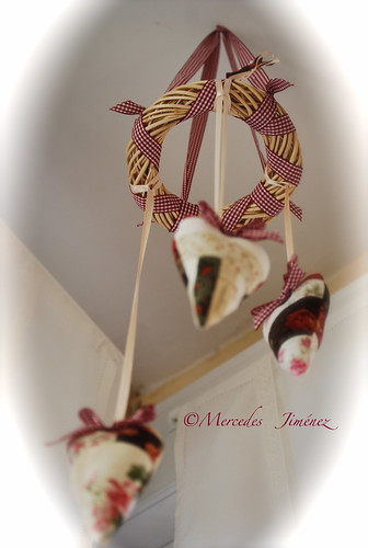
Así se ven desde abajo.

Móvil corazones desde abajo


¿ Te animas a darle salida a esos pequeños restos de tela que nos van quedando ? Ya ves que es la mar de sencillo y queda muy vistoso.
Read More

C'est Magnifique!

Last night, I had the privilege of attending a little soiree at the showroom of Belgium born fashion designer Jonathan Riss who's label is named Jay Ahr, after the phonetic pronunciation of his initials. Most of the guests were speaking en français since Mr. Riss also works and has a showroom in Paris. The most amazing part of the space is that he had the plasterers who work on the restoration of Versailles come and do his plaster! How does one even go about doing something like that?!

I was able to chat with the designer and learned that he loves the period of Louis XV mixed with modern elements like the custom designed side chairs and massive marble dining table in another room that he designed. He also mentioned that he is planning a book that will chronicle the evolution of his showroom. I will keep you posted as to when it is published. Oh, and did I mention he also creates beautiful dresses and jewelry and was serving Dom Pérignon?! Très chic! I know I will definitely be keeping my eye on this inspiring designer and you should too!
Read More

Chic New Fabrics

Celerie Kemble's new line of fabrics are up on the Schumacher website and look amazing! I especially love the Hot House Flowers pattern in Spark as seen on the pillow above. According to the website, "Celerie’s look is based on beautifully refined traditional design with a reinterpreted and updated approach that speaks to a new generation. It combines classic looks with very modern details and geometric patterning, using unexpected metallic finishes, exotic touches such as ikats and embroidery, as well as glamorous moiré, silk and velvet all in a rich and sophisticated color palette of saturated hues and subtle neutrals." Sounds and looks good to me! I may have to make a run to the D&D this week to check them out in person!
Read More

Attic Transformation!

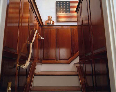
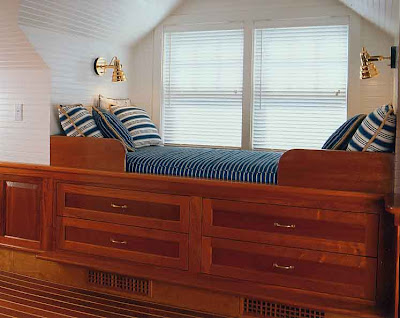
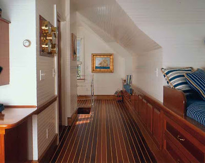
What to do with that unused attic space? Here is a space that Lyman Perry Architects have transformed into an owners retreat. In the third floor attic space, they have created a den that resembles a yacht's cabin. Above is the staircase entering to the new retreat- it gives you at hint at what might be above. I love the rope handrail and varnished nautical woodwork.Built into one dormer is a day bed with chart storage space below. What a great use of under bed storage space. Notice the teak floors resembling a boat hull.

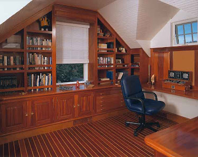
An instrumentation panel hangs near the helmsman's desk, whose bookshelves utilize the nautical details preventing falling books as the boat tosses at sea. The final touch of a light hatch in the ceiling completes the scene, creating the experience of spying views of the port from the sea.
All photos Lyman Perry Architects

A wonderfully creative use of an attic! And, all the small details really add the the authentic feel. Lyman Perry Architects - Artists at work!
Read More

When It Rains.....It Pours!


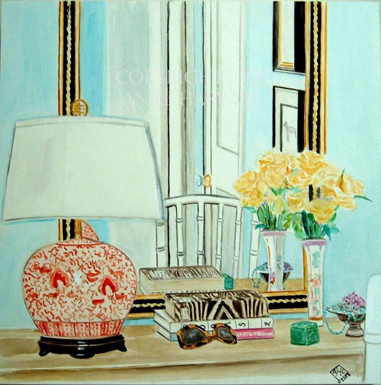
LILIBET IN LILAC SILHOUETTE COLLAGE

Annechovie's Queen Elisabeth Series


Sweet Anne Harwell, artist extraordinaire and blogger of  Annechovie was kind enough recently to showcase moi,  here.  I'm not sure what I've done to garner such niceness, but - hey, I could use a little "nice" in my life.  Anne and I go way back in blogger world, I started in May 2007 and she in July the same year.  We connected early on and have remained in touch through many emails and a few phone calls.  Early on in our friendship, Anne painted an area of my living room and more recently, my two dogs.  She's always been there for me when I needed her and hopefully she feels the same of me!   I was thrilled when she sent me a list of interview questions and said she wanted to include me in her Artist's Portrait Series.  I guess being an interior decorator can be like being an artist, but I'm not sure I would go so far as to call myself that!! 


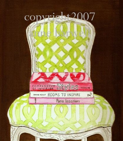
COURTNEY BARNES CHAIR GICLEE ON CANVAS - 11x14

Anne's famous Courtney Barnes chair

If you have a moment, click here to read the interview with me  and be sure to take a look around her Etsy store.  She does fabulous paintings of house decor and - my favorites are her chair series.    You can probably even buy portraits of my dogs if you want! 


SPRINGER SPANIEL PRINT

Anne's adorable painting of my springer,  Georgie!

<

COURTNEY'S FAVORITE THINGS GICLEE ON CANVAS 12X12

Courtney's Favorite Things by Annechovie


Anne, thank you again so much - this means the world to me.  Here's looking to many more happy years of blogging!


Joni  aka Cote de Texas

Read More

What A Dump!


my office 023

Webb Design Headquarters - What A Dump!

What a delight (not!)  to open up someone else's blog and discover your own messy, unorganized office plastered for all the world to see.   Today, I had that lovely experience!   Now, imagine that this is the office that you hide, not only from your family who live in the same house, but also from the clients for whom the office is intended.  So, it's not exactly a pleasure to share it with total strangers.   My office started it's life as a guest bedroom, but it proved too small for anything larger than a twin bed.  For several years my husband officed out of this space - his desks consisted of wall to wall banquet tables bought from Office Depot.  Once he came to his senses and realized he needed a true office with its own address - not our home address - he moved out and left me with this miniscule room to use for Webb Design's headquarters.    I promptly tossed out all the banquet tables and folding chairs.  For a desk I went to Pier I and bought a 6' dining table with an X base, stained dark brown.  The table has proved to be a wonderful desk:  with its  large surface, I can spread out floor plans and fabric samples and still have room to work.    Perhaps the best advantage to buying a dining room table instead of a desk is price.  For some unknown reason, put the label of "desk" on a product and the price goes up. 


  my office 011

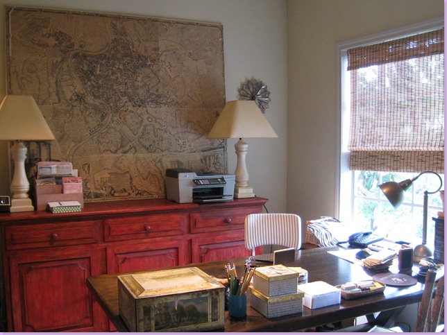
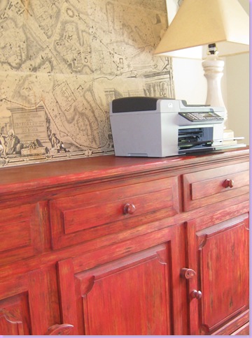
The red console, which should be painted black!


Next to go in the office remodeling was the wall to wall carpeting which we had installed over the hardwoods to muffle my husband's office noises.  I then polished up the once hidden floorboards  and put down a large seagrass (naturally) rug.  For a console, I chose a red wood piece.  Today, about 8 years later, I would pick out something different, and definitely not something  in red.  But this was a choice made when the color red figured heavily into my decorative scheme.  It no longer does.  I know, I know, I can hear you!   Paint it black!  Isn't that what I tell all my clients to do with wood stain they no longer like?   I probably will, someday.


my office 005

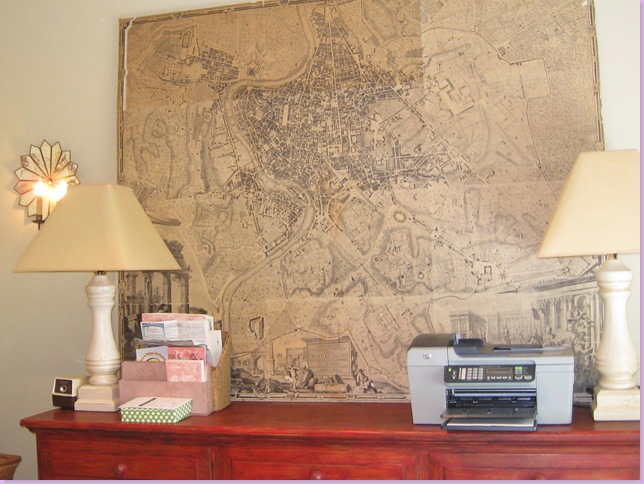
The antique map of Rome.

The bamboo window shades came from Target, and the antique wine rack that holds files came from Chateau Domingue.   The sconces were once in my dining room, bought at the wonderful shop, Schors, during a summer vacation on South Padre Island - the best beach in Texas.    The focal point of the room, is, of course, the map.  A copy of an antique map of Rome, it is my favorite thing in my office.  The map is oversized and is pasted onto  a heavy, wooden board.  It weighs about a ton and I had to hire movers just to bring it upstairs to my office, it was that heavy.   I bought it - used, of course, from Antiques and Interiors on Dunlavy, and the map, made of paper,  is far from pristine, which only adds to its charm.


my office 017

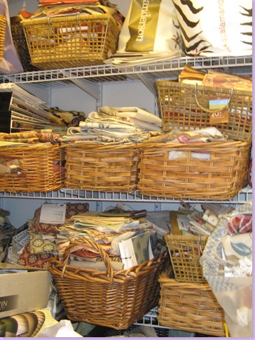
My sample closet:  wire shelves hold wicker baskets which hold fabrics and more fabrics.

My sample closet started out very organized, with  baskets for all the fabric cuttings.  But over the years, I've slowly outgrown the space and seriously need more storage room.  The overflow is now taking over my garage and my sweet mother-in-law came last weekend to help me reorganize it so that hopefully, we can get a car or two parked back inside.   She's promised to come back this weekend to finish the job, but I'm afraid it will take more than just one day;  creating storage room where there is none is an almost impossible task.  Until I can get more storage space and thus organize, my office is off-limits to everyone but me.  That was, of course, until now and Ms.Whitney English and her blog. 


my office 014

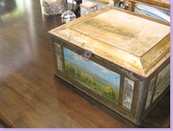
Using a dining table for a desk means no drawers.  I get around the problem by stashing the staplers and tape and scissors, etc. in this large, antique biscuit tin from England.

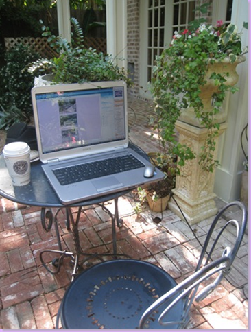
A few weeks ago Whitney English Kolb, of Whitney English, wrote me to ask if she could highlight my office on her company's blog.   gulp.  Why, I wanted to know, horrified at the prospect of showcasing my awfully messy office?    I explained to Whitney that my true office is really my laptop on a table, set up in my courtyard, where I tend to spend the majority of my time.  Undeterred, Whitney was very persuasive explaining that her company was highlighting bloggers and their workspaces as a tie in to her business.  Before I knew it, the article was written and there it was - my desk in all it's glory for the world to see.   Oh well, there is such a thing as truth in advertising. 


image

My "real" office - outside, Starbucks and all.

The more interesting part of the story though, of course, wasn't my office,  it was Whitney herself.  A young, beautiful blond from Tulsa and Dallas, she owns Whitney English, a paper goods and stationery company she started in 2002.   The inventory is classic, sophisticated with just a touch of trend to make it exciting.   This March,  Whitney was honored by Country Living Magazine, when she was named one of their Top Women Entrepreneurs of 2008.  A few years ago, Whitney expanded her company by purchasing Hicks Paper Goods, a leader in the stationery world.  Young and full of energy, Whitney has a very bright and exciting future ahead of her.    My favorite factoid about Whitney?  Hailing from Tulsa, she is a relative of that city's uber talented interior designer, Charles Faudree, who was named to Cote de Texas' Top Ten Interior Designers list.   While in college studying interior design, Whitney spent a summer interning for Faudree, which she writes about in detail here.   I can imagine she learned more in that summer than in four years of school!   Be sure to visit her web site and read her blogging series on Bloggers and their Offices, including moi among others.

Lastly, many thanks Whitney for including Cote de Texas in your Inspiration Series.    I am very grateful, and excited to be included, despite my utter humiliation!!!!    You are so sweet and I appreciate all your efforts so very, very much!


image

image

Examples of stationery from Whitney English.


about whitney english

The beautiful entrepreneur, Whitney English Kolb.

Read More

Belgian Inspiration

Someone recently suggested that I should visit Antwerp so I've been considering it just so I can figure out for myself why a little country has such a large influence on the world of design. I'm also attending a fashion week party for a Belgian fashion designer tomorrow night. Maybe that will give me a little insight. I was also recently looking at a home designed by Kay Douglass in the south that was influenced by Belgian design and Axel Vervoordt that was published in the October 2007 issue of House Beautiful. There is something about this look that seems perfect for fall. I can just picture sitting in one of these rooms on a chilly day in front of a roaring fire.

The sunroom with its brown slip covered chaises and windows dressed in Belgian linen is one of my favorite looks in this home. I love how the bright yellow metal antique table, art and pillows provide pop of color.

Wood and linen seem to be hallmarks of Belgian design and in the family room that is accomplished with a media console hidden behind huge doors, a natural wood coffee table and linen upholstery.

Belgian style also always seems to be clean and spare but yet incorporate interesting antiques such as here in the entry.

"In the dining room, the unexpected textures of the raw wood ceiling and timeworn Belgian dining table add a lived-in European romance. Mirrors are custom-made to seem "crusty and old," says Douglass, and curtains are crisp oyster-colored silk from J. Robert Scott."

The dining table looks like still life out of a Jan van Eyck painting!

The chairs in the kitchen are Chinese but somehow seem to work with the design perfectly.

"The steely severity of industrial materials played against warm wood tones is something Douglass often sees in Belgian interiors. That aesthetic inspired her placement of Circa Lighting's industrial pendant lamps over the kitchen island and her use of metal tiles from the Walker Zanger Metallismo Collection for the backsplashes."

"In the master bedroom, an antique door is the headboard, a trick Douglass often uses to add interest while taking up less space in the room. Ivy-patterned pillowcases are custom-made from Galbraith & Paul fabric. The pair of Earl chairs are from South of Market. Walls are Seapearl by Benjamin Moore." I don't know that I would have ever thought of putting chairs like that at the end of a bed but they also work perfectly. I really love the pops of orange too.

The orange color flows into the master bathroom and plays well off the pale walls and dark floors.

At the stairway landing, outdoor-style half shutters dress the windows, as in a European house and definitely give it a Belgian feel. Now if I could just understand Ann Demeulemeester's designs, I'd be well on my way to figuring out Antwerp and Belgium's design influence!
Read More

Don't Fence Me In


ft worth 020

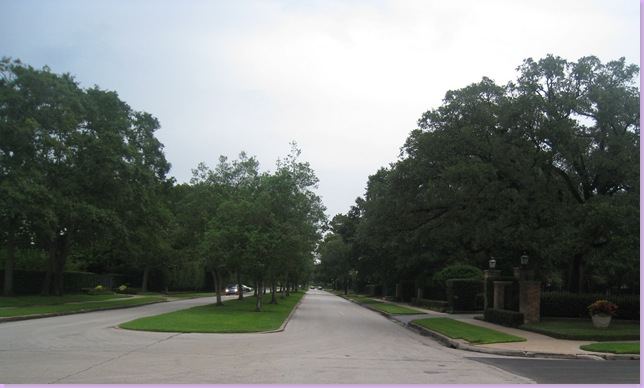
In Houston, Sunday driving is best done in our nicest neighborhood, River Oaks.  Home to most  of Houston's who's who, it was founded in the 1920s by philanthropist Ima Hogg (yes!) and her two brothers who hired the architect John Staub to build its original speculative homes.  The wealthiest of Houston  still live in the neighborhood and there is really no better place to cruise around and look at gorgeous houses and lush landscaping.  The center of the neighborhood is the grand parkway, River Oaks Boulevard  with a high school at the beginning of the street and the private, exclusive country club located at the end.  At Christmas time, the streets are filled with cars from all over the city who come to ooh and ah at the spectacular light shows many of the residents put on.  I should know, I've been driving through River Oaks looking at Christmas lights since I was just a babe.   My family would load up the station wagon with blankets and pillows and we'd slowly make our way through it's winding streets, admiring the huge estates almost as much as the glorious twinkling lights, and giant candy canes. 
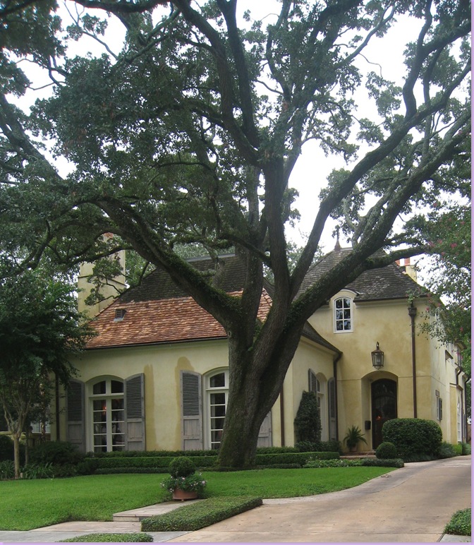
ft worth 018

They say not much changes in life, and many years later, I still like to drive through River Oaks, looking at the palatial homes, though mainly I do it now for inspiration from  both the old and new construction.  And, as always, its the French inspired architecture that attracts me, like this beautiful house, in the midst of getting a new roof.   The stucco with its walls damp from a light rain, is a soothing shade of creamy yellow, it's wood shutters a weathered, natural gray.
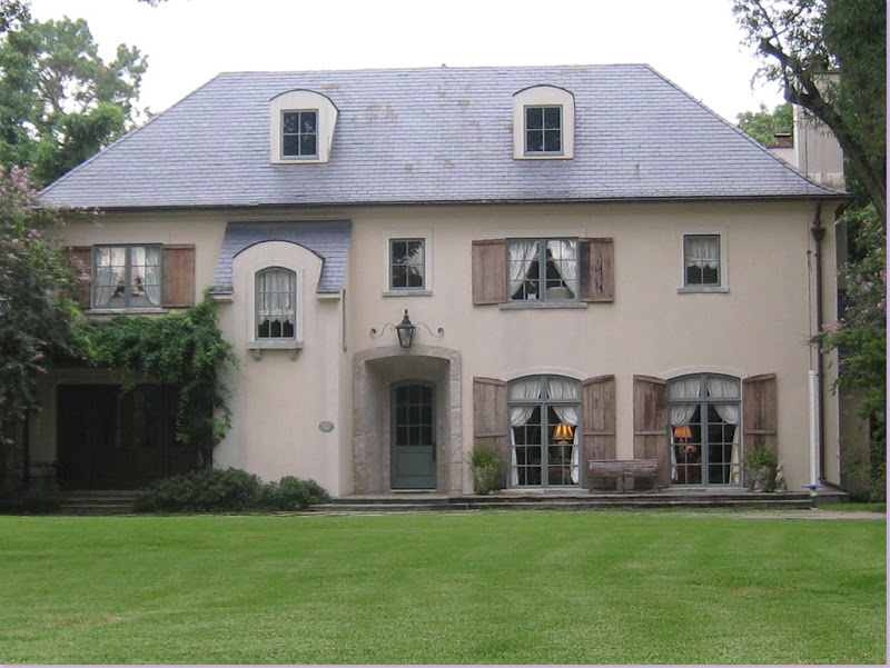
ft worth 059

And then there is this French stucco home, with its rustic, wooden shutters and slate roof.  I especially like the alcove with a bank of french doors on the very left of the house.   It could use some landscaping, even though it's more authentically French to have none.
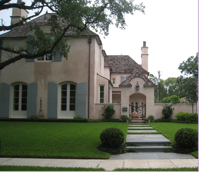
ft worth 013

This light pink stucco with its pale, blue shutters has long been a favorite.  I love the portico at the entrance - it looks like a little gate house - just charming.  
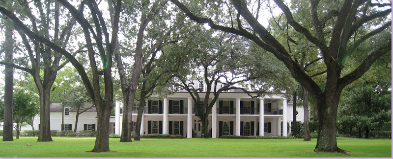
ft worth 022

This southern colonial is an original.  It's been here longer than most houses in the neighborhood.  Right on River Oaks Blvd., next to the country club, you can't get a better address than this.  I could tell you this was a plantation in Louisiana and you would probably believe me, so authentic looking is it.   Yes, driving through River Oaks looking at houses is always exciting.  Just driving along, admiring the view, all the while hoping the unmarked security cars that sit parked outside houses like this don't radio the police to come arrest you as a potential house burglar.   Yet, it's all worth the risk to get a glimpse of  the beautiful houses.....
ft worth 023

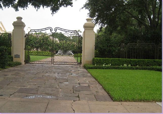
Beautiful houses like this.  Oops!   Can't quite see this one.  But the locked gates are really beautiful.  Stucco with finials,  The gates are French looking too.  Judging by them, I would say the house is creamy stucco, French inspired.  New construction.  I'll never know for sure though. 

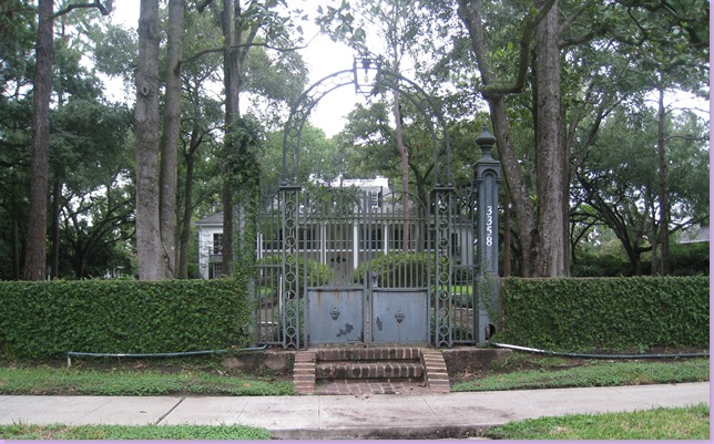
What is interesting about this gate and the others like it in the neighborhood, is just how many houses are now hidden behind these gates.  While people tend to think of a gated community as one where there is a set of gates that keep non residents out of the neighborhood, slowly yet surely, River Oaks has become a gated community of sorts without anyone realizing it.  Instead of the  one set of gates leading into the neighborhood, house after house is located behind their own iron gates now.  Until my latest drive through, I hadn't realized how many houses were gated in what was once a more accessible neighborhood.   In America, we tend to think of gated communities  as being far away, out in the suburbs, a place where people take flight against a rising crime rate.  But here, in River Oaks, in the heart of the city, in the shadow of our downtown, this community has chosen to hide themselves behind formidable walls,  and thus, have changed the look and atmosphere of one of our treasures.  Not that I blame the owners for putting up gates, I don't at all.  But still, it's sad to see that this is what it has come to.    Not everyone in the neighborhood lives behind gates.   The smaller houses that surround the heart of the neighborhood are left gateless, and thus, vulnerable to crime.  It's the estates on the larger acreage  that are now increasingly gated.   Driving through River Oaks just admiring the houses, is not quite as easy as it once was and I suspect it will be get harder as the years go on.
ft worth 024

Here's a beautiful southern colonial, hiding behind a rather unattractive gate.  The house is barely visible now, but I would think the low hedge would be easily scaled by a ne'er do well.
ft worth 027

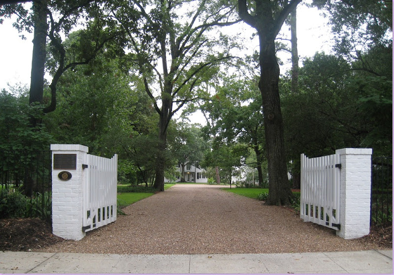
Wait!!!!  These  gates are actually open!!!  This house must be really special, there are several historical markers on the gateposts.    Very southern, and very romantic looking, these gates mimic the design of the house.   I love the long, gravel driveway.   OK, now I'm reduced to commenting on driveways.
ft worth 029

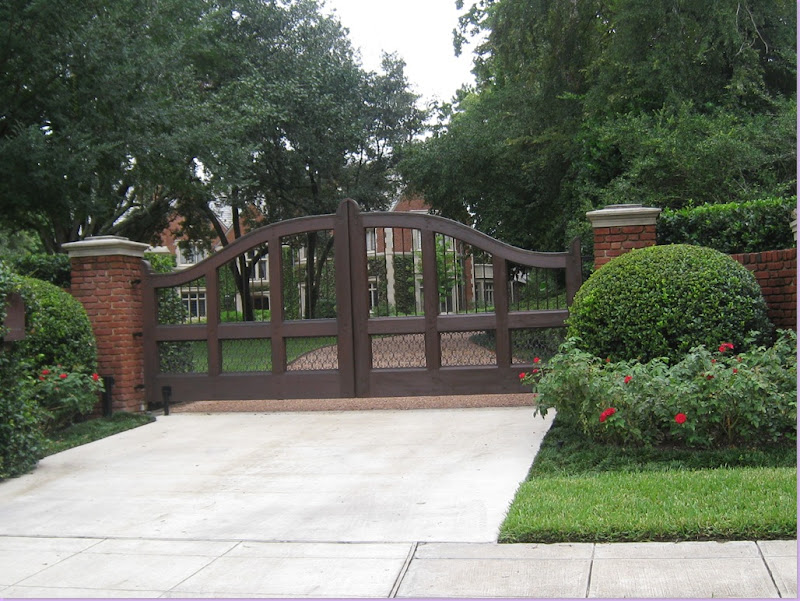
This English styled new construction has a very attractive wood and iron gate.   The best thing about it is you can  sort of see the house!
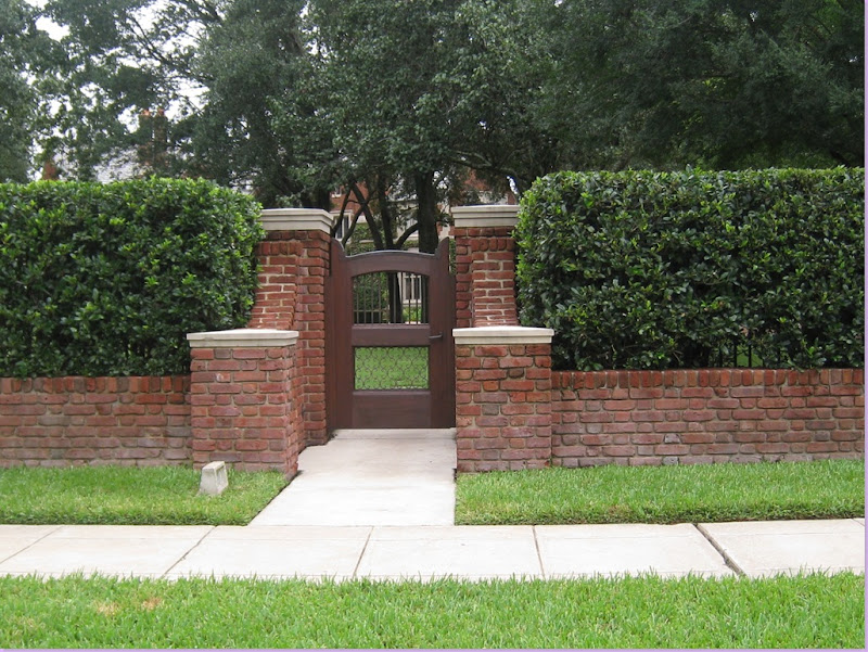
ft worth 030

It even has a little door for deliveries that matches the bigger gate.  Isn't this cute?
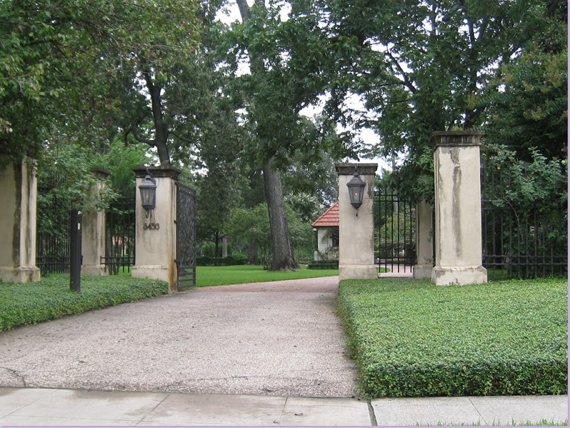
ft worth 031

Hi!!!!!  You open for visitors?  I'm here!!!!  
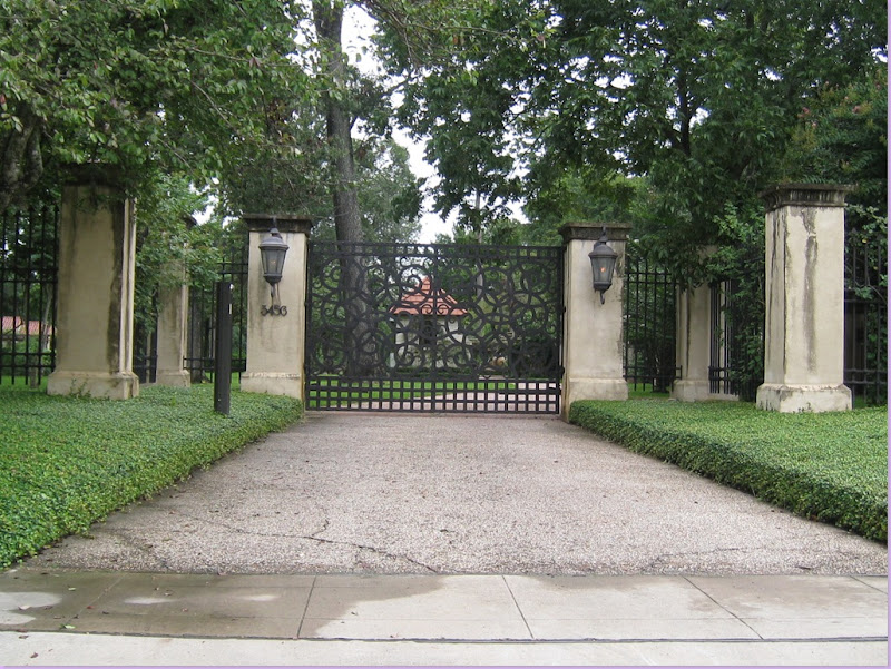
ft worth 032

Oops.  I guess not.    The gates quickly closed as soon as they saw my camera.  This house is a quite a complex.  I've actually been inside it, not as a guest, but as a paying person on a house tour benefiting some charity or another.  The house backs up to the golf course and the lot is immense.  There are several different buildings on the estate, a main house, a carriage house, and a pool house with his and her dressing rooms, among others.  It's a Mediterranean design and it's very unique and quite fabulous.  The gate's unusual design reflects the owner's artistic sensibilities.   This is the gate on the east end of the property.  See the little manned guard house with the red roof just inside?
ft worth 034

In the middle of the property is the front gate for visitors without cars.  Not sure in Houston how many people would actually come visit without a car, but if they do, they have their own gate. 
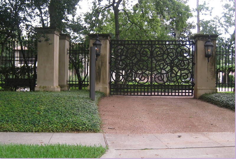
ft worth 036

And on the west end, a matching drive in gate.   The property has never been published, but the owner's Aspen vacation house was recently shown in Veranda. 
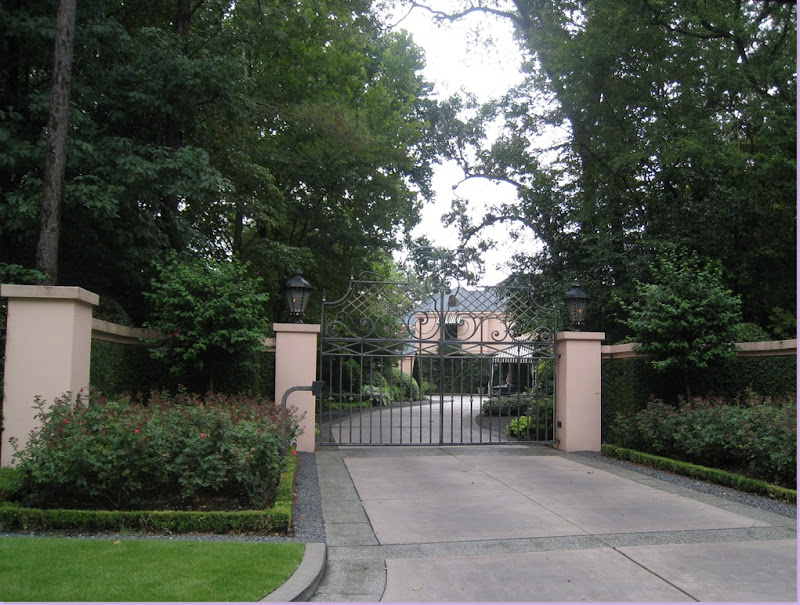
ft worth 038

This is a beautiful gate, with elaborate yet tasteful scroll work.  You can just glimpse the matching pink stucco home inside with black and white awnings.  
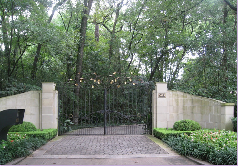
ft worth 041

Here is an unusual contemporary styled gate:  an art nouveau inspired design, with gold leaves, and a wall  made of limestone blocks.  The large speaker on the left kills the beauty though.  Most gated houses tend to hide the security speaker under a cover of ivy. 
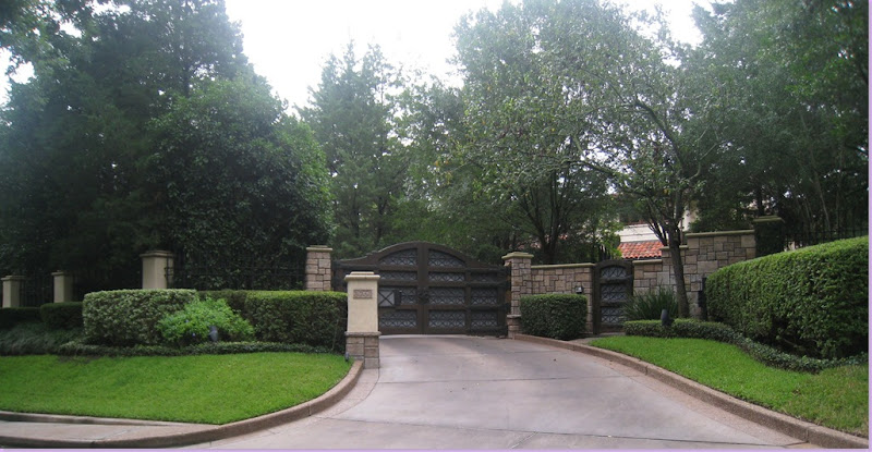
ft worth 042

Another unusual wood and iron gate with limestone fence.  Impossible again, to even glimpse anything of the house except it's red tiled roof.

ft worth 043

This gate allows an expansive view of a newly constructed Georgian styled home.  The wooden gates, though, don't do justice to the elegant stucco white house. 
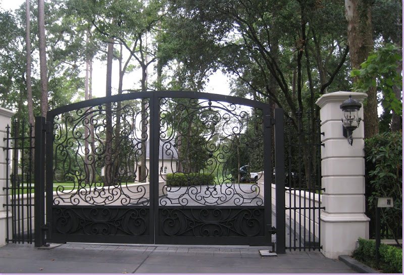
ft worth 044

Limestone and scrolled ironwork - a sure bet this house is a newly constructed, French design.  You can glimpse the garage at least.
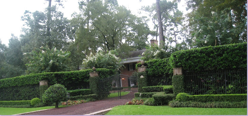
ft worth 049

This is a more unusual gated estate in River Oaks:  an original home.  The rather plain gates seem to say they have been here for quite a long time.  The house, a red bricked colonial styled home is not nearly as flashy as it's newer neighbors.
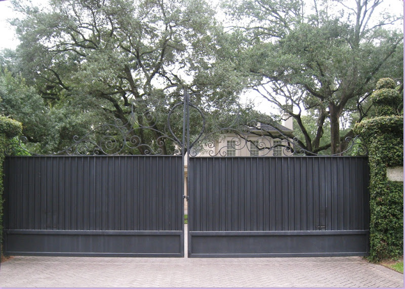
ft worth 050

OK!  We can take a hint!    These people really want their privacy.    I would suspect the gate was added on after the house was built as the approach to the house is so wide open - hence, the rather austere design of the gates.  Unattractive and overbearing, these gates are certainly not inviting.
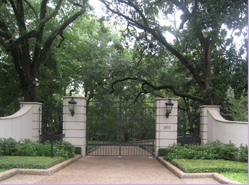
ft worth 055

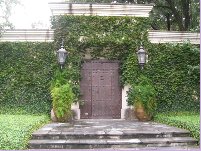
Now this is a pretty gate - stucco limestone, with a rather plain, but elegant design.  I like the large gas lanterns and the way the fence is gently curving.  The landscaping is nice, too.   Who am I kidding?  The landscaping is gorgeous.  Behind these gates I would guess is an elegant, stucco home built to the highest of standards.
ft worth 054 

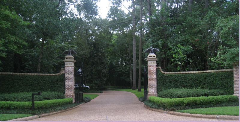
Open for visitors, except the two rather scary birds of prey on top of the gate posts which are not exactly inviting.  The brick fence is handsomely covered with creeping ivy, the drive way is long and curving.   Again, a beautiful, brick house most likely lies at the end of the curving drive.
ft worth 047

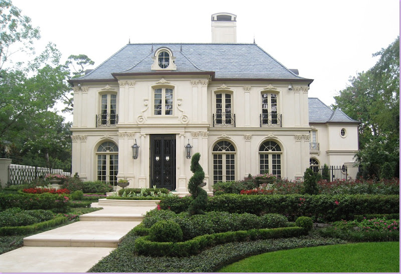
And lastly, this house takes a different approach to the gated issue.  Their front door itself is gated, as are the driveways on the left and right of the house.   At least you can see the house and enjoy its beauty.  For the other houses hidden behind gates, they are for the enjoyment of the owners alone.    I wonder if one day soon these owners will add a gated fence around the home, as well. 


All in all, it wasn't a great drive-by day for pictures in River Oaks, though it was an eye opener to what is going on in the neighborhood.   On the streets I drove down, the majority of houses were hidden.  I'll have to go back on another day to  admire the houses on the smaller lots where there aren't a lot of gates.   If you are interested in reading more about this historical neighborhood, there are several excellent books available at Amazon:  here and here.  Both are about John Staub the famous architect who developed River Oaks and built many of its most beautiful homes.   

Read More
DISCLAIMER
If you are the copyright owner of any of these articles or image and don't want me to share them, please, write comments on pages and I will gladly remove them.