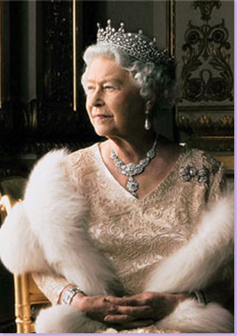
Detail of Annie Leibovitz photograph
A few nights ago Barbara Walters hosted a special on the Queen of England using footage from a BBC documentary based on a year in the life of the Queen and her family. As it turned out, the most fascinating segment of the two hour special was a photo session with famed American photographer Annie Leibovitz and the Queen Elizabeth. Leibovitz was hired by the Queen to take her official portrait to commemorate the royal visit to Jamestown in celebration of its 400th birthday. The documentary captured a few tense moments when Annie asked the incredulous Queen to remove her tiara because "the garter robe is so.....," Annie paused, and the Queen snapped back "Less dressy? What do you think this?" while angrily pointing to her over-the-top garter robe. This exchanged caused a major controversy in England when the BBC's aired the special. In the BBC version, the camera cuts to the Queen storming out after the exchange with Leibovitz. It then shows the Queen testily saying to her Lady-in-Waiting: "I'm not changing anything. I've had enough dressing like this thank you very much." Someone at the BBC was actually fired for showing this scene out of context. Barbara Walters got the context correct. The scene with the Queen stomping out and refusing to "change anything" was actually filmed as she was walking INTO the photo session with Leibovitz not OUT of it. British Fleet Street had a field day with the BBC's deception and Barbara Walters wasn't about to repeat the error.
Regardless of all the uproar over the photo session, the actual footage of it was amusing and it showed the Queen acting "human" in front of the cameras for the first time in memory. What is not surprising is that Leibovitz' resulting photographs are stellar. Leave it to Leibovitz, more used to photographing rock stars and actors, to capture the Queen as she has never been captured before. The photographs are moody, regal, dark, atmospheric, and mesmerizing. Rarely has the Queen been successfully shown both artistically and beautifully. Most artistic portraits of Elizabeth to date have been downright hideous. Leibovitz released four pictures from the photo session. Each is fascinating.
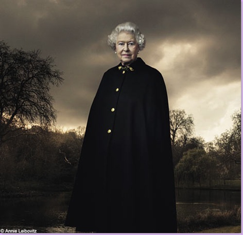
Critics of this Leibovitz photograph say the Queen looks like a vampire. Instead, I find it hauntingly beautiful.
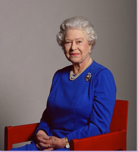
Contrast the above Leibovitz picture with this official one taken by the Queen's brother-in-law, Lord Snowdon. Nice, but utterly boring.
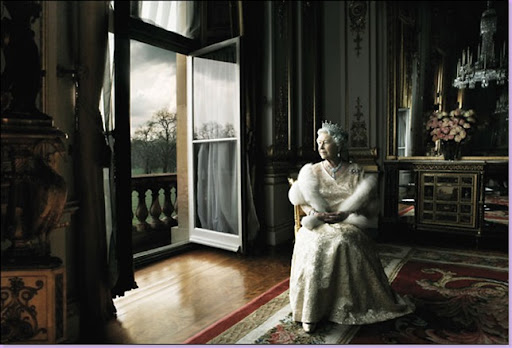
Another photo from the Leibovitz sitting. This one was inspired by the portrait of Queen Charlotte that hangs in the National Gallery in London (below). The room is regal enough, but the windows look like they were stolen from a government building.
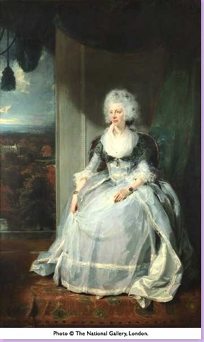
Queen Charlotte, Leibovitz' inspiration for the photograph shown above.
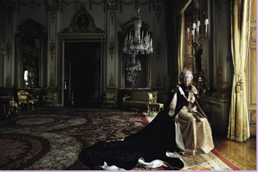
The third Leibovitz photograph: The Queen in her garter robe, taken
right after she was asked to remove her crown. I love the composition here with the Queen to the right while the room takes up most of the space.
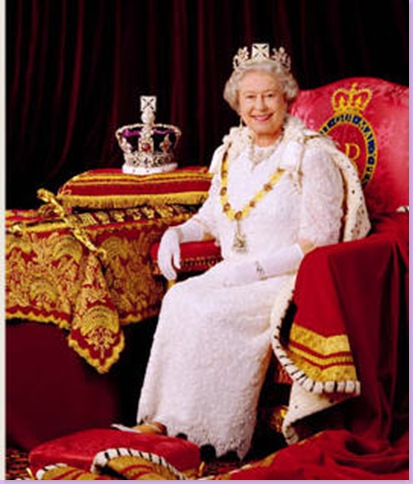
Contrast the above Leibovitz photograph with this one of the Queen in her royal robes taken by Calder. Leibovitz' pictures look like paintings rather than photos. Here, the Queen looks like she was just told a funny joke.
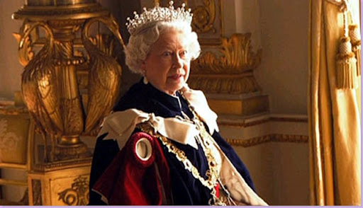
This is a still taken from the documentary at the exact moment Leibovitz asked the Queen to remove her tiara. " Say what????? " She doesn't look too pleased with Leibovitz here! The Queen's main concern was how her hair would look if the tiara was removed.
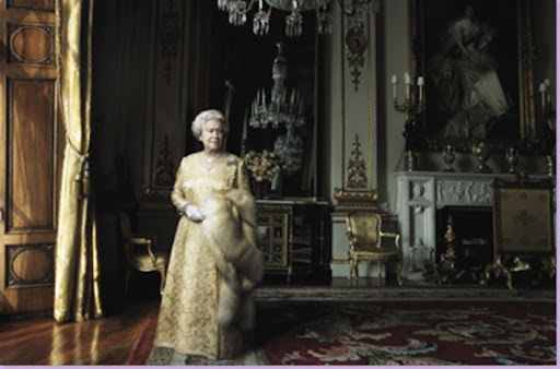
The final photograph released from the photo shoot. Again, this picture seems more a painting than a photograph. Art critics raved about the photos, while the public was mostly appalled by them.
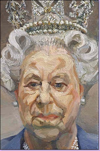
The Queen painted by Lucian Freud, one of the world's most famous and accomplished artist. The public severely criticized this portrait, but the art critics loved it. The Queen was said to be not amused. Knowing what a Freud looks like, she should not have been surprised. Note: She's wearing her tiara here!
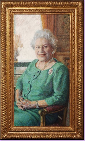
This commissioned portrait painted by Rolf Harris, was more accepted than Freud's and Leibovitz' images of the Queen. I think it's just terrible and doesn't even look like her.
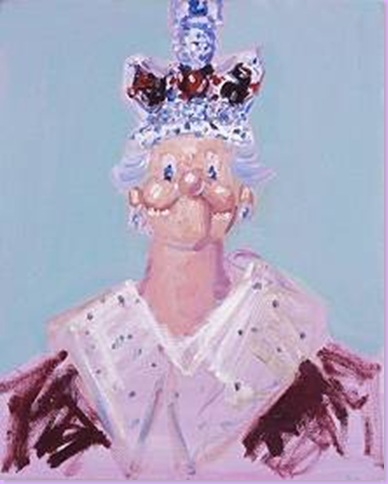
The Queen as a cabbage patch doll by George Condo. Believe it or not, this actually hung in the Tate Museum of Modern Art.
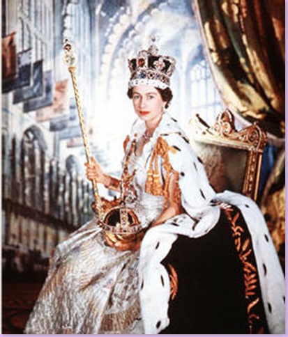
The Queen,at her coronation photographed by the great Cecil Beaton. The contrast between Beaton's style and Leibovitz' style could not be greater.
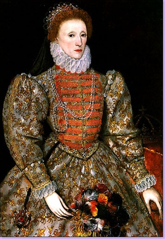
Royal portraiture from another age: The first Queen Elizabeth painted by Damley.
Which is your favorite image of Queen Elizabeth - and don't say The Cabbage Patch Doll!
 I've managed to contract the plague that is going around New York right now so I'm too busy chugging cough syrup and watching the BBC version of Pride and Prejudice to write anything coherent. Until I recover, I'm leaving you with some lovely photos of stylist Lili Diallo's Brooklyn loft. I think this is a prime example of the type of features that Domino does best. A very personal home that is filled with treasures from around the world and is full of personality. Unlike me a the moment. Enjoy!


.jpg)
.jpg)

 A montage of David and Ione's New York apartment and LA home above.


.jpg)
.jpg)
.jpg) I think you couldn't help but be inspired if you sat at a red desk like the one in Ione's office! The photograph above is by John Swope.
I think you couldn't help but be inspired if you sat at a red desk like the one in Ione's office! The photograph above is by John Swope..jpg)

 In the bedroom that is hers alone now, Ione traded out the jute rug for fun stripes and added a patterned coverlet. You can see her hippie making the house her own again.


 “I wanted the space to feel like the most beautiful suite on a 1930s French luxury liner.”
 In the sitting room are a pair of French leather armchairs and a cocktail table from the 1920s, and an 18th-century Swedish drop-front secretary. “I wanted it to feel like a movie set.”
 In the kitchen, a Charles X opaline chandelier hangs above a Alvar Aalto table and chairs.