Seeing this picture of a NEW item from the 2007 spring accessories market makes me smile. Sculpted coral (faux, no doubt) holds up a bottle of wine. Gee, why hadn't I thought of that? Is there no end to this coral madness?! No? In this month's Domino Magazine, L.A. interior designer extraordinaire Suzanne Rheinstein admitted she can't stop decorating with branches of coral and Miles Redd volunteered he can't stop his shell addiction. I, too, admit to a love of coral, sadly.
Trendy decorative items seem to be overtaking the world. Due to the proliferation of do-it-yourself decorating stores like Pottery Barn and Restoration Hardware, there is a constant need to fill their shelves with items to sell. And, coral, seems to fit that bill this year. But, honestly, does anyone really need a coral mirror as hideous as this?

Or, these totally over done coral pillows, in red:
 Or brown?
 Or blue?
 Or how about red, spiky coral pillows?
 Here's another trend this year, damask. But tell me, does anyone really need damask freezer bags?
 Or how about a damask tool kit?
 This beautiful bedroom by Jackie Lanham featured antique intaglios, a key element of the room:
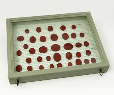
 Now, to pick up the trend, who doesn't need fake intaglios, in a green shadowbox? What, no takers?
 And don't forget the must-have suzani. Most people want an original one on their bed, but for those who don't, how about a faux suzani pattern painted on a faux antique Chinese rice box?

Here, is a medley of three trends all in one: birds, birdcage, and mirror! Beautiful??

Using trends in interior design can be very tricky. If you glance through the book on Frances Elkins, you can how timeless classic design is. Some of Elkins' rooms look like they were designed recently, not 80 years ago. They are a testament to what good design is all about.
If you can't resist trendy decorating, try to limit the trend accessory to just accents here and there, as opposed to wallpaper or upholstery. This way, you can easily change it out without a huge expense. Like this room:

Here are some beautiful living rooms that are so obviously of the 2000s, yet, you won't find any trendy coral or other tacky accessories, just timeless, classic design.


 Middle Eastern and Moroccan design is all the rage. This company, Wunderely, has both trends. Their prices are very reasonable and their web page is set up to purchase. I'm not sure if the prices are truly wholesale or not, but I had no trouble setting up an account online. One or two of their products can make a room mysterious and oh, so current. Enjoy!
 Wood and bone mirror.
 Moroccan rug. Fabulous.
  Their lighting line is extensive.


 Or brown?
 Or blue?
 Or how about red, spiky coral pillows?
 Here's another trend this year, damask. But tell me, does anyone really need damask freezer bags?

 Now, to pick up the trend, who doesn't need fake intaglios, in a green shadowbox? What, no takers?


