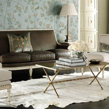
What do you say about a store that is brimming with beautiful things?
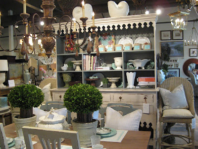
That has the best selection of Julie Neill Chandeliers, Aidan Gray accessories, and Hickory Chair upholstery and case goods?  A store that is full of edgy accessories, new ideas in garden decor, and lovely Swedish and French reproductions.
 A shop that tops it off with a talented in house staff, an excellent relationship and appreciation of local interior designers and owners with great business sense and even better taste?
 You call it Home and Garden in Covington, LA.
Just a short drive over the Pontchartrain bridge from New Orleans and you arrive at a mecca of fabulous home design all under one roof.  Home and Garden is owned by: John, Kenny and Jennifer Rabalais.
  With their outstanding taste and excellent business acumen, they have a created a wonderful environment for designers and homeowners, alike, to create beautiful interiors.
 Home and Garden houses the largest display of Julie Neill lighting, outside of Julie's own shop, and the largest selection of Suzanne Kasler's line for Hickory Chair in LA. Above notice the Julie Neill Juliette chandelier and the Suzanne Kasler Choate Dining Table.

With so many wonderful lines available here, and so much inventory to choose from, Home and Garden creates some fabulous vignettes. Here is a wonderful dining room! Notice how the Julie Neill Ingrid Chandelier Pendants echo the lines of the dining chairs.
As promised in my previous post on New Orleans, meet Jeffrey McNeely, Director of Retail Development and the namesake of Julie Neill's new Jeffrey Chandelier above. Jeffrey works exclusively with designers to help them create the perfect look for their clients. Notice the Julie Neill Madeleine chandelier to the left and the Artemis toward the middle bottom, and the Jeffrey on the right- Suzanne Kasler Prado Bookcase in the background.
 Home and Garden has literally hundreds of interesting accessories. Above is an impressive display of metalware by Beatriz Ball.

Here is a summer beach tablescape complete with Aidan Gray candlesticks.
 Lovely slipcovered ottomans with incredible ribbon detailing and an Aidan Gray lamp.
They also carry several slipcovered lines. I loved this sweet chair with embroidery.
 Home and Garden also has several vintage items and antiques - Here is an antique lantern, the patina on this piece was amazing.
Millie, Kenny, Suzanne, Gina
So imagine my excitement when Kenny Rabalais invited Millie and I to come to Home and Garden and meet famous designer, Suzanne Kasler! For my readers who may not know, Suzanne has been named by "House Beautiful" magazine, one of the top 100 designers for 2005 and one of the top 125 designers for 2004; "House & Garden" named her one of 50 Tastemakers in March of 2006; and Suzanne was the 2003 Southeastern Designer of the Year!
.
Since her launch of her line for Hickory Chair last year, Suzanne has been visiting premier retail locations and sharing her visions of design. Home and Garden hosted a luncheon in Suzanne's honor and invited local designers meet her and learn more about her design inspiration and philosophy.
 Probably the most interesting part of meeting Suzanne was learning about many of the pieces in her line and what inspired her to have them recreated by Hickory Chair. I learned that many of her pieces were recreated from antiques she had personally collected over many years, or had found for her elite clientele. She spent over a year and half working closely with the craftsmen at Hickory Chair to create what she believed were beautiful pieces that would fit in with both modern and traditional styles. Let's have a look:
The Frederica Bench is a beautifully proportioned, delicate, hand-carved reproduction of an antique French bench from Suzanne Kasler's home. Though beautiful, the original, like most antiques, was bit too narrow and uncomfortable. She deepened the seat and softened the cushioning and now, its the perfect marriage of beauty and comfort. She couldn't find a wide enough stripe for the bench, so she used solid fabric cut to width to create the wonderful striped effect. Anasthasia bench, Antoinette side table and Alexandra chair also pictured. 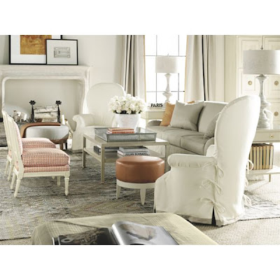 Suzanne has known the Rabalais family for many years and helped decorate John's home in Rosemary Beach, Florida. The slipcovered Nanette chair was actually inspired by a chair Suzanne found for John. She fell love the oversized shape and scale and convinced him it was perfect for his home. Also pictured are the Auburn ottoman and Ainsley chairs.
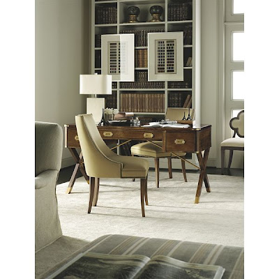
The original Campaign Desk, actually sits in Suzanne's home office. It was a bit too narrow and also quite warped, as antiques tend to be over years of use. The Hickory Chair Campaign desk has a wider proportion for a laptop and of course no warping. The metal work on the original was painstakingly recreated. Suzanne commented that she was thinking of switching out her original desk with the new one, simply because it looked identical and lived much better!

One of Suzanne's favorite pieces in the line is her
Anasthasia bench, a Russian antique that she found in Paris. The original, above, sits in Suzanne's living room. She said she missed the bench, as Hickory Chair had several of her pieces for months and months, while they meticulously recreated them down to the most minute detail.
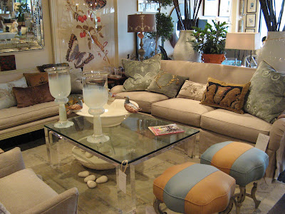
And here they are recreated at
Home and Garden. I love Suzanne's signature stripe upholstery. Also shown is Suzanne's new Emory skirted sofa.

Here are the
Anasthasia benches upholstered in plain linen.

Comfort is very important to
Kasler. All her upholstered pieces were designed with comfort in mind. Here is the Emory chair.
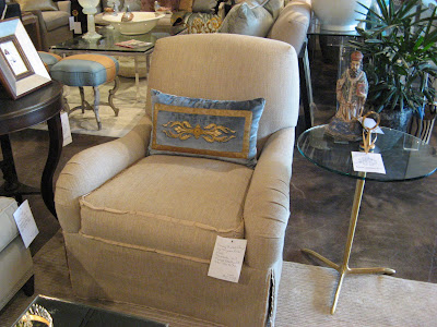
But when we think comfort we so often think unattractive; not so with this line. Suzanne is famous for her dressmaker like details. Here is the Emory chair at
Home and Garden. Notice the flange welting and pleated skirting.
She is inspired, she says, by the French antiques and French modern pieces she collects. This inspiration is then personalized by the addition of signature details like grosgrain ribbon trim and dressmaker skirts (blending dressmaker details into upholstery is a favorite
Kasler technique).

The result is refreshing, a little witty, and versatile enough to work in environments that range from informal to elegant; evident again in the
slipcovered Nanette chair
Other items recreated by Hickory Chair from Suzanne's home include:

The
Choate Dining Table which was inspired by Suzanne
Kasler's antique Regency table.
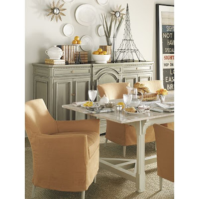
The Piedmont table, a great wooden, farm table inspired by the original which sits in Suzanne's kitchen. Also pictured is the new
Carlisle Credenza, which Suzanne explained is better because the doors are not warped like her original.
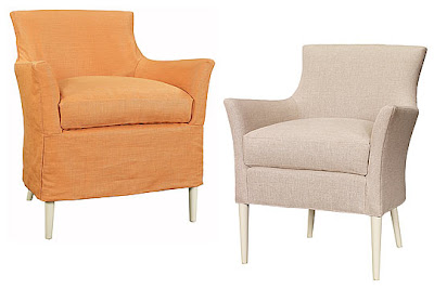
And the
Chastain Chair, which comes
slipcovered or with bare legs, which was inspired by a wicker chair
Kasler slipcovered for her office.
She also has a wonderful line of lighting made by Visual Comfort.

This chandelier is a copy of the one that hangs over her kitchen table.

Here is her brand new Thornton lamp, just released at market. I love this!! It is modern and classic at the same time.
Her lights are available at
Circa Lighting.
She also has the Suzanne
Kasler rug line available from
Safavieh. A wonderful collection of 10 to 12 hand-knotted wool or combination wool/silk rugs.

For more information about Suzanne
Kasler see this wonderful post by
Things That Inspire and this interesting and very comprehensive post by
Cote de Texas.

Suzanne mentioned that as a designer she was so clear on what she wanted to create, but she did not know what to call her "signature style". Her publisher mentioned they were very inspired by her interiors and hence came the name for her new book:
"Inspired Interiors" , which will be released in October 2009. I am sure it is going to be fabulous and chock full of wonderful information.

I had an unforgettable time in New Orleans, meeting Suzanne Kasler, and of course the Rabalais family, and their exceedingly talented staff. If you get to New Orleans, do not miss visiting Home and Garden. You will be thrilled and astounded, as I was. Oh, if only I could have stayed longer...
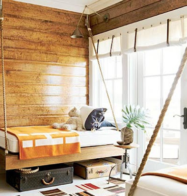
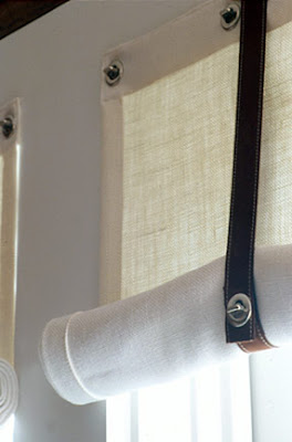
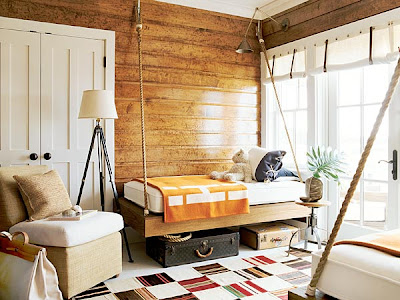 Notice Suzanne's use of horizontal hung wood paneling finished with marine like varnish. This detail along with the yacht like fittings and the bunks attached to the walls with boat cleats, really gives the feeling that you are in the cabin of a boat. Swing-arm lamps, installed high on the ceiling for reading in bed. I especially like the sailcloth curtains, hung with rivets and and tied with top stitched leather fittings. All these elements bring your eye up and down around the room.
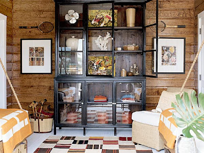
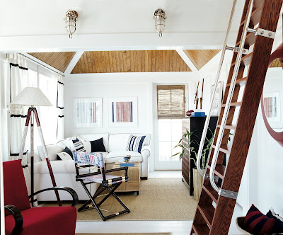

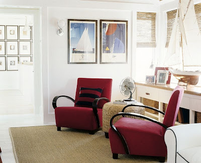 Suzanne brings in texture with the seagrass ottoman, the rug, the woven shades and the baskets. She completes the look with a vintage pond yacht model and sailing prints. I also like the touch of the vintage style electric fan. I think the noise of that fan would really add to the experience of this classic room.


 I also love that in the land of McMansions and cavernous bedrooms that this one feels cozy when you close the doors. I think it would make a perfect guestroom. The 1950's abstract painting is second in the show by Steven Pace. The other is in Donald Schermerhorn's room. It works well with the art in the sitting room which includes another abstract painting not seen in these photos.


 A store that is full of edgy accessories, new ideas in garden decor, and lovely Swedish and French reproductions.
 A shop that tops it off with a talented in house staff, an excellent relationship and appreciation of local interior designers and owners with great business sense and even better taste?
 You call it Home and Garden in
  Home and Garden is owned by: John, Kenny and Jennifer
  With their outstanding taste and excellent business acumen, they have a created a wonderful environment for designers and homeowners, alike, to create beautiful interiors.
 Home and Garden houses the largest display of Julie Neill lighting, outside of Julie's own shop, and the largest selection of Suzanne

 Home and Garden has literally hundreds of interesting accessories. Above is an impressive display of
 Lovely
 Home and Garden also has several vintage items and antiques - Here is an antique lantern, the patina on this piece was amazing.
 Probably the most interesting part of meeting Suzanne was learning about many of the pieces in her line and what inspired her to have them recreated by Hickory Chair. I learned that many of her pieces were recreated from antiques she had personally collected over many years, or had found for her elite clientele. She spent over a year and half working closely with the craftsmen at Hickory Chair to create what she believed were beautiful pieces that would fit in with both modern and traditional styles. Let's have a look:
 Suzanne has known the
 One of Suzanne's favorite pieces in the line is her


 But when we think comfort we so often think unattractive; not so with this line. Suzanne is famous for her dressmaker like details. Here is the Emory chair at Home and Garden. Notice the flange welting and pleated skirting.

 The Piedmont table, a great wooden, farm table inspired by the original which sits in Suzanne's kitchen. Also pictured is the new
  And the

 For more information about Suzanne
