Male vs. Female: It’s a Size Thing
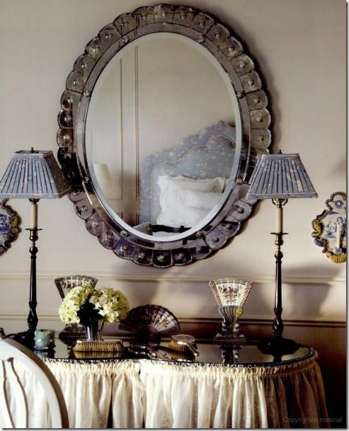
A skirted vanity table, Venetian mirror, silver toiletries – a femininely designed master bedroom shared by a husband wife.
OK, I am going to say it. Like it or not. Here goes. I would much rather design a house for and with a woman than a man. I just prefer feminine decorating over masculine decorating. Even the male interior designers I most admire design in a feminine way - Saladino and Carithers come to mind immediately. Yes, I know there are exceptions and right now I am thinking of a few couples I have worked with whose projects ended up being very successful. But, given the choice, I PREFER the design project where the wife takes the lead and makes all the decisions. Usually when the husband gets involved, it’s not a good sign: he’s not happy with the wallpaper, he doesn’t like linen, he hates curtains, he doesn’t like seagrass, and he loathes four poster canopy beds. You know, all the things I love. Some woman love designing for men. They like masculine things and appreciate dark colors and chenille, leather and plush carpet – I just don’t. For myself, I know a project is going to be good when the husband leaves the room, and the wife rolls her eyes and says to me – “don’t listen to him.” Even better is when the first time I actually meet the husband is at the installation. Now, that’s a great client!
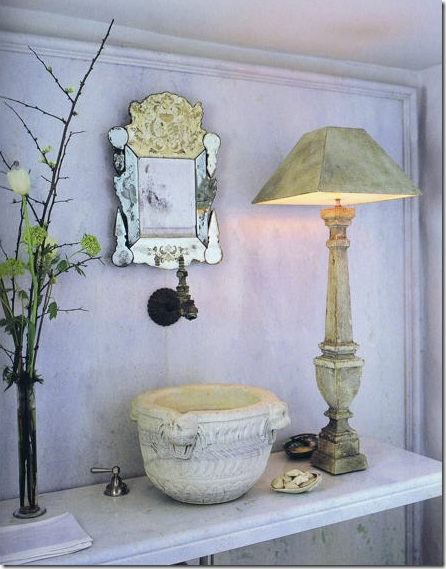 John Saladino’s powder room. A male interior designer not afraid to show his softer feminine side.
Testosterone-driven designing is just not my thing. To illustrate my point, I have found two extreme examples – one where the husband had a huge impact on the project, often leaving me to wonder if he was even married. The second house is the result of a woman designing for a woman. It’s a house where the husband said - “Honey, if you are happy, I am happy. I know interior design matters more to you than it does to me, so you do whatever you want to the house. I trust your taste.” That is a husband who is secure in his masculinity and doesn’t need to live in a house which proclaims he is the boss. Both houses shown today are about the same size, though the lot sizes are quite different. They both have many bedrooms and both are obscenely expensive. Look at these two houses and decide: Do you prefer a masculine design or a feminine design. Have fun!
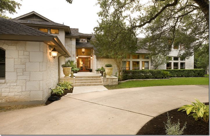
House #1 is located in Austin, across the street from the lake. It was built in the early 80s and has been remodeled three times. Clad in native Austin limestone, it’s typical of the contemporary Mac Mansions built in Austin by the all the dot com executives and by the real estate agents who got successful serving them.
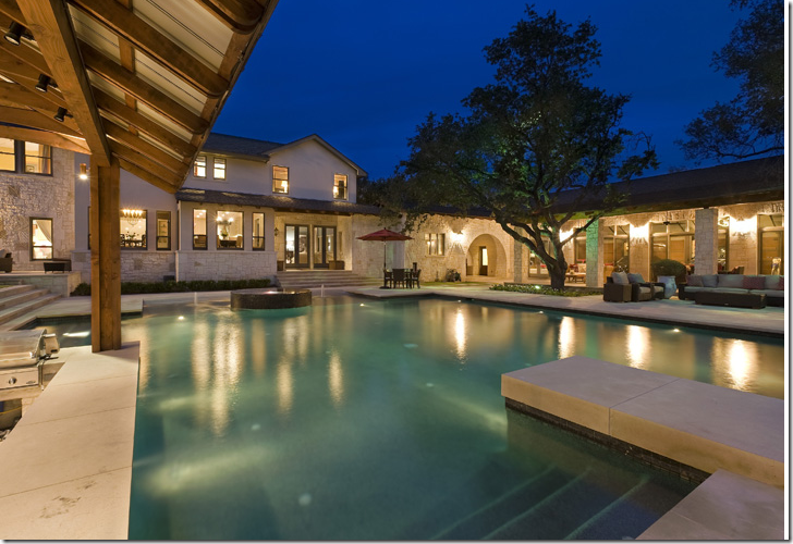
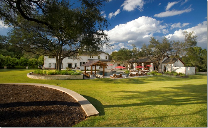
The huge swimming pool was only added last year, replacing a much smaller one. The first major remodeling was done in 2004. In 2007 a massive four car garage was added – the garage is the large wing on the right side of the house with glass doors overlooking the pool area. Now tell me, what woman would build a four car garage before a swimming pool? And what woman would actually WANT a four car garage? And honestly, what woman would even WANT a pool this big? This complex actually looks like a hotel. Woman don’t decorate this big. We’re happy with smaller, cozier, warmer, quainter. Men want it BIG. The bigger the better. It’s a testosterone thing.
The back yard complex during the day. The massive four car garage is to the right of the main house. The landscaping is really sparse – no beds of lavender blowing in the breeze. No roses or hydrangeas either, in fact, not many flowers at all.
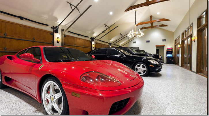
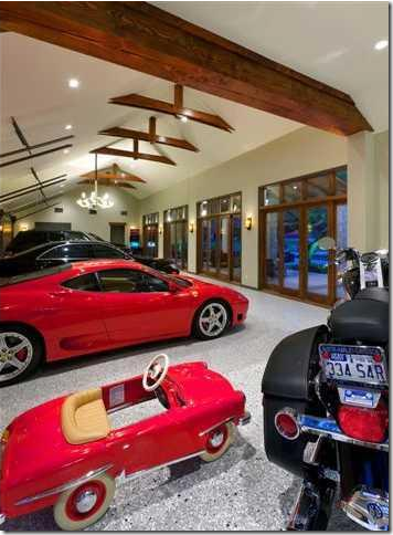
The famous garage that doubles as a party room. OK. Wait – it DOES have a chandelier in here, along with a video arcade game. The glass doors overlook the pool. I suppose it’s nice to have a pool view while you’re working on your cars! Ladies, I ask you – would you EVER want a garage like this? This size? This BIG?
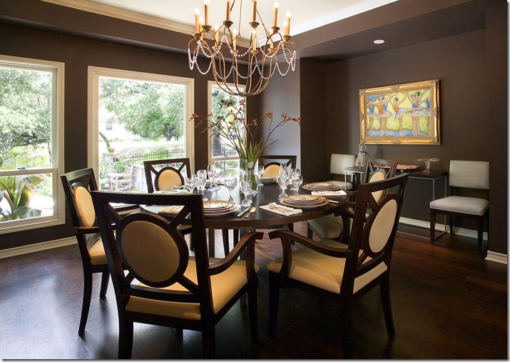
The most feminine room in the house is the dining room – there are actually crystals on the chandelier! The real estate brochure includes pictures before and after the remodeling which are interesting to look at. Here, there is no rug.
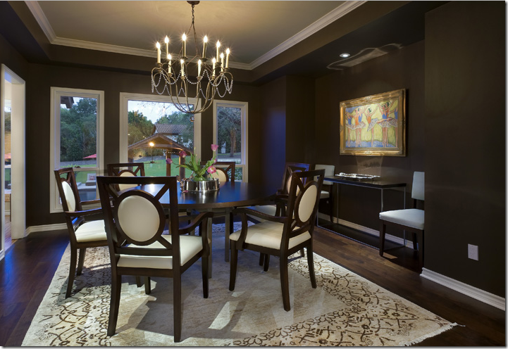
And here, with the addition of the back yard pool, the dining room gained a rug which brightens up the space considerably. Notice the ballet art on the wall – the husband threw the wife a bone here. Just kidding! Maybe it’s even the wife’s own art work? The dining room overlooks the beautiful backyard - the kitchen is through the open door to the left. Although it’s not my personal style, I do think this room is very pretty and well designed for soft contemporary.
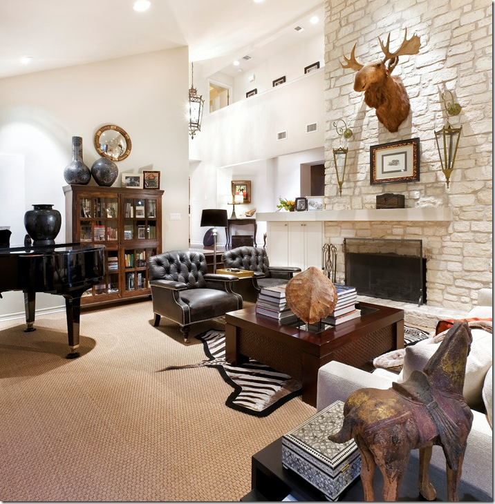
The main living room. Masculine or feminine? A huge moose head, leather chairs, and seagrass – wow, that’s a first for a male!!! This room would be great as a man’s study, not a main living room – especially for a feminine wife. Is there even one feminine touch in here? This room faces the front yard. It’s a shame there’s no view to the back yard, but the house does face the lake – so there may be a lake view.
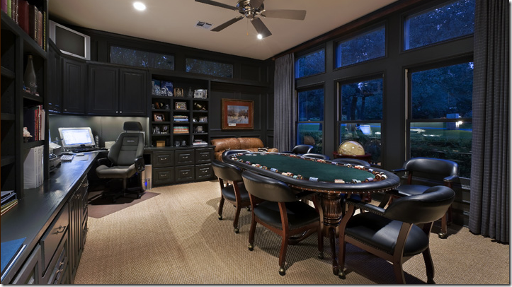
The King’s domain. What an office and what an extravagance: a poker table all set up and ready to go. This is a man who knows what he likes and gets it. He doesn’t hear “no” too often. He’s used to getting his way. Notice the flat screen in the upper left corner, just for poker nights! This office is to the right of the living room and also faces the front yard.
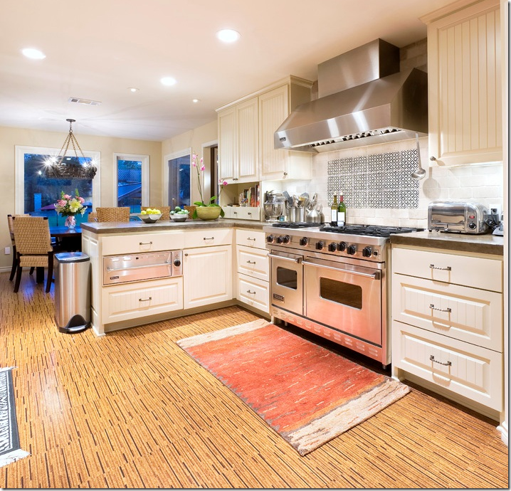
Now THAT’s a range for cooking up some steak and potatoes. But being as this is Austin, it’s probably used more for grilling fish and vegetables.
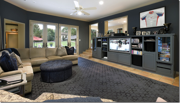
The area to the left of the kitchen (just down the steps) is the family room, complete with all the male necessities: a sectional in suede, an ottoman for his tootsies, a large screen TV and a built in media center. AND included here is every woman’s favorite decorating item: a sports jersey won at a charity auction! And look – the room was even decorated in gray to match the jersey! Now, this is a sweet wife! She already gave up her living room to her husband, her back yard, and now her family room!
This picture is included in the real estate brochure, but I am going to say this is same family room before the recent remodeling. Notice the furniture.
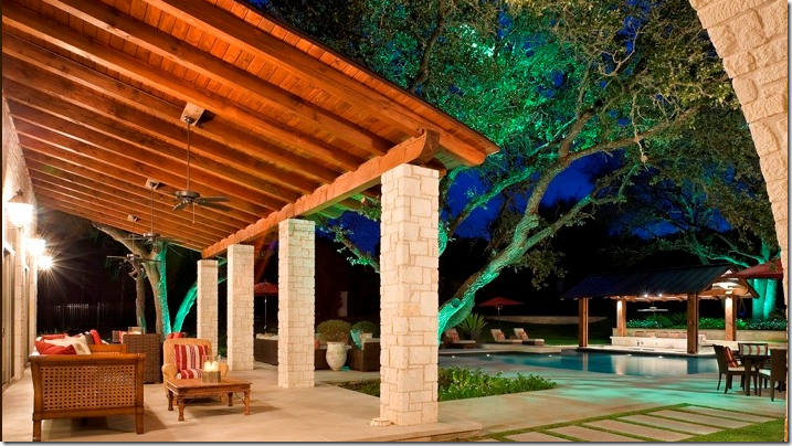
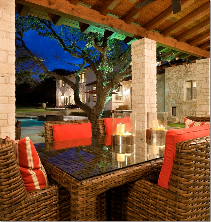
Yep. The furniture was moved outside to the patio in front of the garage. What a beautiful backyard – a playground fit for a King! The lit trees are incredible at night.
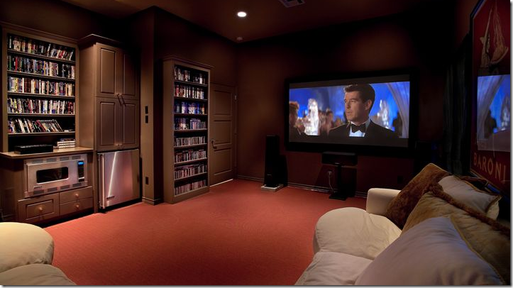
OF COURSE there is a giant media room, complete with a small kitchenette and a plush, lush, squishy ultrasuede sectional! You didn’t think the husband would be forced to watch TV just in the family room, or in his poker room/office now did you? Of course not! And you knew there would be another sectional somewhere, right? No man is happy without a couple of leather or suede sectionals spread throughout his palace. And that’s not just a TV there, there is also a powerful surround sound set up. What man can’t live without surround sound or brown paint and orange carpet, too? Remember this is Austin, home of the burnt orange UT longhorns! I am going to guess that this is the former garage – that was at the front of the house before the remodeling. Now that the new four car garage was built, the former garage was turned into a media room. Just a guess.
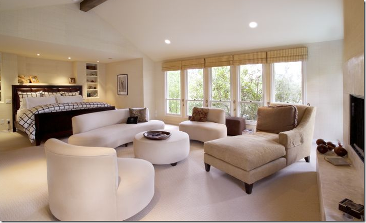
The master bedroom – newly decorated. The former bedroom is pictured below. I’m not sure why both the before and after pictures are presented in the real estate brochure, but I love seeing how the house was upgraded. The decorator did a good job – all kidding aside – decorating for a male. In this picture – there is new carpeting and a new bench which I love. The decorator also added draperies (probably because the husband couldn’t get the room dark enough with just the shades – so they added black out curtains for him – I’ll lay odds on that guess!) Also, the soffit over the bed was removed in the remodeling and windows were added next to the bed, along with grasscloth wall covering – all so masculine. The two windows were added to gain a view of the back yard – there wasn’t one before – smart decision! Of course there is a wood and leather headboard – no tufted velvet upholstered jobs for this man. Men love big, heavy beds. And never a canopy for them, thank you very much! More suede on the chair and a half (natch – the bigger the better!) One more thought - how much more masculine could the duvet be? Brown and white windowpane.
The room before (I think this negative was reversed here) – notice the dropped ceiling over the bed which is now removed. Windows were added to the sides of the bed, along with the new carpet and wallpaper. Hubby loved his windowpane brown and white duvet, so that stayed. But all the white ultra modern furniture went bye-bye. I like the new bedroom so much better!! No curtains here either which was too much sun for the King’s eyes.
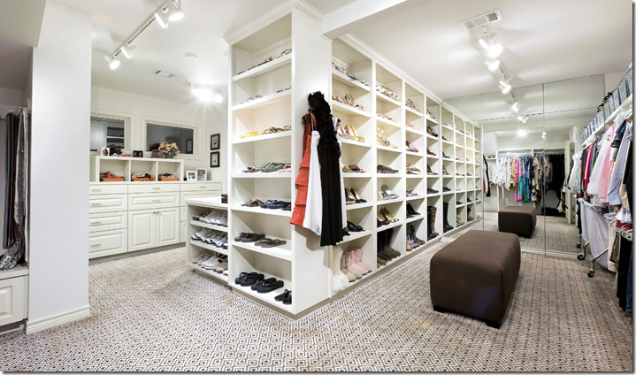
The King’s private store – a walk in closet to rival any boutique! He is married – I can see his wedding pictures where his bride in her white gown is clinging to him on his motorcycle. This truly is a Type–A personality living here. And he also rides horses – check out his boots and riding hat. All the photographs are in neatly matching brown frames – which is a perfect idea, excellently executed! And he has a little daughter! Hmmm – there sure didn’t seem to be any signs of a child living here. The carpet is really attractive, in a masculine way, of course!
Her side – her closet was expanded, there were before shots of the closets too. If this was MY closet, it would be so frou-frou! I would have vanities and Venetian mirrors, and white marble, and sconces and a chandelier or two! I would have an antique chaise lounge in my closet area – certainly not a brown contemporary stool, but then again, Mr. Slippers Socks Man surely isn’t in control of OUR decor! He knows better than to even offer a suggestion! The Queen does like her shoes. This is one neat, organized couple – I have to hand it to them! What a dream it would be to have all this storage space.
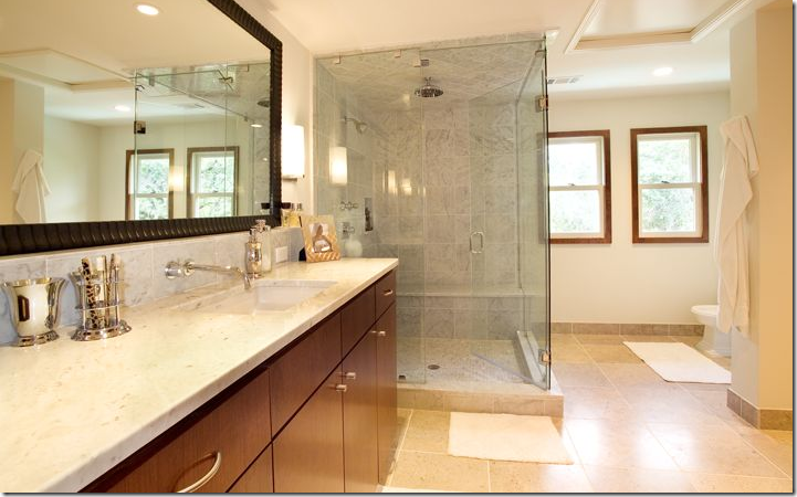
Now, the question is – is this the master bathroom before remodeling, or just one of two bathrooms? If they have two bathroom, this would be his.
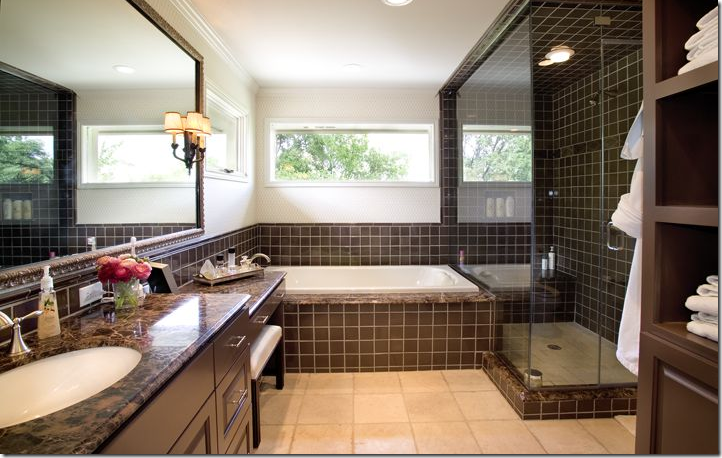
And this would be hers. But if this is the same bathroom remodeled - there is a vanity now and a bathtub added. This does look updated and it has the same mirror. It’s hard to say if this is a separate bathroom or the same one remodeled. Can’t see them sharing this bathroom with just one sink. But why is her bathroom decorated with the dark brown marble – so masculine, while his is light limestone? Rather or not its two bathrooms, or the same remodeled - look! Fresh flowers! Wow!!!!!! And a sconce!!!!! A few feminine touches even with all the brown marble and tile which happens to perfectly match the window pane duvet!
All kidding aside, despite being a Type A personality and always getting what he wants, it’s obvious he is a real softie: look to the right of the picture, under the window – there is a dog door – with STEPS! AWWWWW, too cute!!!! He added steps for his little dog to get in and out! Now that’s a thoughtful man!
And proof there IS a baby around! A toy car is parked right next to her daddy’s wedding get-away motorcycle! Too sweet!
So – what do you think? Could you be happy living in a male dominated environment – with every concession made to please the man of the house and the woman’s femininity totally pushed to the background? If I hadn’t seen her closet, I would have doubted a woman even lived here, save for the ballet picture and crystal chandelier in the dining room. This is a man’s playground to be sure! I wonder where they are moving to? Next up, below, is the example of feminine decorating.
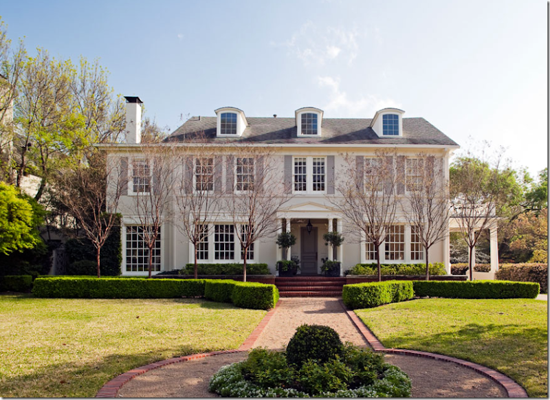
Located in the heart of Dallas’ Highland Park – a classy, old neighborhood, this is MY idea of a dream house: yes, it is huge, but it seems manageable. I could be really happy in this house! I love the classic facade with the beautiful windows and the porte cochere with the terrace above it. And what pretty landscaping – even in the winter – it’s still lush green with its welcoming center flowerbed. I also really like all the box that curves out and frames the front steps. Charming! Even the paint color gives off an air of femininity – a soft grey with darker gray shutters. This house is oozing in curve appeal and softly saws – I am woman! (Albeit with a wealthy, quiet, understanding and obliging husband.)
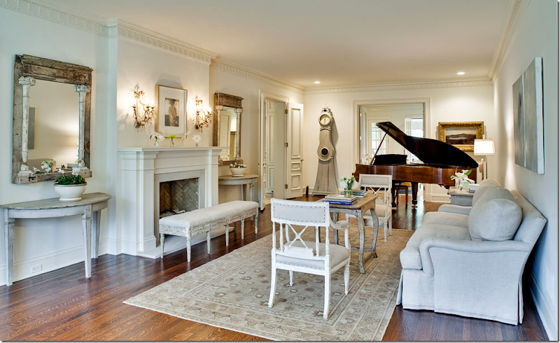
The living room says it all – this was decorated by a woman for a woman. Does a man even LIVE in this house?????? It’s a vision in Gustavian – so beautiful! I love all the painted gray and white-washed furniture – the two Swedish chairs in plain linen, the French bench in front of the fireplace with its dainty crystal sconces. And where did she find two antique matching mirrors? Amazing! I love the way the demi lunes and mirrors are flanking the fireplace. There’s a plush, down filled sofa in a pale gray linen with a subtle tape on the hem. The coffee table is so feminine – but nothing is more feminine than a Moro clock! Look at it – it looks like a curvy woman in a long dress standing there! Notice the lacy crown molding and the fluted mantel trim, even the bricks inside look white washed. Just beautiful. I have only one comment/complaint. I noticed that in Dallas, not as many people use seagrass as they do in Houston. This room is crying out for seagrass with the rug layered on top of it. Just my opinion! You knew I would say that!
Looking the other direction– in the front window is more antique furniture – a Swedish sofa and two French side chairs. I love the curtains too – nice and full. Through the double doors on each side of the fireplace is the sun porch. Notice this detail: I love how the owner kept the original nails in the chairs next to the sofa – she could have used a beautiful gimp trim to hide them– but she chose to keep it original.
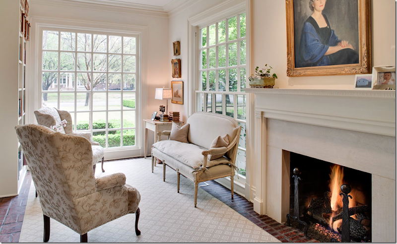
The sun porch has a charming brick floor – you just don’t get these details and small rooms in new Mac Mansions. The scale of the rooms in older houses is so much more human – so much more cozy and warmer. Here she pairs a French settee with two wing chairs covered in a feminine embroidered fabric. I would have morning coffee in here and light the fire each winter day. I love how the fireplaces were updated with the white stone – so soft looking. Again, I would have chosen seagrass. Don’t you think the texture and color of the seagrass would be better? Hard to imagine making these rooms any better, though.
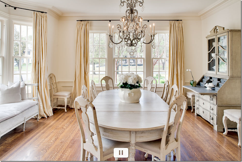
OMG! A vision!!!!!!!! First, I love all the pale painted furniture - the table and Swedish chairs. The chandelier is so beautiful, iron and crystal. It’s so curvy and feminine. In the bay window, another Swedish sofa is used, again in plain linen. And the desk! A Swedish secretary with its dark gray interior that picks up the pewter color of the iron chandelier. The creamy, dreamy, silk taffeta curtains are perfection. Notice how the wainscoting is painted cream against the white walls – and how the curtains blend with the wainscot – that very subtle difference in color keeps the room from going icy. This decorator knew what she was doing. Oh help me!!!! I WANT this room!!!!!! It’s all so feminine and wonderful and soft and romantic. I would love to see this room at night with the chandelier dimmed (and trust me – this owner has all her lights on dimmers, I just know she does!) What a beautiful room!!! The wife is so lucky that her husband lets her decorate the way she wants to! That doesn’t always happen, believe me – it doesn’t. She is truly lucky he trusts her taste – and he should. She has beautiful taste! Again, you know, you know – the seagrass! I almost feel guilty pointing it out.
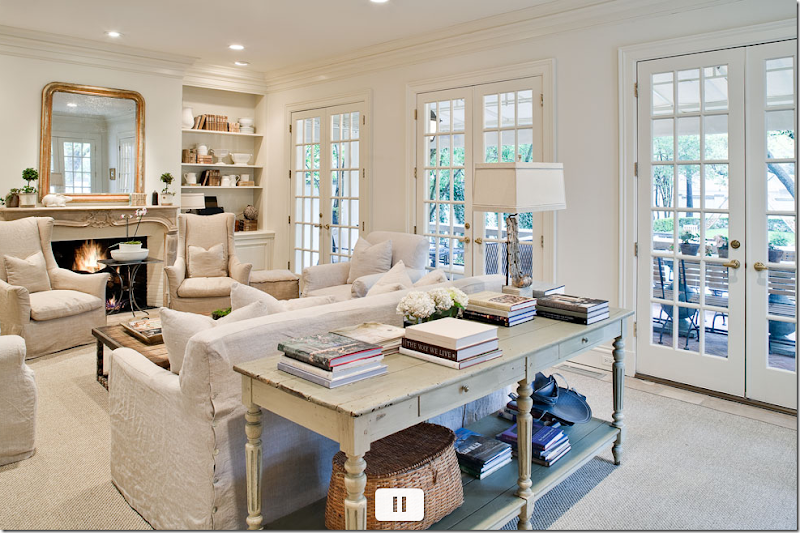
Will someone please just kill me and put me out of my misery?????????? Please! I can’t stand all this beauty! I am two shades of green now. OK – sisal ???? But it’s better than nothing. Let’s dissect: The slips on the furniture is so perfect! I love the color, not white, not gray, just linen. The two wing chairs are a darker shade which is such a great choice and what a cute steel table between them. The fireplace is so pretty – the curvy Louis XV mantel with a Louis Philippe mirror above. I adore how she accessorized her shelves with white ironstone and antique books. And the sofa table – nice and deep! Piled with decor books – Michael Smith’s first book is right on top – good choice! Here’s another square linen lamp shade, love those. Could you improve on this room? Maybe. Maybe with a light fixture and curtains. Maybe not. Hard to say. It’s just so pretty as is. Just beautiful. Whoever owns this – has great taste and style. I wonder if she decorated it herself? If not who was the designer? I am just dying to know!
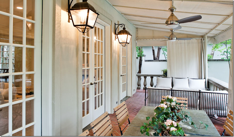
The brick floored terrace outside the family room – cute of course, with an awning covering the space. French garden chairs surround a slate top table, French lanterns light the space. Notice the balustrade - gorgeous. And I love how she can make the neighbors disappear with the curtains!
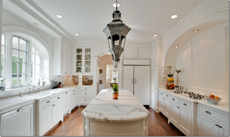
Well, at least the kitchen is ugly! Yeah, in my dreams! First, the Carrara marble is gorgeous – or it could be Calacutta marble, hard to tell. Notice how the arched window is repeated in the arch over the cooktop and the doorway. Charming. The cabinetry is beautiful – I love how it’s all footed. The island is so long – what a great space to spread out a buffet. And the matching lanterns - adorable! The door that leads to the porte cochere is located in that area between the kitchen and the dining room.
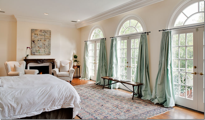
The master bedroom looks surprisingly a little unfinished, but hey – who can blame her?!! She’s exhausted from getting the rest of the house so perfect. I do love the silk taffeta curtains in mint. Again, so feminine – mint taffeta! And the French doors are beautiful – look at the scrolled iron balconies overlooking the back yard.
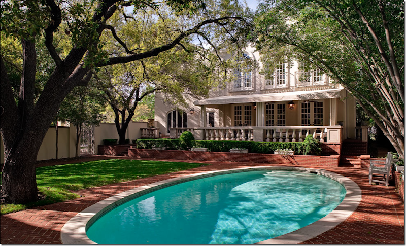
In this picture you can see the beautiful back porch with its balustrade and awning. Above it is the master bedroom with the scrolled iron Juliet balconies. And the arched window on the left must be another arch in the kitchen – most likely the breakfast room. I love the romantic iron gate on the left side. The landscaping is simple and neat – just box with small pots of blooming flowers.
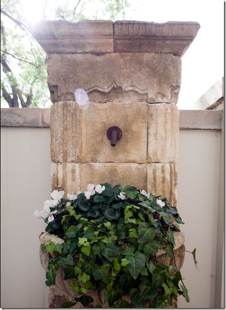
On the porch – outside the arched kitchen window is this antique fountain, filled with ivy and winter cyclamens instead of water.
The tale of the tape: both houses are just under 6,000 sq. ft. The Dallas home has a basement with a media room and gym – not pictured, plus a two bedroom/two bath cabana. The master bedroom is a 5 room suite. The Austin house has 6 bedrooms and 5 baths, and both houses have 4 living areas. The Dallas house is $5 million and the Austin house – the masculine resort - is just 3.5 million – seems like a bargain in comparison! The Dallas house was built in 1925 – the Austin house was built in 1982. Both have been extensively remodeled. The Austin house covers 1.35 acres, the Dallas lot is 90 x a deep 225.
These two houses are both examples of decorating in the extreme. A masculine escape – a soft contemporary, filled with two media rooms, a dedicated office/poker room, a four car garage with a chandelier and glass doors VS a light, air, feminine Swedish styled classic house with rooms scaled to human beings, not elephants or Type A masculine egos! Which do you prefer? What is your style? Are you a feminine designer or a masculine designer? Are you more contemporary or do you favor antiques? Do you need large, comfy, squishy sectionals or could you be happy with wood framed antique Swedish sofas? Do you need large chairs & 1/2 or will a French bergere be fine for you? Could one designer have decorated both houses? Or more importantly – would one designer have WANTED to do both styles? Can you guess which one I would have loved to have designed?





0 comments:
Post a Comment