Ballard Designs Presents James Swan
Something is happening at Ballard Designs. Something really good. Just when you thought that everyone’s favorite home decor catalogue couldn’t get any better, it has.

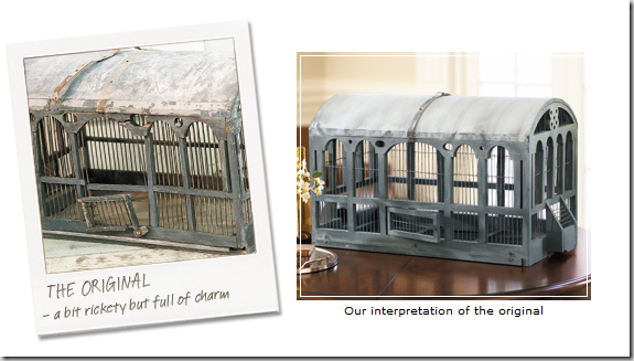
The evolution of Ballard Designs’ bird cage – from the flea markets of France to the catalogue.
It all started with a contest – in 1982, Metropolitan Home Magazine awarded Helen Ballard Weeks’ condominium First Place in a reader’s competition, and then promptly featured it in the magazine. Weeks, who was inundated with phone calls praising her interior design, decided to take advantage of all the interest by launching a two page, black and white catalogue which featured a copy of her antique French dining table. Obviously it was a instant hit and the start of a business that is today one of the largest and most successful of all the home decor catalogues.
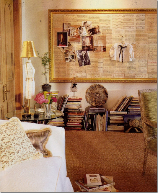
The former office of Helen Ballard Weeks, founder of Ballard Designs – the large bulletin board, framed in gold, is a classic Ballard item. The lamp with a gold shade made out of a mannequin was once a popular item – today it is no longer sold. Weeks loved French antiques and used them as her inspiration for her merchandise.
Another detail, besides the antique reproductions that set Ballard Designs apart were the eye popping colors on its pages: Weeks favored black and white with chartreuse accents and lots of leopard thrown in. One of her most popular fabrics-by-the-yard was a velvet in chartreuse, a highly unusual color choice at the time. Over the years, the company grew and in 1997 Ballard Designs merged with Cornerstone, a conglomerate that also owned the catalogues Frontgate, Garnet Hill, Smith and Noble, The Territory Ahead and Travel Smith. After the merger, fans of Weeks were distraught, I know – I was one of them! Selling out would mean a change at Ballard and many felt it wouldn’t be a good one. Yes, things did change, but Weeks’ initial vision, her love of antiques and her color schemes can still be found in the catalogue today. In truth, the company only got better with the infusion of big business. Weeks remained at the helm of Cornerstone until she retired in 2002. Today, Barry Diller, head of IAC and the Home Shopping Network owns Ballard Design. Now, with two stores open in Florida, Ballard Designs has gone the retail route. It publishes a new catalogue monthly and distributes 40 million copies yearly. Quite a feat for a catalogue that started as two pages in black and white.
Ballard in a nutshell: white slipcovers, seagrass, and zebra!
The catalogue in on-line and that’s where all the fun is. The web site has gone blog! There’s a lot more to see online than in print – customers send in photos of their homes showcasing what they bought, there are stories about how antiques are turned into products, and there are endless columns with decorating advice. Recently Ballard Designs even teamed up in Domino Magazine! There’s a special section online called Style Studio where this month, the talented Beverly Hills interior designer James Swan is featured. Swan created four rooms using only Ballard products. Swan shows how the price-friendly Ballard Designs merchandise confirms that good taste knows no cost. His rooms are high end, yet VERY affordable to most of us. Thank you! Swan was chosen by Ballard Design for his clean and effortlessly elegant designs. In the layouts, Swan chose to use both new products and the best sellers that Ballard’s customers have come to love over the years. There is a “behind-the-scenes” story of how the rooms were created, so be sure to look at that too. Swan has a book coming out, “101 Things I Hate About Your House” – a humorous look at interior design – I can’t wait to read it! So – enjoy Swan’s rooms for Ballard Designs below:
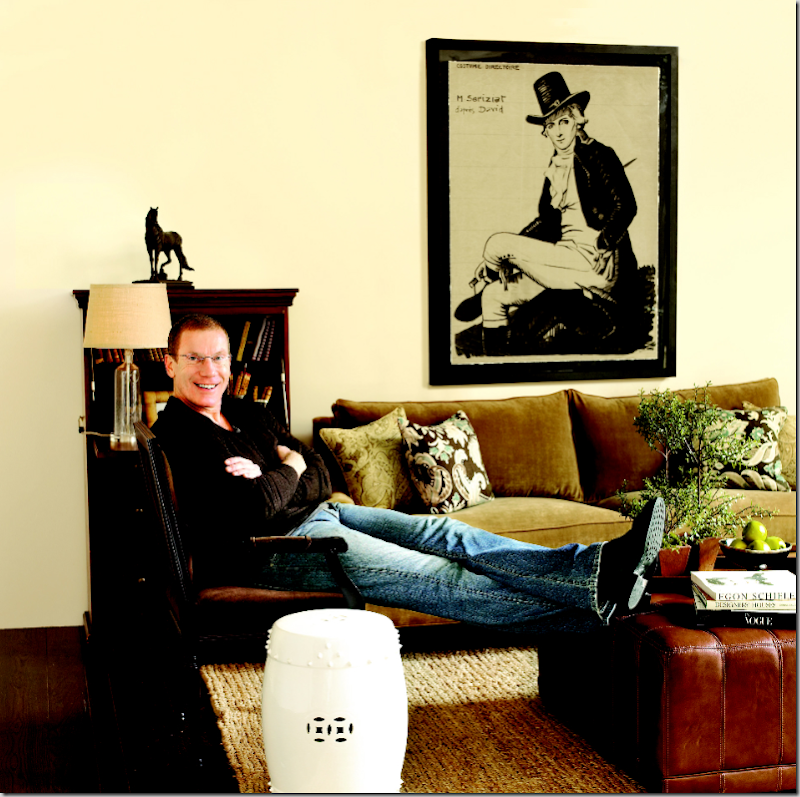
The first room Swan designed is this living room – the framed print is the focal point here. It is based on an original Regency piece by Napoleon’s court painter Jacques Louis David. The print is a new item for Ballard, as is the wonderful large sunburst mirror. Two French chairs, painted black, and a velvet sofa were used with dark wood furniture. The coffee table is actually four leather cubes put together to form a more substantial size. The ottomans separate for more seating when needed. Checked curtains add French charm. Everything pops off the light colored jute rug – a perfect choice by Swan. the lamps on the wood console are mercury glass, made to resemble glass apothecary jars. My favorites in the room are the large Regency print and the sunburst mirror – beautiful!
The dining room designed by Swan uses two of my favorite new items from Ballard: the focal point – a trio of oversized botanicals that are SOOO fabulous! I think this series is stunning! The next item – the slipcovered chairs which are also a new design. The chair, the Gramercy, can be ordered upholstered or slipped – either way it has wonderful lines and is a very sophisticated addition to their furniture line. Swan paired the chairs with the classic Berkley trestle table, topped with three topiaries and a set of Ballard dishes. The two light fixtures, The Marianna Chandelier, is a charming new item for Ballard. The brown and celadon rug perfectly picks up the colors in the chair fabric. And lastly – the painted wood mirror, the Winslow, is another new item in the latest catalogue. I would love to order the botanicals and the set of chairs!!!!
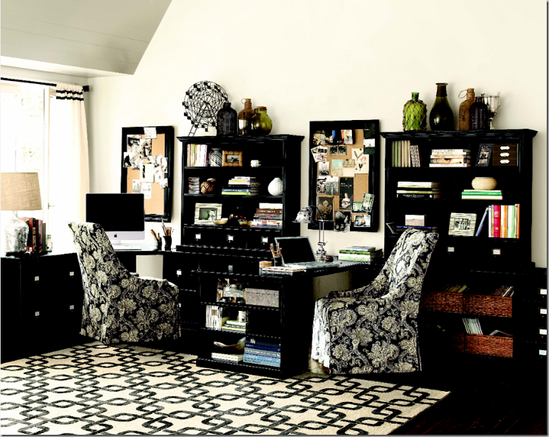
In the home office, Swan chose the new Celia Indoor/Outdoor rug as the focal point. He used a combination of hutches and cabinets in black to create the work space. The desk return becomes a perfect surface for two people to use at the same time. Swan again chose to use the new Gramercy chairs, again with slips - this time in a black and white damask pattern, Marlo, new to Ballard Designs. Ballard’s popular bulletin boards come framed in small to extra large sizes. The baskets add a welcome texture as does the lampshade. Swan used an assortment of decorative items from the catalogue, including the new and charming iron Ferris wheel. The curtains, another new item, with the black trim add a soft touch to the graphic and high contrast office.
The bedroom features the new rattan Grovesnor headboard along with an assortment of fabrics and bedding. The curtains and pillows are made of a venetian style fabric and the bench is in the classic “Helen Ballard Weeks” chartreuse green. The end tables are a new design – the Dunstan – with an “X” detail. The new series of wood coral prints serve as a focal point. Their background of deep chocolate picks up the browns in the striped fabric, another new item in the fabric-by-the-yard collection. The series of mirrored butterflies are new to the spring catalogue too. I couldn’t find the lamps online, but I assume they will be there shortly.
The designer, James Swan sits in the living room he created for Ballard Designs. Job very well done!!
For more information on Mr. Swan, be sure to visit his web site here. And, to keep up with all his adventures in design – visit his blog, here.


0 comments:
Post a Comment