My Kitchen Unveiled!
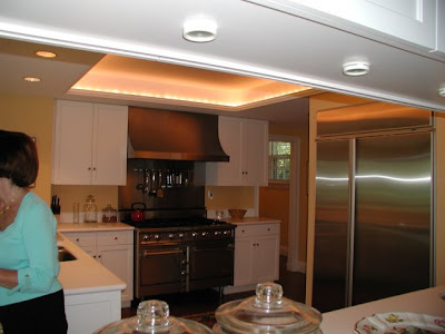
When I bought my house I felt the kitchen needed some minor renovation. Here's what I liked: the layout and the windows across the entire back of the space,which gave it incredible light. I liked the white cabinets, and the recessed ceiling in the kitchen area. What I didn't like was the lack of a center island and the way the cabinets seemed cut the space in half. I disliked the backsplash, and the very badly scratched white Corian counters. I also disliked the lack of mouldings and details, that were so abundant in the other rooms of the house. These pictures were taken when the house was for sale and include the previous owners furniture and accessories.The area above is also the family room space, though they had taken out the couch and love seat. I felt like the table was too close to the family room. An area needed to be added for the table to have its own space. During this renovation we designed and created a glass breakfast room for the table.
Here are some inspiration photos:

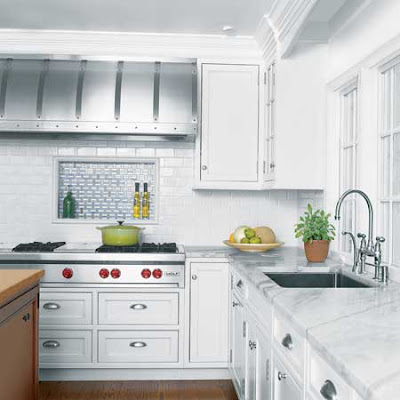
This is a Victoria Hagen kitchen. I loved the soapstone, subway tile and pendant lights. I also liked the beadboard ceiling, but perhaps a bit more scaled back.

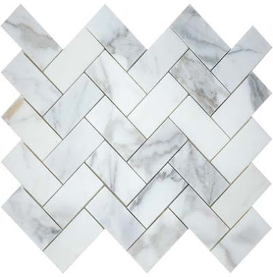
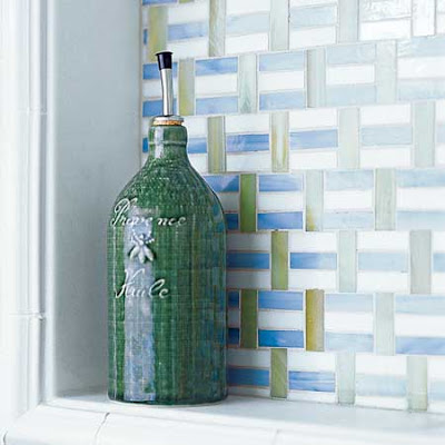
I loved this box out behind the stove for oils, peppermill, etc. I liked the different tiles with the white subway tile. But I preferred Calcutta marble in a herringbone pattern like this one below:

Here's my inspiration:
 Here is my box out behind my stove:
Here is the before looking into the kitchen: (that is me holding my nephew while my sister takes the photos)
We pulled out the small upper cabinets above the island and added pendant lights. We replaced the upper cabinets by the stove. Then we also pulled out four of the lower cabinets to create a center island. The new "island" has curved soapstone, which you can not see in this picture. Notice the beadboard in the recess of the ceiling and the pendant lights. Also look at the before picture and notice how the windows are lower than the doorways - this always annoyed me, but I was able to correct it during the process.
 Notice the plain ceilings in the before picture and the beadboard ceilings in the after. Also new sinks and faucets and moulding details. I also added ice box latches and bin pulls to the cabinets.
 Here is a great picture of the windows which have been raised up about 4 inches so the door and window moldings align.
Here is the TV area before:  And after:
As soon as my new furniture and chandelier arrive I will show you the lovely glass breakfast room with beadboard ceiling and adjacent family room area!
A little inspiration, finding the right quality cabinetmakers and lots of time helped bring my kitchen up to date and back to the original quality of the rest of the house. We are very happy with the result.


0 comments:
Post a Comment