Lessons from a Town House
As most of you know – searching real estate listings can either be great fun or a terrible bore – depending on the zip code and what’s available on the market. Hours can be wasted in the hopes of finding just one house that is decent – manicured and decorated. The majority of houses for sale are neither. Finding one appealing house is like finding a needle in the proverbial haystack. You’re extremely lucky if you do. I got lucky this time! This town house in Houston is located in an area close to great shopping and within the inner loop. The 1950’s era houses in this neighborhood are being torn down and replaced with town houses, sometimes 3 and 4 per lot. Still, it’s a lovely area with towering trees and mature landscaping – and it’s highly sought after by empty-nesters and young married couples alike.
I thought I would show you this particular house because the owner got so many details “right” – and there’s a lot to be learned here. The owner is a single woman, I believe, and she is either an interior designer or hired one – not sure which. But certainly, this wasn’t put together by an amateur. It’s three story – a piano nobile design, which is typical of high density lot town houses in Houston. The square footage is around 4,000 and it lists for about $900,000. Oh, and don’t fall in love – it’s a Sale Pending!
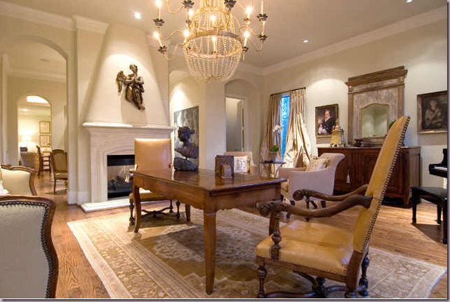
The public rooms are located on the second floor. The living room is arranged with entertaining in mind. There is no coffee table, instead a small dining table is set in the middle of the room – centered in front of the fireplace - with two large antique chairs surrounding it. A beautiful antique chandelier is centered over the table. This arrangement is a brilliant idea for a living room which probably doesn’t get much daily use. When having a large family dinner – this extra table will come in handy. It’s an unusual arrangement, but I think it is very practical.
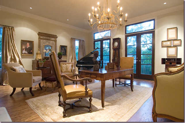
Looking at the room from the other angle, you can see how large it actually is. There is a baby grand piano in the corner – another great idea for entertaining. The front windows are left undraped while the side windows have silk curtains, probably for privacy from neighbors. If this was my client, I would have draped all the windows – and taken the curtains up to the ceiling molding – but that’s me. It looks perfectly lovely as is. What is notable here is the different furniture heights. LESSON: try to vary the height of furniture in a room, otherwise it gets rather boring. Here, the two tall French chairs, the clock, the large mirror, and piano all lend different heights to the large room, thereby creating interest.
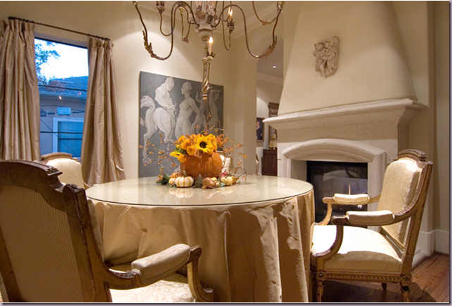
The dining room is through the double arches and shares the fireplace with the living room. Notice how both mantles are clean – just a small hanging sculpture was placed on each fireplace. I love this room with its gilded wooded chandelier and silk skirted table. The chairs are gorgeous. It’s simple, yet very elegant.
Past the dining room is the kitchen with it’s granite countertops and trendy stainless appliances. The bar stools are too low to be functional. LESSON: be sure when ordering bar stools that you buy the correct height – they come in two standard heights. I like the touches of texture – the window shade, the large wicker basket, the rattan seats.
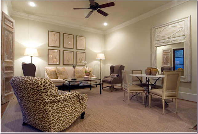
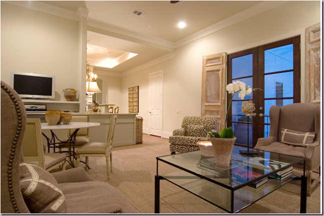
Past the kitchen is the sitting room. Here, the owner made perfect choices. First – she ordered a custom cut seagrass matting rug. Notice how closely the rug is cut to the walls. A store bought seagrass rug or an ill fitting one can ruin a room – it would be better to do without. LESSON: A properly sized seagrass rug should cover the room almost as if it was wall to wall carpeting. I love this room – to me, this is a wonderful family room. The sofa is high backed and is fashioned after an antique style. The two wing chairs with their French mouton legs are again, copies, of antiques – but they seem almost contemporary here. The classic club chair with its English saddle arms adds just enough pattern to this quiet interior. The French side chairs surround an iron based table which adds a needed texture. A large French antique mirror reflects the daylight. LESSON: Always place your mirrors where they can reflect something beautiful – an important rule to remember. The set of large botanicals are perfectly placed and hung. LESSON: place art just a few inches above the sofa. This is a good rule to follow. This helps to connect the art to the large sofa – otherwise, if pictures are hung too high above the sofa, or the buffet or the console, it looks like they are flying off into space. Remember – just a few inches above the grounding piece! Notice too the size of the prints – together the six look like one large element – the scale of the six prints to the sofa and room is perfect. Absolutely perfect! And lastly – instead of curtains, the owner has used antique doors or shutters – again, to add texture and interest.
A view from the opposite direction. Here you can see the contemporary glass coffee table – which plays off all the antique styled furniture. Notice, here the wing back chair with its beautiful nail heads, a nice way to update a classic.
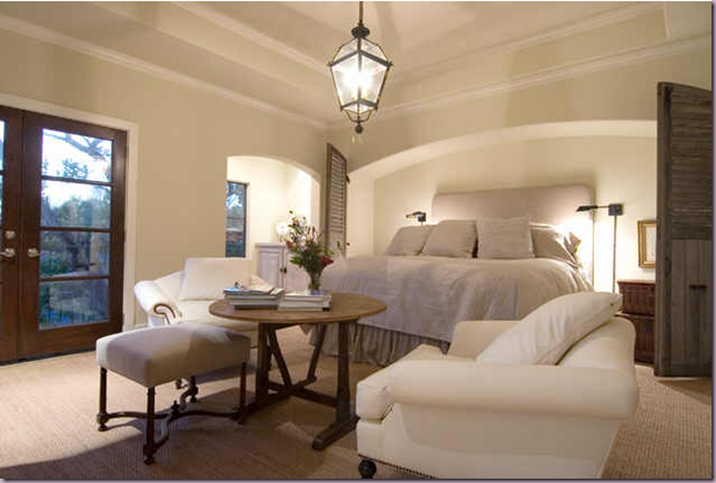
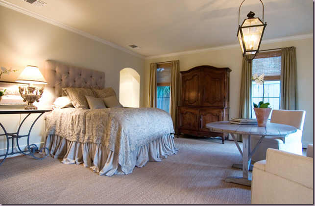
The master bedroom is divine! The architecture is wonderful – notice the low, wide arch that creates an alcove for the bed. LESSON: notice how high the bed is – it was probably placed on risers purchased from Bed, Bath and Beyond or somewhere similar. This is an excellent way to update a bedroom. Notice the two stacked baskets that double as a night table. The bedding is simple, a plain linen coverlet and pillows – no fancy trims to spoil the look. The sconces are just the right touch of “industrial” to add another texture – iron. Again, antique shutters are used to bring texture and architectural detail to the room. I love the low hanging trendy lantern over the sitting area. And notice the placement of the furniture, floating in front of the bed. I love the antique wine table, simply decorated with a few books. The chairs should probably be slipcovered in a tight cover to keep them fresh – but then you would lose the lovely nailhead detailing. LESSON: Visual Vamp came up with the perfect solution for white upholstered furniture: she purchased yards and yards of white pleather and recovered everything in it! The white pleather is a wonderful alternative to slipcovers and allows the use of trendy nailheads. In the seating area, I love how the ottoman doesn’t match the chairs, interest and texture comes from its wood frame. LESSON: notice the great wall to wall seagrass matting. It adds a wonderful, live texture and color to the room. I think this room is perfection!
To the left of the bed, is a small “breakfast” bar. LESSON: the wood has been fauxed to look like an aged piece of furniture. The iron hardware continues the deception. Wonderful, simple accessories add just enough to maintain the spare look of the room.
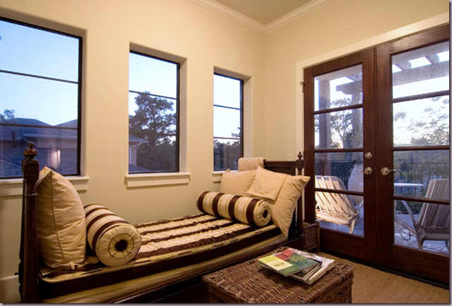
Across the bed and furniture grouping is this French antique day bed. What a luxury to have a one bed for the day and one for the night! Again, simple linen pillows are mixed with striped bolsters – this fabric is the only pattern in the room. LESSON: use a large wicker basket instead of a coffee table, side table or night table. If this was my house – I would have added curtains and shades to the windows – but again – it looks perfectly fine without. LESSON: I’m just one who believes that curtains add so much warmth and romance to a room, they should always be used!
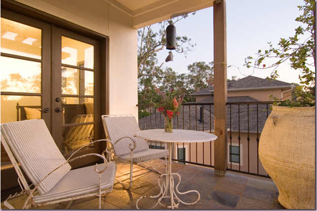
Off the master bedroom – there is a balcony – and notice how the owner chose to furnish it: using antique iron furniture instead of modern pieces. They add just the right touch of romance to this French inspired home. And I love the single, oversized French vessel! Wonderful!
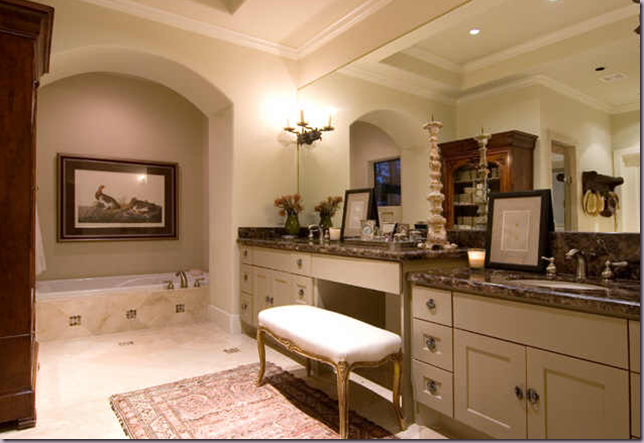
The owner brought furniture into the master bathroom to warm it up – I love the large antique bookcase used here. LESSON: bring furniture, lamps, and paintings into the bathroom to make it a more warm and livable space.
The guestroom – again, the bed is raised. Notice the wonderful dust ruffle with its hem slightly puddled. Another wine tasting table with two chairs float in the room – with another lantern over the setting. LESSON: if a look is great – why not repeat it? I think this is a great looking bedroom! Simple, quiet and elegant. The buffet a deux is gorgeous. The iron table adds just the right amount of metal in the room. The curtains are paired with woven shades – again I would have brought both the shades and the drapes up to the ceiling molding. I think this is an important point to emphasize. LESSON: if the curtains are brought up to the ceiling it creates a clean line, it adds height to the room, and it increases the size of the window by camouflaging the sheetrock above the window and below the ceiling. Personally I think curtains should always be hung that way, if possible. Again, the owner used wall to wall seagrass and I think these rooms are a wonderful example of why I stress using a textured, natural fiber for floor covering. LESSON: natural fiber carpet adds much texture and color and warmth to a room – as opposed to plain carpet! If seagrass is not an option, opt for using a flat weave, patterned carpet instead. All in all – I love this room and think the owner got it just right!
The third bedroom – it’s nice enough – we can’t all totally decorate every room! Actually – the four poster bed works great with the unusual, small windows. I think this room might double as an office.
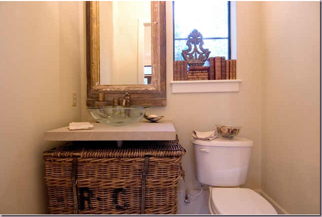
The powder room continues with the French theme found throughout. LESSON: the owner came up with a brilliant idea to hide the space under the sink counter by using the large wicker basket. I love how casual this room is. The books stacked in the window is a charming touch – as is the wonderful mirror and glass sink.
I hope you’ve enjoyed looking at this town house and getting ideas from the owner on how to achieve a French inspired home! It’s always great when you can learn from someone who understands design and knows what looks good in a home!





0 comments:
Post a Comment