Katie did – She Really Did
Most design blogs are written by people who love interior design. Few, though, are written by actual interior designers themselves – true designers who make a living from the profession. Those few standout designers who do write blogs bring a unique quality to the world of the design blogosphere. Instead of posting endless pictures of other people’s work – they are able to show images of their own design, and thus, explain the process to us – help us understand how they came up with the design, what was their inspiration, what were their sources, and how we can emulate their design in our own homes.
 The beautiful Katie, captured by Gina Silvernale for 1st Dibs
Katiedid is one such interior designer blogger. We both started out about the same time and became email buds along the way. Katie Denham, aka Katiedid, is endlessly talented – a fact her readers have gleaned from the occasional pictures she has shown of her own home’s remodeling. A few months ago, she took her readers through the process of her c0mplete kitchen make-over and the results were stunning. The final reveal pictures of her kitchen and butler’s pantry belong in the best design magazine out there. There have been other snapshots of her wonderful turn-of-the-century house in Sacramento that she shares with her husband and two daughters: pictures of vignettes in her entry way, her living room, her daughters’ rooms, the landscaping. All have provoked a feeling of longing to see more of her work. Up until now though, Katie has been reluctant to let her readers view her professional work – you see, she works for a large interior design firm and there are bosses and privacy issues, etc. Until now, that is. Until the Cosmo Cafe.
Recently, Katie casually revealed a party she attended of a newly opened restaurant in her home town - the Cosmo Cafe. She quietly mentioned that she actually was a senior designer on the project. I was floored. This project was huge – it was very impressive. Very. Katie has been keeping quite a secret from her readers – the secret of her talent. Katie is too humble to brag about her talent, so I’m going to do it for her. Let me tell you - if I had designed this restaurant, I’d be bragging about it for months!!!!! As an interior designer myself, I look at the pictures of the Cosmo Cafe in total awe and admiration. Interior Design like this is not easy to do, people, trust me! I am so happy for Katie – I could burst! So, enjoy these pictures of the Cosmo Cafe, and be sure to check out her blog where she talks about the project in more depth, here and here.
Congratulations Katie! You deserve it!!!
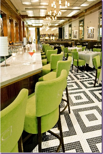
The Cosmo Cafe – with its distinctive black and white mosaic tiled floor and chartreuse upholstery.
The front waiting area - pedigreed contemporary furniture. I love that banquette!
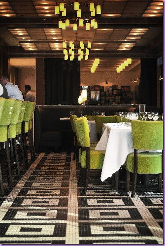
Another shot of the dining room, with its classic white table cloths.
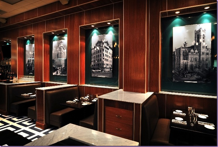
The Cosmo Cafe is located in d0wntown Sacramento in a restored building. The blown up historical pictures in the booths’ niches reflect it’s storied past.
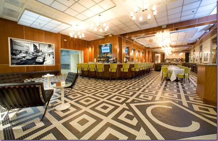
A wide shot of the restaurant with its distinctive lighting and floor. Notice the large C in the entry way’s floor. Also notice the beautiful wood walls that play against the contemporary feel of the restaurant. Ying and Yang. Just beautiful!
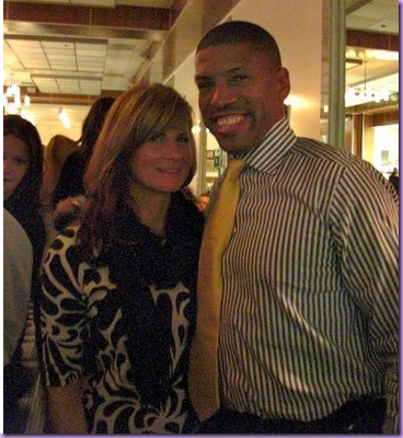
At the opening night party at the Cosmo Cafe, Katie posed with Kevin Johnson, the former NBA player who was just elected Mayor of Sacramento!
Another picture from the opening night party – check out the red-soled Louboutin shoes! Too funny!
![[3.jpg]](https://blogger.googleusercontent.com/img/b/R29vZ2xl/AVvXsEjTlwm0BUNjgOGS39quYcr2d0e-GY1s7mCnSYxHjrZwf2wSlnw7t9VRtVL3k7vC7Ml-ByvO1wusYRetMUaZUjrvIfYyVszV8IISQrHHBOS7ZPq3cxtj4WgvND8NjQmKAx3PpAasLNwUOFI/s1600/3.jpg)
Katie’s house: Katie changes the decor of this console with the season. Here, she styled it for Christmas with a unique, lighted Empire State Building, candles and antique books.
![[flowers.jpg]](https://blogger.googleusercontent.com/img/b/R29vZ2xl/AVvXsEhftSYKbEJ4UtJjSVGF7RIv7929v-d0OvNx03gbqxw9HwknRLCuUIrBod3tZjAunfU2E3WHan22WSZCClbiFomVZ5cNA3n7NV5EP3lLPihcBURPR38a7WBzVtoqekWGT1_AzN0TUmMFPzw/s1600/flowers.jpg)
Here, Katie styled the console with branches and shells.
![[front+table3.jpg]](https://blogger.googleusercontent.com/img/b/R29vZ2xl/AVvXsEjR8FMYN6tUkMjpJqwZrzQRQtcVH1N0uKsBuhKxzYcM6arkQSxFVOkIOY_XGWP_Vbzd1Wb0YSXLJWKhDDp9avj-Ij-PHbpgCh-uddhwfeTvcYNrmfj7iuH4KFF4J_ngCCTTJGldFtfXqqE/s1600/front+table3.jpg)
And here – for fall, grasses and pumpkins!
![[Mine.jpg]](https://blogger.googleusercontent.com/img/b/R29vZ2xl/AVvXsEhEkC90kiLdarGaZwmkbN3dtMO7mGBJXKRqHUu_WmwemixPe4WCDiuV5Wy_ItpZfz3547G-qna4qz4upb31j29fgBrutcBtYqZ5DX25dx1tKEHBgFyVwdKkdGVlSMX1r2hOjr_2bcQEnnjK/s1600/Mine.jpg)
Katie lives in a beautiful turn-of-the-century home that she has been remodeling. Here is picture of her living room. I love her styling skills – notice the coffee table – how perfectly it is arranged. Underneath, a cowhide rug accents the area.
![[tablescape.jpg]](https://blogger.googleusercontent.com/img/b/R29vZ2xl/AVvXsEiEF6S89s0_O8fh6TlcutqdVvNJHefEkCRhyphenhyphenB6pJKT9duw9zqQZFDy_uEWRH3rvDYRA7Br9LS033peeJAN6yWN1KSJhQY-EihcSpzKrySjDv5JLRwzzC0OlcYY1LEQYgdpXlgm3EonjO7Ka/s1600/tablescape.jpg)
And, again, a perfect vignette, styled for summer with cool colors.
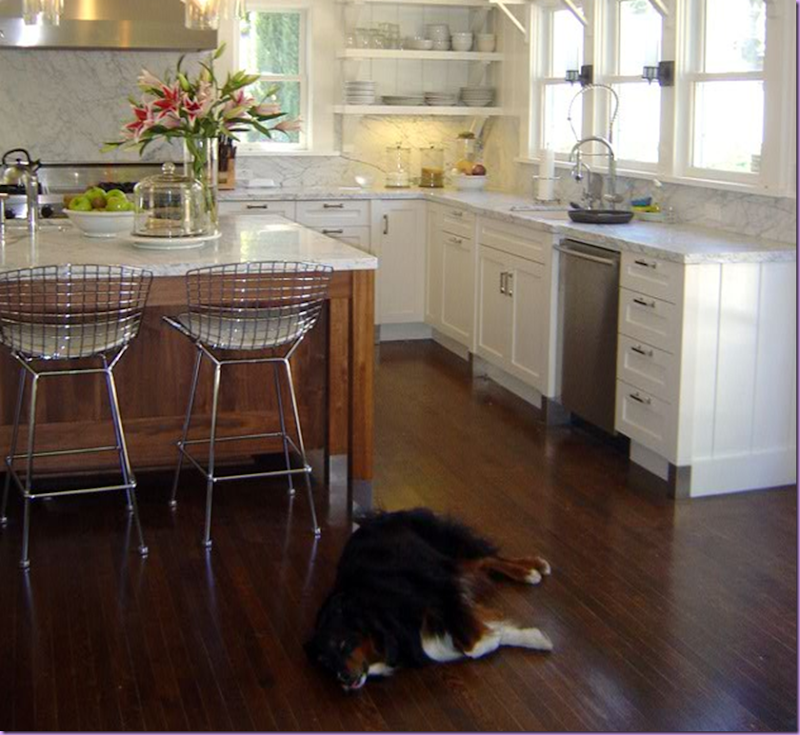
Katie’s recently finished kitchen. Isn’t this stunning? I love the contemporary chairs juxtaposed against the traditional design of the kitchen. Notice, too, that the island is stained wood which creates further interest and brings warmth to the design. The Carrara marble countertops and backsplash is so gorgeous. Love Conner the dog, too!
![[Hall2.jpg]](https://blogger.googleusercontent.com/img/b/R29vZ2xl/AVvXsEhStgJYf4NWD2WzftXDbBK8BpErky3iDVWs28qovI_48ay979yY3M6uVFnKQksAWZDaWzqWr0QX9NPlN2QRiS1rzVdr96cQdUyyCjgGnfjgoHx8q6yAq94XpXWKEHoUSmZ3JAtRXf5fP3YJ/s1600/Hall2.jpg)
The Butler’s Pantry is off the kitchen. Again, the style of it matches the era of the house, yet the contemporary lighting fixtures and mirrors bring it up to today.
![[Kitchen.jpg]](https://blogger.googleusercontent.com/img/b/R29vZ2xl/AVvXsEhyY_0RoxzKNRP7S654Ro1BQQhe-IRGPzKlyNAqaXmbCYujkYRJpvTUPTiZK6RRFaWKeQ0V6gcd8hCpFnXUflpupzHZCmRFSyNf5cyex8OkStyaP36PUQq_SSJOiRMI3C2GwC4OWiMBDdQ/s1600/Kitchen.jpg)
Lest you question exactly how extensive Katie’s kitchen transformation was – here is how it all started – gutted to the studs, as they say!
![[Stove+Wall.jpg]](https://blogger.googleusercontent.com/img/b/R29vZ2xl/AVvXsEhAT0kmITuMnMhDSAHwJhOkXf5MmNMlie8VYFqVXe2-5waT31HmCoT7f09pRQdYQTeE-ss6L7E3ej0kQILsjHtV3cE9Mhj4f96T2ueKeVsDSJFk0HOLyQ5iLX0AHWWnaFY70oZ77xnpUsQ/s1600/Stove+Wall.jpg)
And just to show Katie’s not a one kitchen wonder, years and years ago, in her first house, she installed another “new” kitchen, again keeping it original in feel to the age of the house. Notice how she updated her vintage range with a custom hood – at great expense, no doubt. The hood is stunning.
![[Sink+Wall.jpg]](https://blogger.googleusercontent.com/img/b/R29vZ2xl/AVvXsEg2eGDX4-p8EdGu7A9CoffHitKW4meo6_pCDkShb7s0TeQMsEWvEVgMqEzJVwzQQnl0hCGL5U4SVHFtqTONbuDS1e2xBY5kcm04A7_oqVl56nFFf-sdPOX7AZ-mRb7K1d2NIED8IuW5uVg/s1600/Sink+Wall.jpg)
And another shot of her earlier kitchen from years ago. Actually, this looks quite current to me. I love the black and white color scheme with yellow accents. Katie was ahead of her time – notice she used subway tile way back then – probably just as it was starting to gain popularity. Great job Katie, as usual!
I hope you’ve enjoyed pictures of Katie’s restaurant design and her house remodel. Be sure to check out her blog, Katiedid here. And, Katie was recently honored with a profile on 1st Dibs’ Blogosphere Series. Read it: here.




0 comments:
Post a Comment