Jeffrey Bilhuber – Lessons in Designing
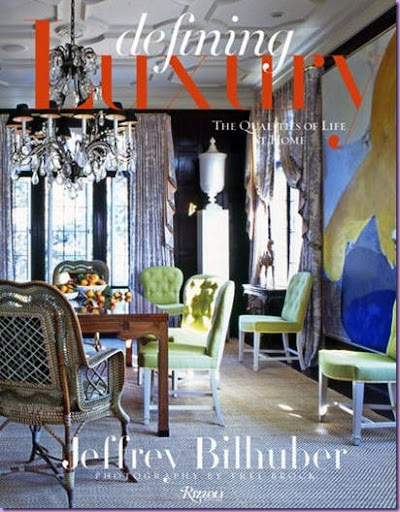
Jeffrey Bilhuber's newest book, Defining Luxury, has just been released and it is a stunner. A bold cacophony of color and prints - there is nothing expected or ordinary in these pages. The book is a complete surprise. The pictures are lush, huge, detailed - and stunningly beautiful. The photography alone is worth the price of the book. It's a bible of design and it sets Bilhuber apart, finally. There is a youthful exuberance to each interior. There is so much to study in this book, so much to learn from it, to take away, and to expand on. You can read through it once and start over again and discover a multitude of details missed on the first go round. The layering, the flourishes, the embellishments of his designs all come together somehow, yet taken apart it's a mystery how it all works together. Bilhuber can mix prints and colors in a way that no one else can or does. The book is not recommended for the designer without an open mind. One needs to realize this is a textbook on how to do it right, correctly, beautifully and completely. There is not a trim out of place, not an accessory askew - it's perfection!
Throughout Defining Luxury, Bilhuber is a teacher. He is the professor here, lecturing on how great interior design happens. Each page shows how design should be done. There are things to learn here, to digest, to study and then to utilize. Even if your aesthetic doesn't match Bilhuber's you can still pick and choose from his examples and apply it to your own designs. The workmanship that goes into each of his interiors is outstanding. The craftsmanship is first rate. If you take only one thing away from Bilhuber - it is that second best doesn't cut it.
Note: some of these pictures are from the new book, some are not. They are Bilhuber's interiors that speak to me on one level or another.
Did I say color? Bilhuber can do monochromatic with the best of them. What he does do in each room - is gorgeous upholstery. Bilhuber's upholstery pieces are expertly constructed. He spends Saturdays in the workroom with his furniture craftsmen - making sure that there are no mistakes, that the fabric is put on the frame exactly to his standards, that the seams are straight and the cushions are just right. His intimate involvement in this process pays off. I dare say he is the only designer in the business who spends his Saturdays this way.
Lesson: Custom made furniture should always be considered when available. Pottery Barn does not do tufting like this.
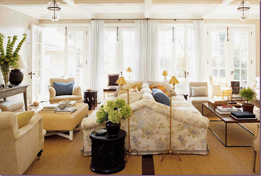
A personal favorite of Bilhuber's interiors. Again, the upholstery steals the show. A large double sided sofa divides the room into two seating areas. Lighting is always an issue with this type of sofa because side tables can be awkward. Bilhuber solves the problem with four identical reading lamps. Bilhuber always makes unique choices whenever he can: here, in order to bring focus on the middle part of the room, he chose to cover only the two middle windows instead of the four. If all had been draped, the focal point would have been the back wall, instead, the drapery brings the eye back into the space, nicely framing the center sofa. Notice also how he chose to put two seagrass rugs in the room instead of one - the visual line of wood between the rugs, subtly breaks up the large mass of sofa. His color choices are always interesting: the linen fabric on the sofa is very muted. Other upholstered pieces are in the wheat color found in the print. The blue on the pillows pick up the bit of dark blue in the linen and pops the room, making it more interesting.
Lesson: Find the focal point of the room and play it up.
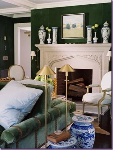
Another double sided sofa. The beauty of this room lies in the color choice of blue, green, and white (with accents of yellow not shown in the picture!) Bilhuber prefers unusual color combinations. Here, he pairs deep forest green with an icy, light blue. Notice how he places the trim on the sofa's arms, creating interest where there was none. Repetition of the placement of the sofa's trim is repeated in the repetition of the blue and white garden seats, the two reading lights, and the objects on the fireplace.
Lesson: Repetition is a design element when used effectively.
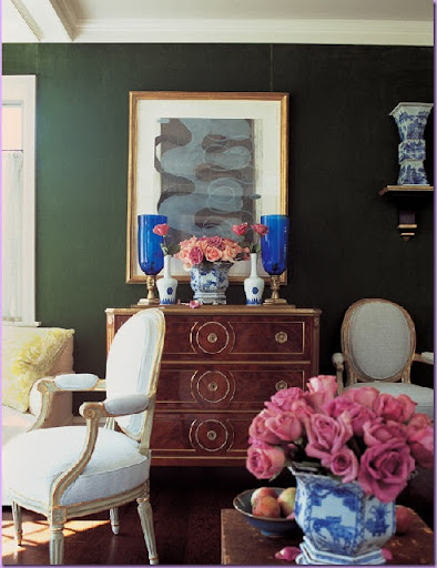
The same room - this chest is one of two in the room. Again, the repetition. Notice here the French chairs that Bilhuber has placed around the room. These are not antiques, they are reproductions, but they are reproductions of the highest quality. Notice how the lines of the painted chairs are gilded. Period antiques are rare, very pricey and scaled rather small for today's larger man.
Lesson: Reproductions have their place, especially when the man of the house is large!
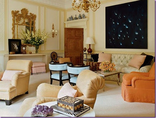
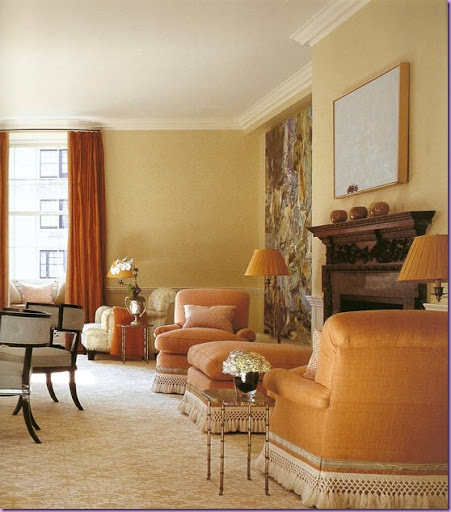
This apartment shows Bilhuber's adeptness with color. His choice of color is unusual and unexpected, yet pleasing and exciting at the same time. He mixes light peach with dark apricot, pink and icy blue. Since there is no pattern on the chairs, the color itself becomes the focus. The ice blue of the barrel back chairs pops against all the orange. On the sofa he places both dark and light pillows for further contrast. Notice the perfection of his upholstery: in the two front chairs - the fabric is expertly gathered in folds at the arms and on the back. The modern art work is unexpected in this setting, yet it is just this unexpectedness that keeps the eye engaged.
Lesson: Using the same color in light and dark shades is an interesting choice.
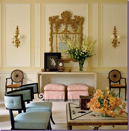
The same room, showing yet another pastel color Bilhuber brought into the room: pink. Notice the different styles of furniture used from contemporary to classic. This mix is what makes the room interesting and livable.
Lesson: Don't be afraid to mix different furniture styles.
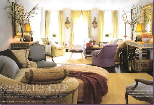
In this urban apartment, Bilhuber uses two seating groups to break up the large room. In between the two groups are a pair of painted consoles, facing each other. Notice how the center curtains are hung differently, again, to break up the expanse and create interest and movement. See how Bilhuber uses decorative trim on the curved sofa back - highly unusual. Pastel greens and blues are harmonious, but it the one piece of amethyst upholstery to pops the room and catches the eye.
Lesson: One odd color in a sea of like colors is highly effective.
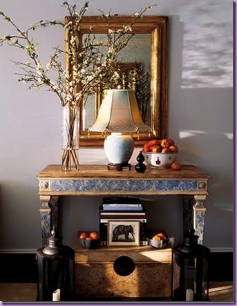
The same room with a close up of the room dividing console. The lamp is placed in an unusual position, right in front of the mirror. Underneath the console, the "dead space" is taken up with a box. I love the two lanterns.
Lesson: Arrange accessories until you find a pleasing arrangement, regardless of if it's traditional or not.
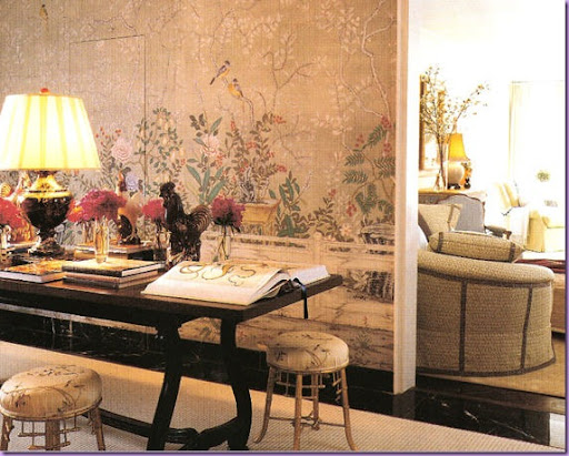
In the next room, Bilhuber wallpapered the room in de Gournay hand painted wallpaper. The dining room table does double duty as a library table. Bilhuber uses de Gournay wallpaper frequently and with good reason, it is stunningly beautiful.
Lesson: Dining room tables make great library tables, the large surface allows the reader to spread out with books and papers.
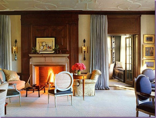
In this home, Bilhuber again uses one color - in two different shades: light and dark blue. To soften the expanse of wood paneling, he has hung icy blue portieres that flank both sides of the fireplace.
Lesson: Curtains hanging in doorways is a pleasant and unusual way to soften hard edges.
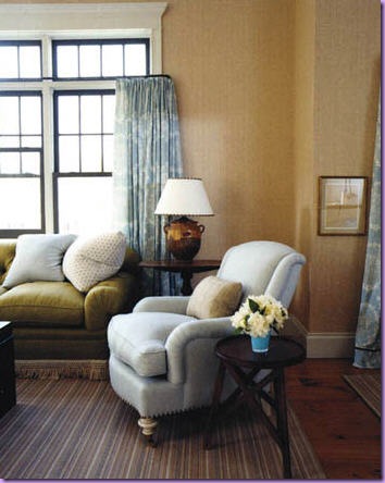
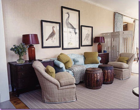
In a Bedford, New York home, a large living space is divided into different seating areas. In this section, olive green fabric covers the sofa. The green is mixed with blue - another rather unusual color combination. The walls are wallpapered in a grasscloth that adds yet another color to the mix.
Lesson: Don't be afraid to mix "odd" shades of green with blue.
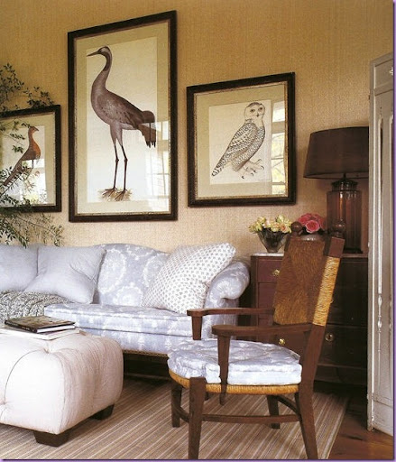
In another section of the same room above, Bilhuber adds the color of deep red to the olive green pillows, blue, and tweed. Notice the chairs - the hem's trim is the blue of the sofa - tying the two desperate colors together. In this home as in the previous home, Bilhuber uses portieres to divide rooms.
Lesson: Use trim to tie together fabrics when there isn't another connection.
The same area styled differently. The art work here was purchased by Bilhuber which is usually not the case. He prefers the art work not to be a part of the decorating process, but something that the owners pick out themselves.
Lesson: Art work is a highly personal and it's purchasing is best left to the owners, unless they request the designer chose the art work himself.
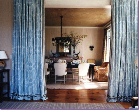
The same room showing the curtains separating the dining room and the living room. The curtain fabric is the same fabric that is on the sofa.
Lesson: When one fabric is used for curtains, repeat the fabric somewhere else in the room.
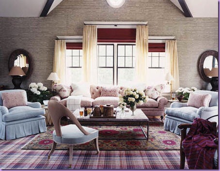
The same home: the large family room is decorated in reds and blues. The blue ties the room to the previously seen living area. A study in symmetry, the two round mirrors with matching lamps balance the large window. Rather than just hang curtains, Bilhuber took this opportunity to infuse the wall with red through the shade's fabric.
Lesson: in a large home, using the same colors from room to room creates a cohesiveness and flexibility.
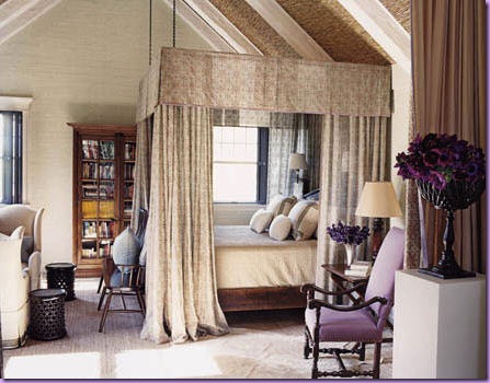
The same house, master bedroom. Portieres again divide this room (seen on the far right.) The room is monochromatic, save for the lavender covered chair! Notice how Bilhuber uses textured wallpaper on the ceiling between the beams.
Lesson: Ceilings should not be ignored. They are a huge surface area and should not just be left to their own devices.
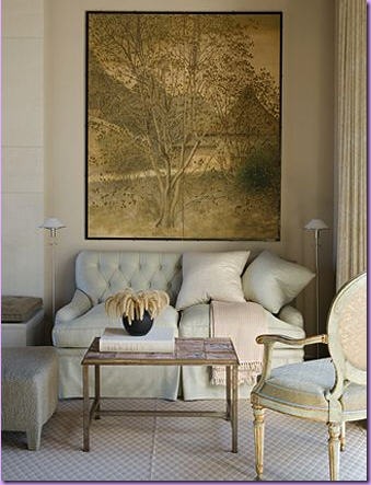
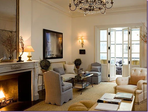
White walls form the backdrop for this living room. The slipper chairs wear a light blue, which is picked up in the pillows. It is always the details that set Bilhuber apart. Notice the slipper chairs' hem - upholstered scallops. A seemingly simple detail, yet very difficult to execute, requiring expert upholsterers. On the side chair with the beautiful tufting, notice how Bilhuber runs the tape - along the hem and up the front and side of the bottom cushion. The trim's color picks up the color of the seagrass matting. The crystal chandelier is placed low enough to be reflected in the mirror.
Lesson: Details, like scallops and trim require expert upholsterers and the designer's watchful eye.
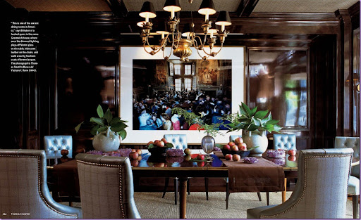
This dining room is one of Bilhuber's favorites - he considers it "sexy." The difference here between this and other paneled rooms is the paint job. The walls are lacquered, a process that involves over 14 coats of paint. As you can see, it is well worth the trouble. But, lacquering is not a job for a run of the mill painter. It requires a skilled artisan to pull it off correctly. Again, this is a detail that requires expert craftsmanship - which sets Bilhuber's interiors apart. Bilhuber always goes the extra mile to incorporate a myriad of details, a clear sign of a top rate interior designer. The brown lacquered dining room is cooled by the icy blue leather chairs. Notice how the chair backs are upholstered in a contemporary check, held in place with upholstery tacks or nailheads. The light rug is the perfect color to lighten up the room -- in fact, the room doesn't appear dark at all given the light colored upholstery fabrics and rug.
Lesson: Consider lacquering wood as opposed to painting it, but only if you have the qualified craftsmen.
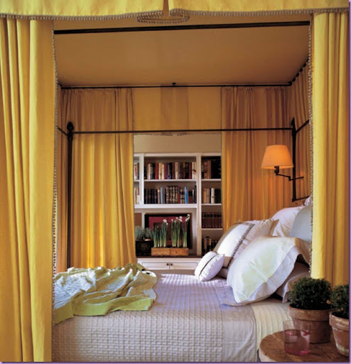
In this guest room, a canopy bed hung with bright yellow fabric creates a room within a room. In a large or oversized room, a canopy bed should be a serious consideration. The cocoon effect of the canopy brings an oversized room down to a more human scale.
Lesson: Use canopy beds in large, overscaled bedrooms.
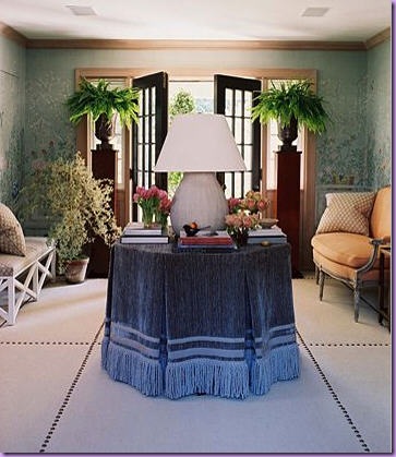
Nailheads again play a major role in this entry hall. Beautiful hand painted de Gournay wallpaper covers the walls. The center table is skirted, but rather than leave the fabric alone, Bilhuber adds tape in two sizes and fringe - creating interest and movement. On the left is a casual bench, juxtaposed on the right by a dressy French settee. The blue and peach is taken from colors in the wallpaper. The focal point of the room though, without a doubt, is from the oversized lamp - an highly unusual detail.
Lesson: Nailheads can be used for decorating walls and floors, not just furniture.
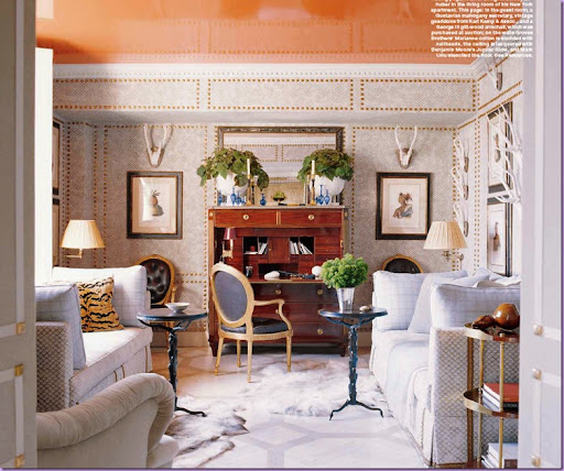
Bilhuber's home: another exercise in nailheads. This time they take the place of moldings on the wall. Matching nailheads are added to the chairs. Notice the painted wood floor. But the most spectacular part of the room is the apricot lacquered ceiling. Amazing!
Lesson: Instead of picture moldings, experiment with nailheads.
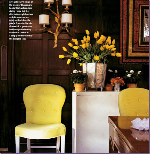
Modern furniture plays against the traditional wood paneling. Bright yellow upholstery is the unexpected touch here.
Lesson: Don't be afraid to mix modern furniture in a room with traditional architecture.
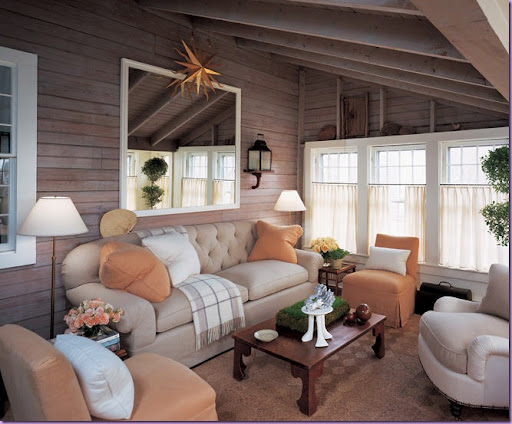
Bilhuber's former summer house on Nantucket. Notice the pillows he uses here and in all his interiors. They are always oversized, 22 to 24 inches. He rarely uses trim around the edges, only a small welt or no welt at all. Pillows that are too small do not pack the same punch as the larger size, especially when the pillows are being used to introduce a color or a pattern.
Lesson: Keep pillows big, 22 to 24 inches is a good size.
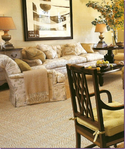
This beautiful living room is rather large. Notice the expertly upholstered furniture. The pillows are large and inviting. Bilhuber uses two mismatched tables here. The large, creamy rug keeps the room light and airy. Dreamy.
Lesson: Mismatched end tables always add more interest than matching tables. Matching lamps though are usually preferred.
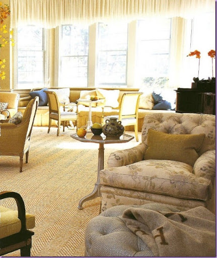
The other side of the above living room. A large banquette with pops of deep blue colored pillows, sits under the window. Rather than use long curtains, Bilhuber chose to use a frilly valance, as always, an unusual choice. Close up view of his expertly designed and executed upholstered chairs. The tufted backs always add an extra detailing as opposed to a plain back.
Lesson: Think outside the box when considering window treatments. Curtains aren't always the only option.
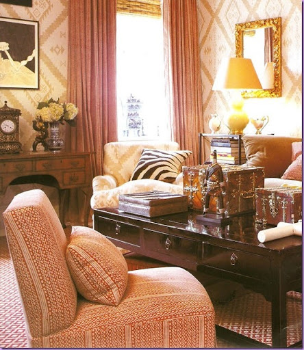
A bold mix of patterns, one on the walls and chair, another on the slipper chair, and a third pattern on the floor, all blend together rather than fight each other. Even the zebra pillow seems to fit in. Despite all the busy patterns, the room is actually soothing and cozy, a perfect place for watching TV or reading.
Lesson: Don't be afraid to mix patterns. Sometimes the more the merrier.
This large room is quintessential Bilhuber. A large blue and white print on the sofa mixes with oranges and wheat colors in this living room. Large contemporary art work covers the walls despite the traditional decor of the room. This room is masterful.
Lesson: Hire Bilhuber, if you can afford it! No one does it better!
Across from the sofa - two ice blue barrel back chairs and two orange linen covered arms chairs with ottoman. The armchairs are decorated with tape and fringe in a cream color that picks up the colors in the patterned rug. Across from the window with the orange curtains, are two armchairs covered in the same blue and white fabric as the sofa.
Lesson: If you can't afford Bilhuber, hire Thom Filicia. He trained under Bilhuber.
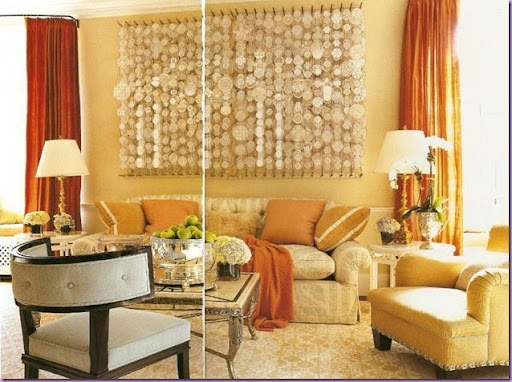
Sorry for the poor scan - but this shows the main wall with the blue and white sofa, orange pillows, blue barrel back chairs and curtains in a deeper shade of orange. The walls are just the lightest shade of orange possible. These three shades of orange all blend together and are set off perfectly by the blues.
Lesson: Using three shades of the same color is a great unifying element of a room.
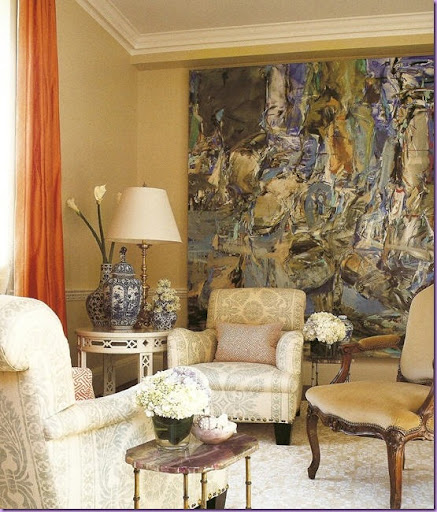
A close up of the living room pictured above showing the two chairs at the back in front of the curtains. Again, admire the beautiful craftsmanship of the chairs - the arms are especially wonderful. I particularly love the overscaled blue and white damask print - a perfect foil for all the plain oranges and apricots fabric.
Lesson: Blue is the perfect accent color to oranges. The coolness of the color tones down the brightness of the orange.
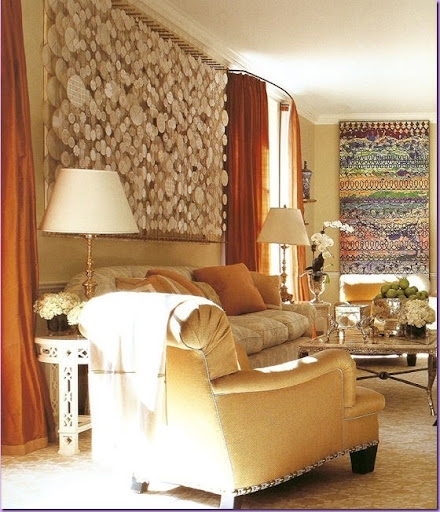
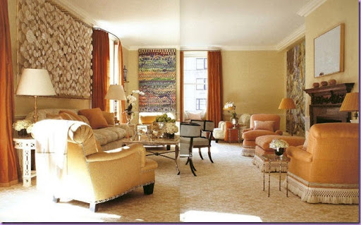
Another poor scan! But here you can see the room in it's entirety. The darker curtains are just the right punch to all the more toned down shades of apricot. Be sure to notice the custom hand made lampshades on the right.
Lesson: Custom lampshades made out of fabric used in the room is a detail that shows an interior designer who goes the extra mile for his client.
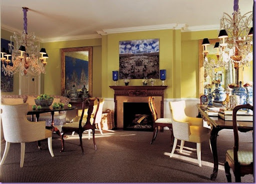
A large dining room with two tables. Usually when two tables are used in a room, both tables are identical. As always, going against the grain, against the expected, Bilhuber uses a round table with a banquette on the left and a large rectangular table on the right. The chairs are two different sets that are mixed and matched at the tables. The two chandelier are identical. The colors here are riotous and are not at all what would be expected in a formal dining room. As always, the unexpected choice is the choice Bilhuber makes.
Lesson: Use unusual colors in more formal rooms to make them more livable and youthful.
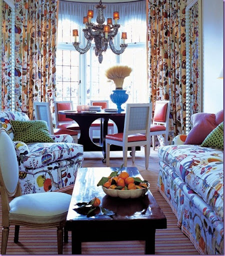
And finally, Bilhuber chose one exuberant print throughout this room. A wonderful family space, the lively print is fun and youthful. Notice that the leather clad dining room chairs wear a check on the back for an added element of interest. Notice too the tape on the hem of the upholstered furniture ties them to the striped rug. A small scaled chair pulls up to the coffee table.
Lesson: One special printed fabric sometimes works best when used throughout the room.
I hope you've enjoyed learning about Jeffrey Bilhuber and will take with you the lessons that his designs teach. His new book, Defining Luxury, is available from Amazon here. Be sure to visit his web site for more images, here. And to see and hear Bilhuber interviewed on design by the great Charlie Rose, click here.


0 comments:
Post a Comment