My Virtual Beach House
All this talk about beach houses and Galveston and hurricanes and linen slipcovers has really got me thinking. How would I, an interior designer, (or interior decorator if ASID is listening!) design my own beach house? The problem is, as I've told you before, I love two different styles of designs - cluttered and sparse. While, the cluttered look has won out at home, would I be able to decorate a beach house with a clean, spare vibe? Even playing around with a virtual beach house design, I can't seem to commit to one or the other style. So, I've put together two looks for a beach house that if I was buying one, this is how it might look. Vote in the comment section for the look you like best.
Look #1 - The Cluttered Beach House:
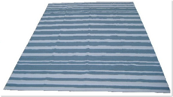
For House #1 - I would use a blue and white striped dhurri as the starting off point. The floors would be dark hardwoods, the walls a light grayish white.
The sofa would be clean lined, slipcovered in white linen, of course!

The two side chairs will be these English inspired, ikat covered ones from Suzanne Rheinstein.
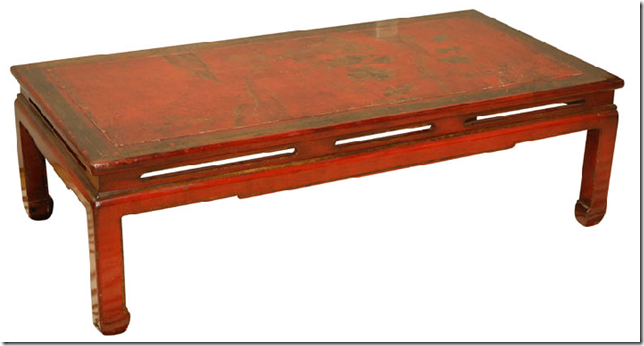
This red chinoiserie table is the coffee table.
Across from the sofa would be these two bobbin chairs.
In between the two chairs will be this antique wine cooler table - perfect to cool down a bottle after a summer day.

The curtains would be made of this Bennison Fabric as would the pillows on the sofa.

And more pillows by Bennison.
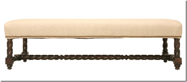
This bench would go under the windows, covered in the Rheinstein Ikat.

The open bar: this Spanish table would be piled high with liquor bottles and glasses, silver trays and ice buckets.
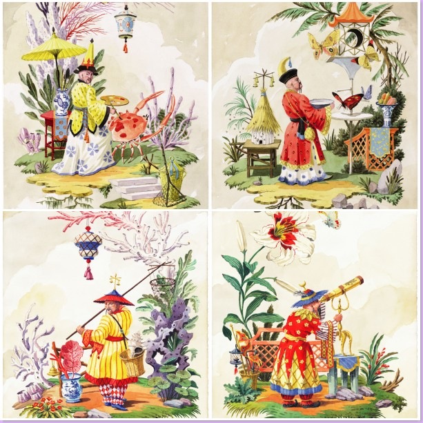
This delightful set of 4 watercolors from the Chinoiserie series are the work of the wonderful artist Harrison Howard. These would go above the bar/Spanish console. To see more of Mr. Howard's work, please be sure to visit his web site!!
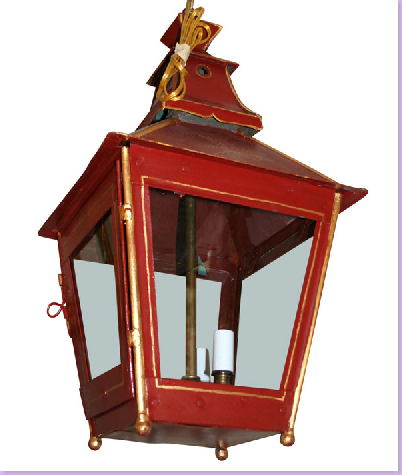
This lantern from 1st Dibs would hang over the living room.
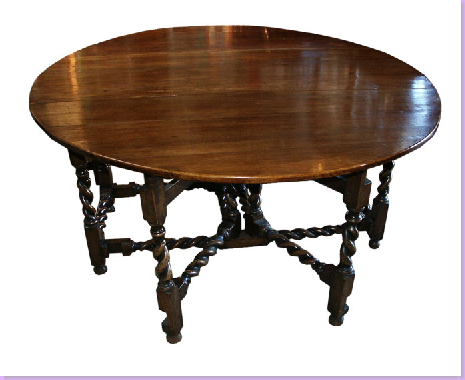
A gateleg table for cards.
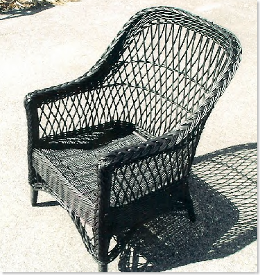
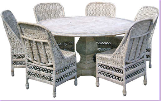
Surrounded by these wicker chairs.
This huge bookcase would be filled with books and globes and blue and white porcelains.
Tons of blue and white everywhere!
And a collection of old globes.
And books.
An antique clock for the wall.
Tortoise shells and boxes everywhere - on the walls and on tabletops.
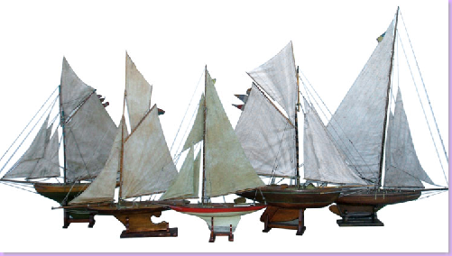
This collection of boats would go on top of the bookcase.
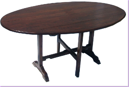
The dining table would be this large antique French wine tasting table.
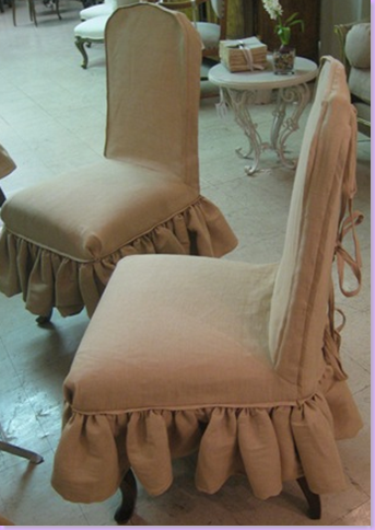
With chairs slipcovered like this all the way around it, in the ikat fabric.
A round bullseye mirror next to the table.
Another lantern for the over the dining room table.
Look #2 - The Uncluttered Beach house
The aqua and white dhurri will be the starting point here - walls light aqua, floors painted white.
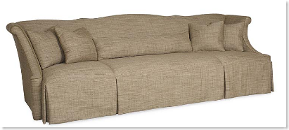
This large Bobby McAlpine sofa - slipcovered in white linen.

Over the sofa - a starburst mirror.
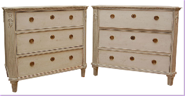
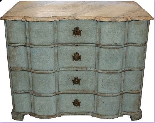
Flanking the sofa, these two Swedish chests.
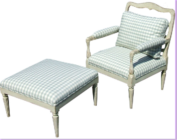
Two Chelsea Editions chairs and ottoman across from the sofa.
Between the two chairs -19th c. Painted Refraichissoir
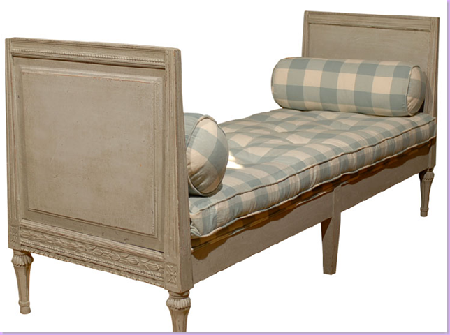
Under the window- a Swedish day bed in check fabric.
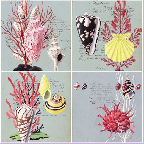
These four prints from Harrison Howard, two on each side of the armoire below. See his web site for more of his fabulous work!
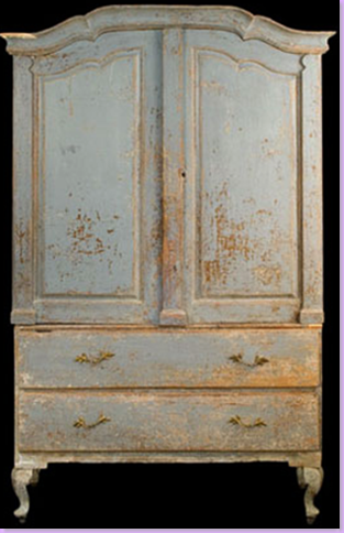
Holding the TV - Swedish armoire.
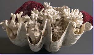
Shells, everywhere.
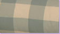
Big Checks for the pillows, upholstery.
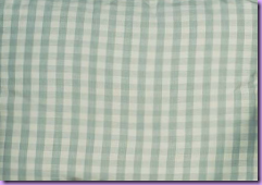
Small Checks: curtains, pillows, slipcovers.
Chest to double as the bar.
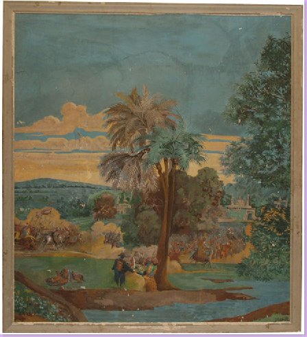
Old cartoon - over the chest above.
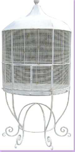
Antique bird cage.
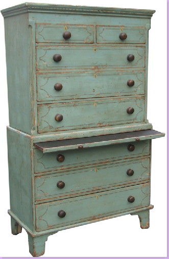
A painted chest over chest in the living area.
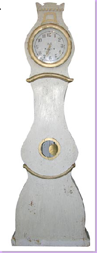
A Mora clock, of course!
The game table, white washed table with wicker chairs.
Sconces - gorgeous, from 1st Dibs.

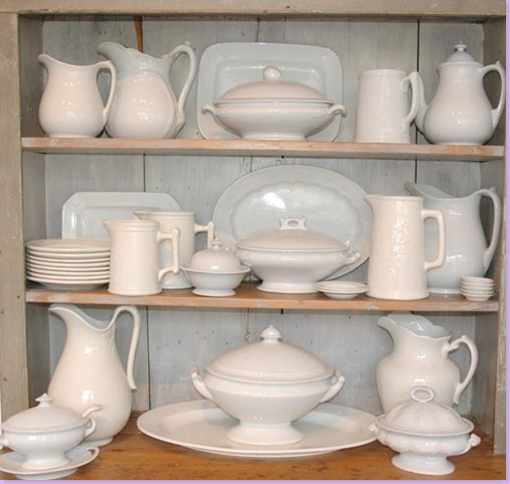
In the dining room, a Swedish cabinet filled with white ironstone.
For the dining room cabinet - white ironstone or creamware - depending on the budget!
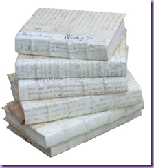
Mix white books with ironstone.
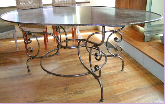
Steel dining room table.
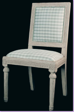
Swedish Chairs, in check, Chelsea Editions.
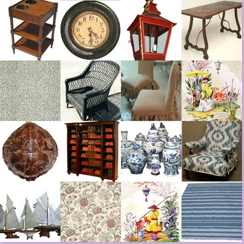
Which look do you prefer, the English influenced cluttered look recapped below:
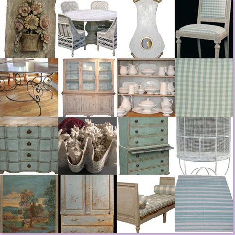
Or the spare, Swedish inspired, clean, white and aqua look?














0 comments:
Post a Comment