James Radin - Something Gotta Give Designer

James Radin designed kitchen, styled after the Something's Gotta Give kitchen
James Radin, the interior designer from Los Angeles is credited at the end of Something's Gotta Give with a "Thanks." There is no hint given of what he did to deserve the thanks, but savvy viewers in the know are aware of Radin's unique contribution to the movie - he is Nancy Meyers' ( the writer and director ) personal interior designer. While Jon Hutman is listed as Production Designer and Beth Rubino is in charge of Set Decoration, it is Beth who has been truly credited with the house's design. What was Radin's role in the house's design? Apparently, Meyers so loves her own home and it's designer that she asked Radin to help out the production team. The big question and one that will probably never be fully answered is who truly designed the Hamptons House? Who came up with the interiors of the Hamptons House? In this article in House Beautiful, here is how Radin described his contribution:
DONNA PAUL: You've designed houses in two hit movies by director Nancy Meyers, Something's Gotta Give and The Holiday. Are you a set designer or an interior designer who also does sets?
JAMES RADIN: I'm an interior designer. I designed Nancy's own house, and she asked me to help the production design team with Diane Keaton's house in Something's Gotta Give. She wanted it to look professionally decorated, like Diane's character would have had.
So, at this point, it doesn't sound like Radin is the mastermind behind Hamptons House (and the house from the movie, The Holiday, too - which I will discuss at another time.) But, the question of who really designed the house becomes even more puzzling when you take a look at Radin's web site. In his portfolio, which is not especially large, he shows photos from both the Something's Gotta Give AND The Holiday house. So, by putting pictures of these two movie houses in his portfolio, does this not officially put the question of who is the true designer of the Hamptons House to rest? Is James Radin the true designer of the beautiful Hamptons House, with its blue and white dhurri, its slipcovered sofa, the dark wood furniture, the beautiful slipcovered chairs in the dining room, the ironstone collection, the gorgeous farm kitchen with the black soapstone counters, and the peaceful cream bedroom with its soft, muted tones? If Radin is NOT the true designer of the Hamptons House, should the house be in his portfolio? And if he is the true designer, of the Hamptons House - doesn't he deserve more than just a "thanks" on the credits? How does Beth Rubino feel about the Hamptons House and The Holiday house showing up in Radin's portfolio?
Judging from his web site, Radin's work is truly reminiscent of the Something's Gotta Give house. You can see the similarities in his other work in his portfolio. Regardless of who is the true mastermind behind the SGG house, Radin is a true talent - he has a fresh, youthful look which is always calming and serene by his choice of colors. Radin likes to use dark wood furniture, light upholstery fabrics, cushy, down filled sofas and chairs, and rattan and wicker accent pieces. Again, he uses no dark colors, no velvets or silks, or chenille's (thank God!!) - Radin has a "look" which he stays true to, despite the architecture of the home.
While we may never know who is the true brainchild behind the Something's Gotta Give house, one thing is certain though, Radin's name is forever tied to the home. And even more so now since the house is included in his portfolio. Judging from the overwhelming popularity of the SGG house, this will be very, very good for his business longevity.
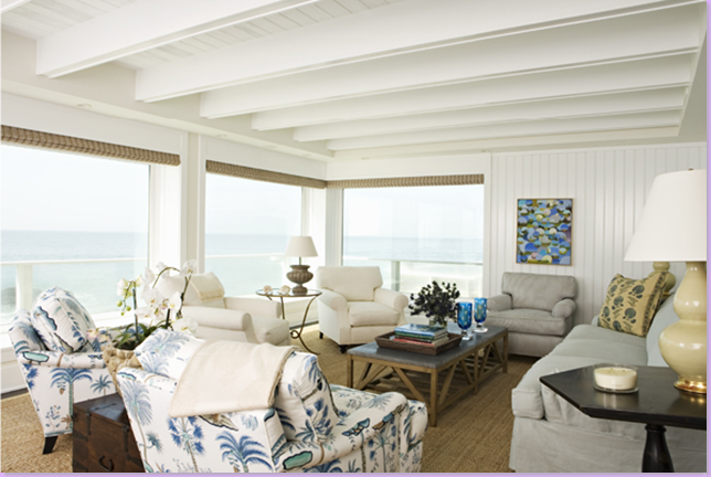
This close up of a living room reveals the house is on the beach, probably in Malibu. Just beautiful!!!! Blues and white, seagrass matting over dark hardwood floors, wood paneling, Michael Smith fabric on the sofa's pillow. Dark hardwood furniture. Calm, serene, and casual - everything you would expect a beach house to be.
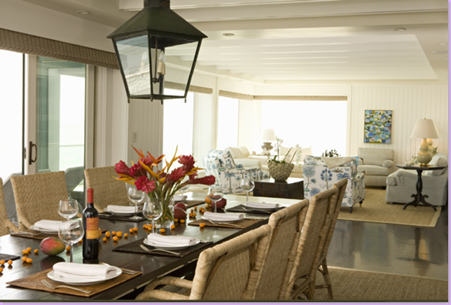
The dining area of the Malibu beach house: I love the light rattan chairs with the dark table and the large lantern. The two areas are differentiated by large seagrass rugs over the dark hardwood floors. Very similar to the SGG house in that the elements are here: high contrast with dark floors and white walls, light colored upholstery, rattan furniture, dark wood furniture. Very casual but still refined.
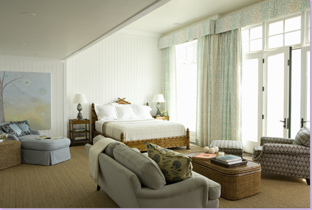
The Malibu house bedroom. More wood paneling and beautiful curtains. Michael Smith fabric on the pillows and the bed appears to be Smith's too. Large rattan coffee table. Transom windows, seagrass matting overs the dark hardwood floors are similar to the SGG house. Again, casual in the Malibu style.
Another home in Radin's portfolio is again, similar in feel to the Hamptons House. Soothing and calm, with blue and white ticking over the two chairs. The appeal of the room is it's casualness - this looks like its a home with young children living there who are welcome in this room. Though the pillow fabric is the same as used in the Malibu home, I don't believe this is the same house. No captions make it impossible to tell for sure.
This room appears to be the formal dining room of the house above. Without captions it's hard to really say.
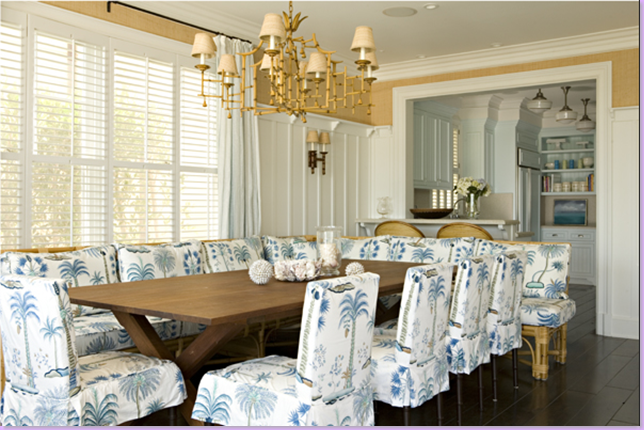
The eating and kitchen area of the living room above. Love the way he used a vintage rattan sofa as a banquette around the table. The pagoda chandelier stylistically matches the sofa. Room has the same high wood paneling or wainscot as the living area with the walls above painted a chamois color.
This bedroom is wallpapered in natural textures. The painting is just amazing.
Another home in Radin's portfolio: the architecture is a departure, but the furniture is not.
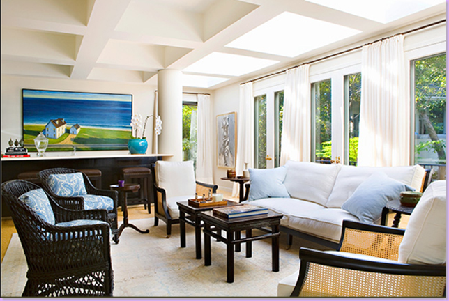
From the portfolio, this family room again has a Hamptons House feel to it. I love the wicker and rattan chairs and sofa. The colors and the curtains are similar to the SGG house, as is the art work. Very casual, but in a sophisticated way.
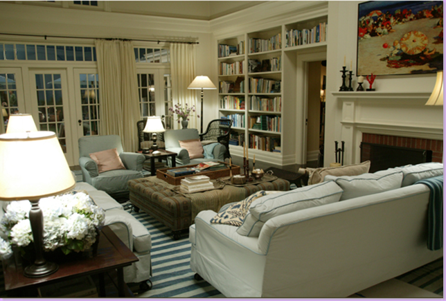
Radin's portfolio included this picture from the SGG house. Actually - this is a different angle of the room which I hadn't seen a picture of before, so that is pleasing, in and of itself. This view really highlights the importance that the books and bookcases played in the design. Notice how much warmth the books add to the room. Also, this is a great view of the windows with the transoms and the flowing, linen curtains.
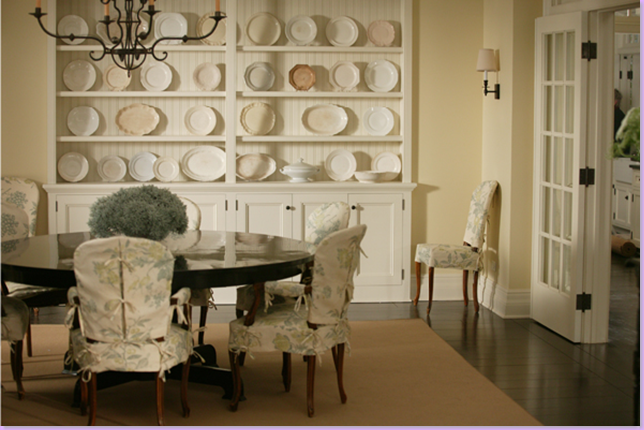
Radin's picture of the SGG dining room shows a larger view of the chandelier. But still, it's not enough to fully see the curvy lines of the light fixture. On a personal note, from doing these posts and staring at these pictures, I am going to slipcover my dining room chairs exactly like these and maybe even in the same fabric! I am in love with these chairs!!!!
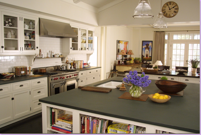
This picture of the kitchen shows more on the left side than has previously been published before. Again, by posting the pictures of the SGG house on his web site, Radin insures that his name is tied to the movie, forever - a great business decision for his future.
And, the last pictures included in the portfolio are the two homes from the movie, The Holiday. Here, is the living room from the Brentwood home in the movie. More contemporary than Radin's typical work, it shares elements with his more typical designs.
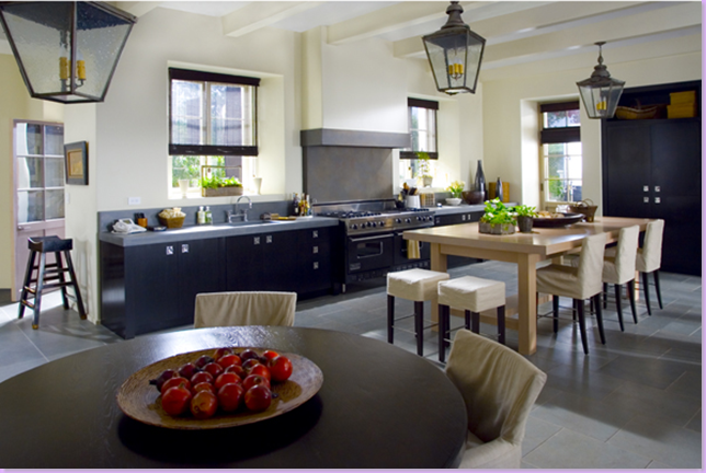
The beautiful kitchen from The Holiday's Brentwood home. The lanterns are such a strong design element. Notice the floor is painted light gray, not dark for a change. I love this kitchen.
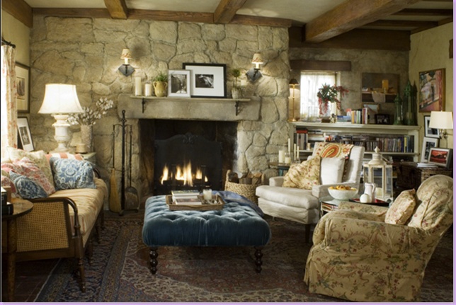
The Holiday: Iris' small English cottage, the charming cozy cottage that steals the movie. Completely different in feel from SGG in every way, by putting this house on his web site, Radin leaves no doubt that he is the creative genius behind Nancy Meyer's movie houses. Right? He is, isn't he?
Left off the web site is this beautiful L.A. home that was in House Beautiful last year. The owners definitely wanted the feel of the SGG house, but not a carbon copy. Radin delivered on both fronts. I love the rug here, similar but not nearly as bold as the Hamptons House rug.
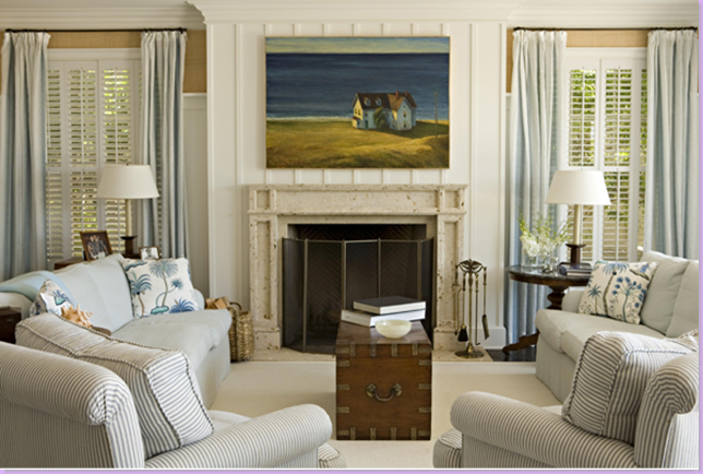
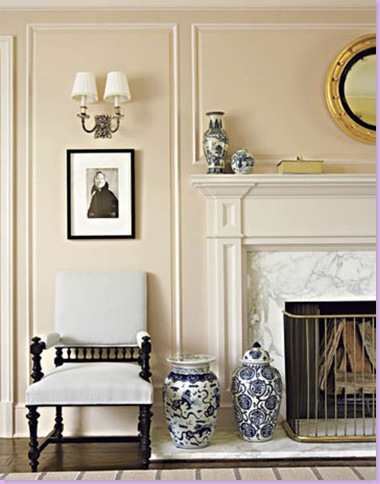
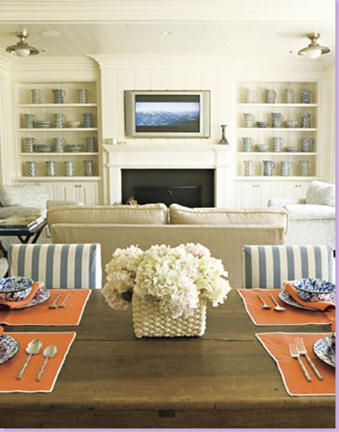
Cropped shot of the living room mantel with its blue and white vases, sconces, and black and white photography. Beautiful carrara marble on the mantel matches the carrara in the kitchen. I love the simplicity of the antique fire screen. Noticeably the Hamptons House has no blue and white porcelains, something that I would have included in the design myself, but no one asked me!
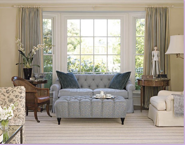
The family room with its blues and creams and tans blending with the blue and white striped fabric.
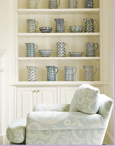
Raoul Textile fabric covers the arm chair. The couple had a beautiful collection of antique spongeware which Radin was not even aware of until after the house was completed!!!!
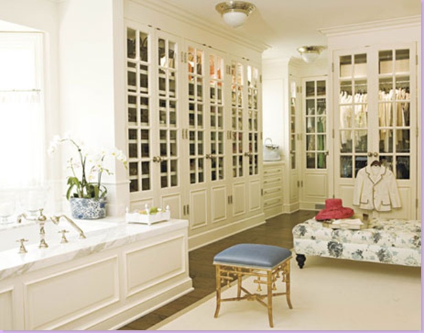
This picture taken from the web site is a real surprise. In other photographs of the closet, the picture is cropped without the bathtub included leaving the suggestion that this is only a closet and not the bathroom. At 500 sq. ft. this room is just stunningly beautiful. Imagine a closet with french doors covering the clothes! And how open and easy is the fact that the closet is a part of the bathroom? Just absolutely gorgeous!!
Below are photographs from a builder's web site, showing earlier work by Radin. This first home, a contemporary Malibu beach house, is decorated with country antiques. This house shows just how much Radin has grown as an interior designer:


And one other home from Radin's older work. Again, it shows how far Radin's work has come. Or, perhaps we can blame the owners for this mess:


Regardless if James Radin is the true interior designer of Nancy Meyers' last two movies sets, he is a new force in Californian design. His future is very bright due to the Something's Gotta Give connection and his web site is proof of his abilities.
Be sure to check out Surrounding's blog for her exhaustive research on Nancy Meyers and Something's Gotta Give here.



0 comments:
Post a Comment