Cote de Texas Top Ten Designers - #9
The second installment of Cote de Texas' Top Ten Designers names Michael S. Smith, interior designer to the stars in space #9. Smith hails from California and has become the darling of the Hollywood set counting Stephen Spielberg, Rob Reiner, and Cindy Crawford among his clients. Other big name clients include Rupert Murdoch and Evelyn de Rothschild - who said of Smith he was the only designer who ever listened to what he said. Murdoch's wife Wendi said of Smith, "He has beautiful taste and is so much fun to be around! He's like a wife's best friend."
Smith first worked for interior design's cream de la cream, John Saladino. He opened his own business in 1991 and has been enormously successful ever since. Smith's style is laid-back, not fancy or frou frou. To place a label on his work would be hard, but English-influenced would probably come the closest to defining his "look." Besides the English influence, his interiors tend to lean on the masculine side. He uses lots of dark woods, ethnic fabrics, English antiques, and oriental accents. Smith is also credited with single handedly starting the current suzani craze which has now reached epic proportions. He has a penchant for glorious hand painted wallpapers for his dining rooms and lavish four poster beds for the sleeping quarters. Wonderful antique Persian rugs covers his hardwood floors, while silk covers the windows. Smith has probably designed more Malibu beach houses than any one person working today. He loves checks and linens and tree of life patterns whose casualness helps to tone down the interiors of the mansions he furnishes.
Besides designing houses, Michael Smith has been busy with other lucrative pursuits. He has a line of furniture, Jasper, which sells in the toniest showrooms across America. His fabric line was introduced a few years ago and it's muted blues, browns and greens on linen make his prints a much sought after commodity. Smith also designs a pricey line of bath furnishings and faucets for Kallista. And recently he debuted a line of tiles for Ann Sacks. And that's not all! There are the rugs he's designed for Mansour and there's the line of lighting fixtures with his name on them for Houston's Visual Comfort aka Circa Lighting. Plus, he now has his signature scents available through Agraria. Whew (as Betty Rae would say!) Smith is one busy and in demand designer.
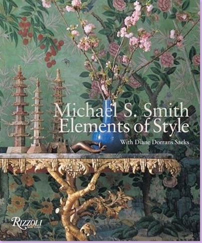
You would also need to add "author" to the list of Smith's accomplishments. A few years ago, he wrote "Elements of Style" which quickly became a highly respected best seller in the design book field. Filled with page after page of his beautiful interiors, it becomes apparent that Smith's look is indeed hard to define. Varied and inventive, each design is tailored to his client rather than the other way around. It's impossible to say, "Oh, Michael Smith did that," so personal are his interiors. Still in his forties, it's obvious to those in the field, that Michael S. Smith has a long and illustrious career ahead of him.
The best seller book that introduced Michael S. Smith to the public.
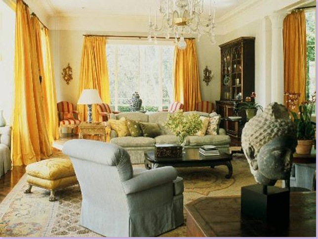
This living room is a favorite of mine. The striking saffron silk curtains are fabulous. Smith paired the drapery's bold color with cool, creamy colors - yet - in the back, he introduced a bold red and cream striped fabric on the chairs. Stunning!
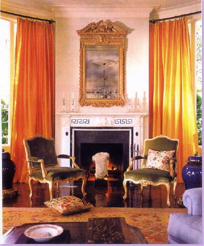
Another view of the above living room, this time showing the fireplace flanked by green velvet French chairs.
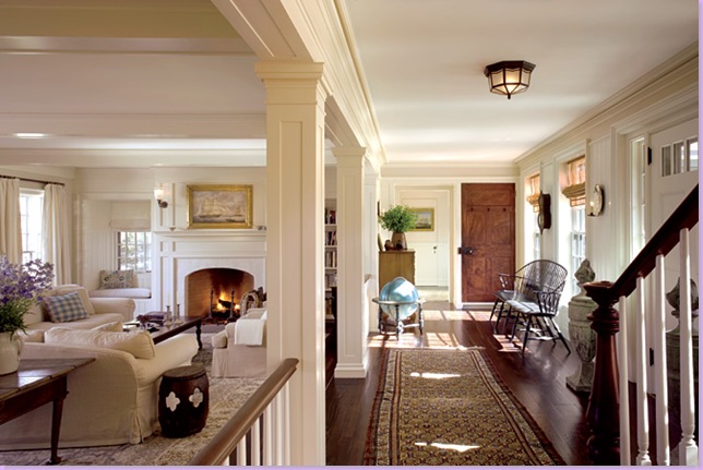
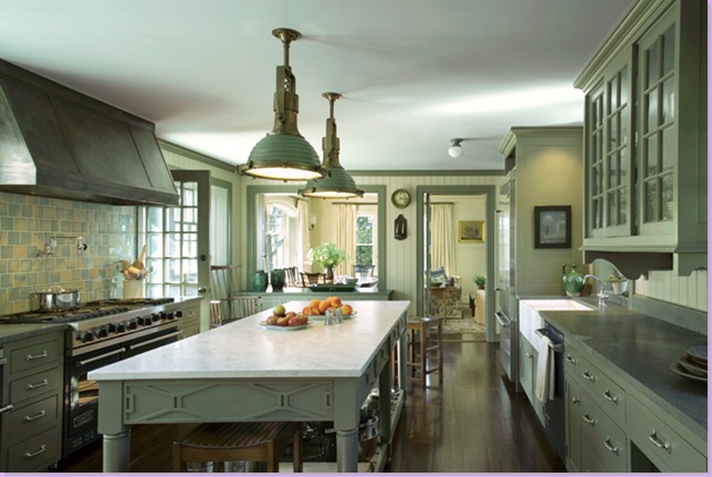
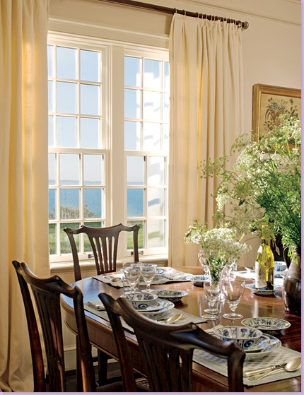
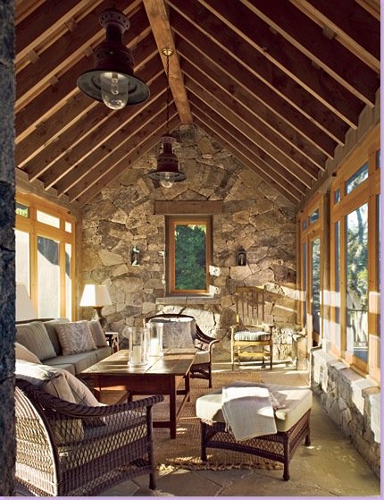
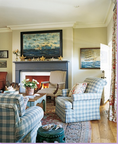
For this house on Martha's Vineyard, Smith mixes American and English antiques to perfection.
The Martha Vineyard house kitchen - all in shades of green.
The dining room on Martha's Vineyard features a table designed by Smith.
The screened in porch on Martha's Vineyard.
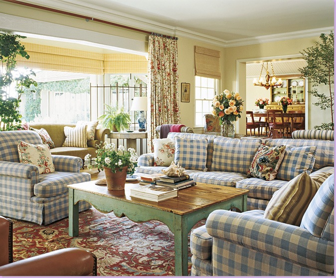
This Malibu beach house by Smith features an early trademark: blue and white linen checks. Smith mixes the checks with floral draperies and a painted antique coffee table. The garden seat is often repeated in his interiors. This house put Smith on the map - published in Architectural Digest, Hollywood power players loved this low-key look.
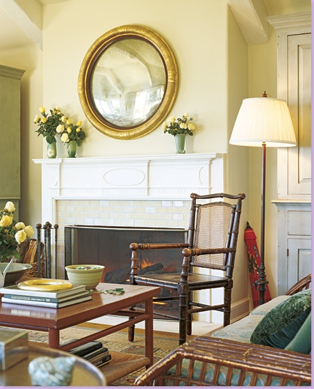
Another view of the beautiful Malibu beach house.
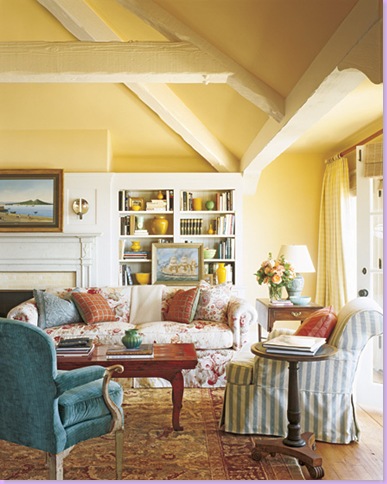
A mix of textural antique furniture in the Malibu beach house. Smith travels all over the globe to find just the perfect piece for each job - these accent pieces are what separates an inspired interior from a "showroom" interior.
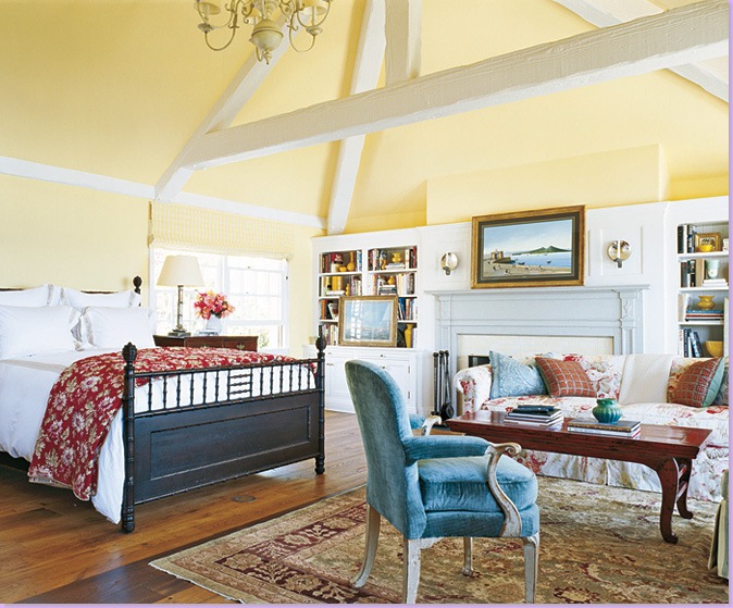
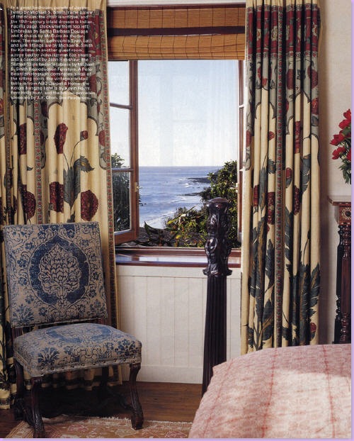
In the Malibu beach house master bedroom - Smith mixes florals and stripes to cozy up the large space. Antique painted coffee table and side table again add that unique touch to this interior.
The bamboo bed, painted black, is dressed in white sheets and a French boutis.
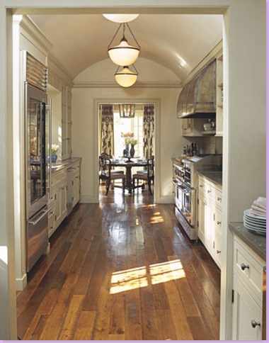
Michael Smith's own kitchen and breakfast room in his newly remodeled home. The galley kitchen is saved from boredom by the wonderful ceiling treatment.
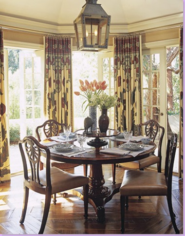
The curtain fabric, Moghul Panels in hemp, is from Smith's own Jasper line, as is the lantern. Table and chairs are dark wood, English antiques - a look Smith prefers.
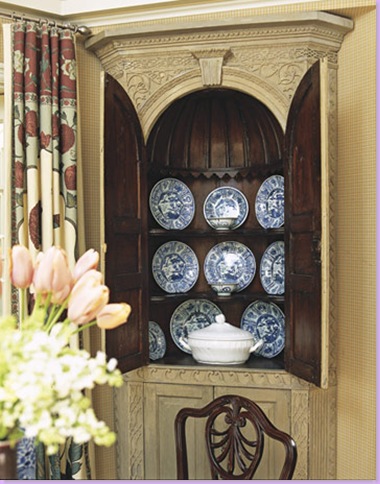
Side cabinets in Smith's breakfast room showcase blue and white plates from OKA Direct, a favorite of Smith's. Smith likes to use blue and white as accents in his designs - whether the color comes from fabrics or accessories matters little to him.
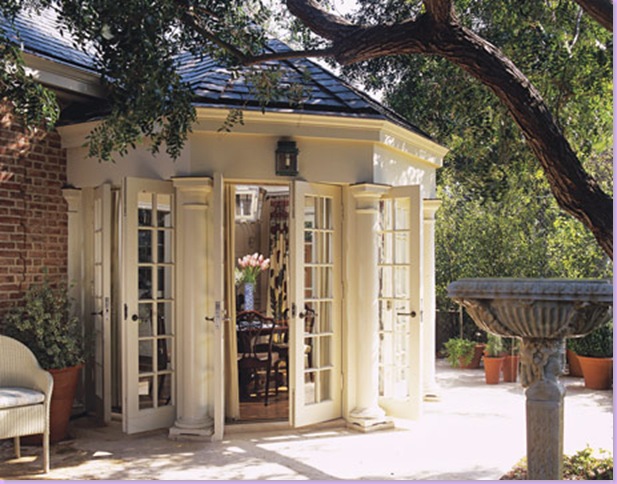
Smith's breakfast room is housed in an octagonal addition - french doors provide ease to the outdoor patio.
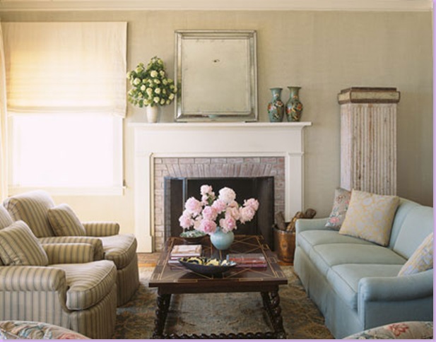
For this Malibu beach house, owned by a film producer, Smith uses light colored upholstery and mixes in his usual antique accent pieces - here a coffee table and an oversized pedestal.
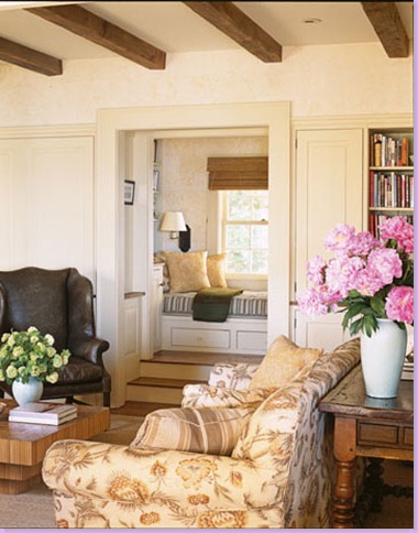
In the family room of the Malibu beach house, Bennison linen is used for the sofa. Again, Smith mixes florals and stripes for a cozy and warm environment.
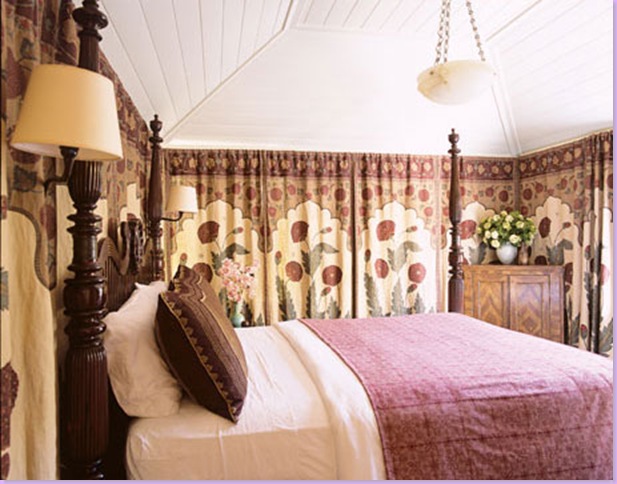
The Malibu beach house guest bedroom is tented with his Moghul Panel fabric. Four poster English bed is dressed in an antique textile.
For the Malibu beach house dining room, a dark wood English table is paired with painted English chairs, and blue and white striped fabric. The oversized lantern becomes the focal point even overshadowing the large antique armoire.
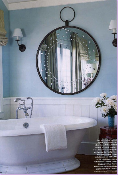
In the bathroom of the Malibu beach house, a fabulous new mirror shaped like a pocket watch, brings a touch of whimsy to the small area.
The master bedroom in the Malibu beach house has all the traditional Smith elements: four poster bed, antique textile bed covering, floral curtains, creamy walls, and ceiling fixture. Ceiling fans are a rarity in a Smith interior.
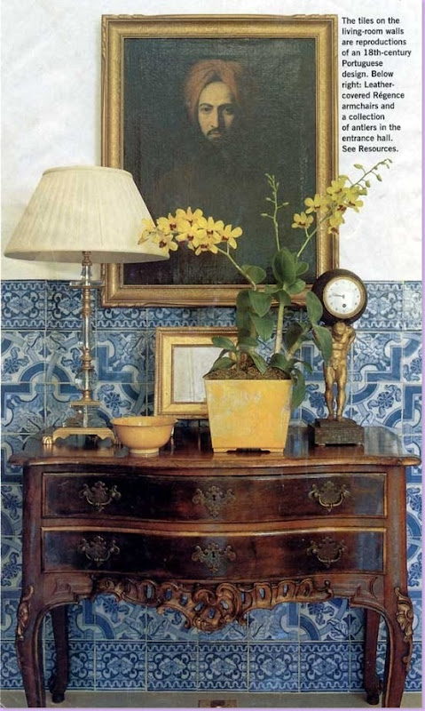
In this Californian home, Portuguese tiles were famously used extensively throughout the property. Here in the living room, the tiles are used as a wainscot. Gorgeous antique console holds an interesting assortment of accessories - another Smith trademark are his tablescapes.
(these pictures are courtesy of Stylecourt.)
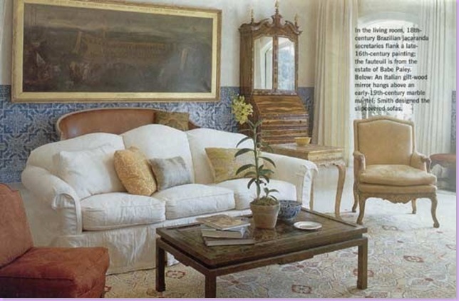
In this view of the above living room, a casual white linen slipcover is a surprising element amongst all the rare and valuable antiques, which is of course, intended.
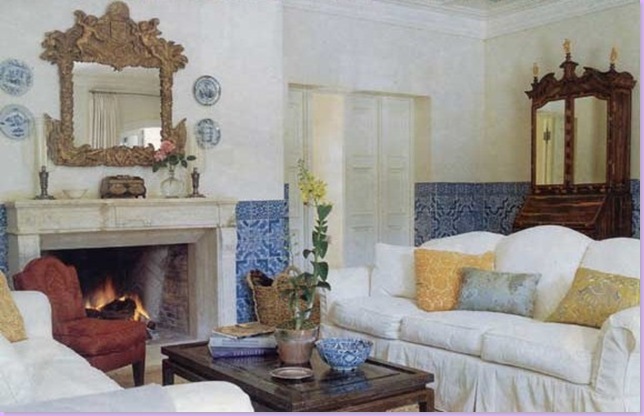
Another shot of the blue tiled living room - antique mirror hangs above the antique fireplace mantel. I love how the red damask chair provides just the right pop of color. Here you can see that there actually are two antique Brazilian secretaries flanking the large oil painting shown in the photograph above this.
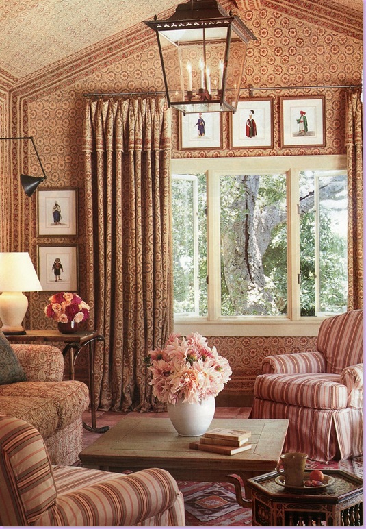
This is another favorite room of mine designed by Michael Smith. For this guesthouse, he bought hundreds of inexpensive Indian bedspreads from Urban Outfitters and covered the walls, upholstered the sofa, and tailored the draperies out of them. He mixes in a linen stripe on the chairs. A large lantern lights the room.
Again in Malibu, this time for the model Cindy Crawford - here the entry hall sets the tone for the rest of the beach house.
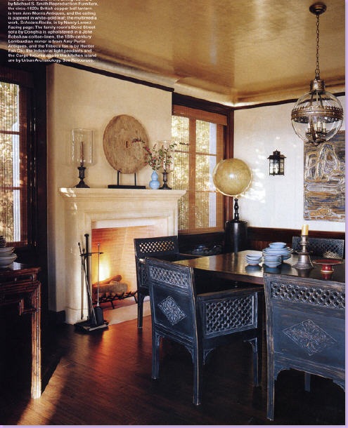
The dark dining room furniture and floors are offset by the creamy stucco walls in Crawford's beach house. I love the large antique globe in the right corner.
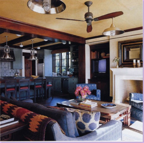
Crawford's family room with it's navy upholstery and famous Madeline Weinrib pillow that was seen everywhere for awhile. Here too is a rare Smith ceiling fan!
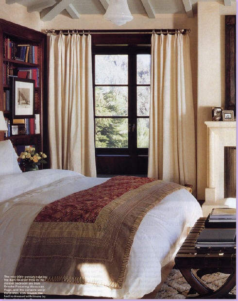
Crawford's bedroom has the trademark white sheets and antique textile in place of the ubiquitous duvet. Creamy wool drapes blend into the walls and pop off the dark window frames.
Crawford's Malibu guest room: the famous Moghul Panel draperies mix with a short four poster bed.
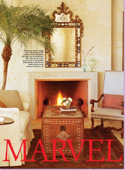
For yet another Malibu home (I told you he's designed a lot of Malibu houses!) Smith uses a Syrian trunk for a coffee table. A rare Venetian mirror hangs over the antique marble mantel.
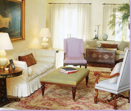
The other side of the living room has a matching Smith designed slipcovered sofa. Antique chairs mix with an antique ottoman from John Rosselli.
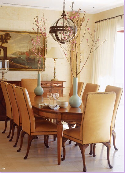
The dining room in this Malibu beach house pairs caramel colored leather chairs with a table of the same hue. Aqua vases give the only pop of color.
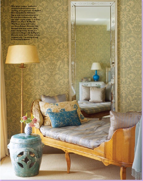
In the Malibu master bedroom - one sitting area is filled with this unusual antique chaise. The wallpaper is hand painted. The mirror reflects the bright turquoise colored lamp next to the bed.
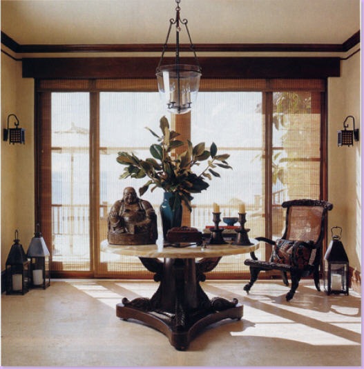
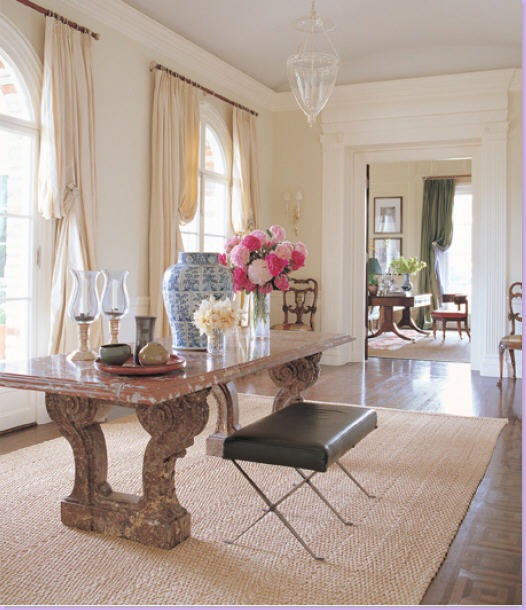
In this Los Angeles home, the large entry hall is potentially dressy with it's marble topped console table. To infuse some informality into the space, Smith adds a modern, leather stool, casual seagrass matting, and accessories.
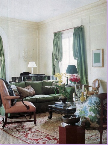
In the living room of the same Los Angeles home, Smith mixes an assortment of fabrics and leathers and silks along with pieces of antique accent furniture. The antique rug is layered over the seagrass matting.
In the corner of the same living room, a green and cream silk striped banquette sits in a corner. The beautiful green silk drapes are lined in blue silk.
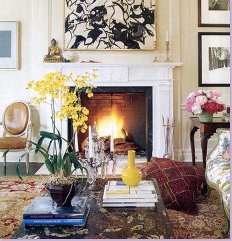
A close up of the fireplace from the same Los Angles home. Here Smith mixes contemporary art with antiques and traditional furniture.
In this living room, apricot colored stucco walls make the antique marble fireplace stand out. Embroidered fabric is on the sofa. Here - a rarity - trim is added to the sofa skirt. Coffee table is a unique antique.
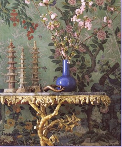
In this dining room, Smith used handpainted wallpaper with a gilded antique console. Smith is quite adept at creating one of a kind tablescapes. This gorgeous photograph became the cover of his book.
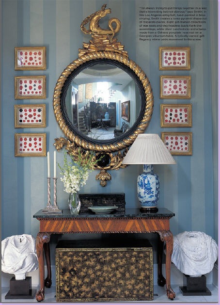
This vignette brings together a diverse group of accessories and showcases Smith's tablescape abilities. The antique mirror is a show stopper.
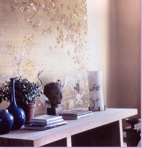
For this vignette, Smith used a panel of handpainted wallpaper along with books, sculpture, and vases.
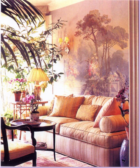
Handpainted wallpaper sets the tone in this living room. A simple cotton stripe keeps the mood casual.
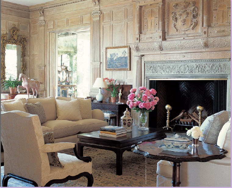
In this magnificent living room, Smith used antique limed boiserie on the walls. The upholstery fabrics blends in with the paneling creating a soothing effect. Antique accent pieces and fine accessories make this room a more elegant than usual Smith interior.
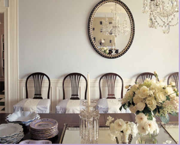
An elegant mirror and crystal chandelier add glitter to this dining room. Smith used blue and white striped slipcovers on the English chairs.
In this bedroom, Smith used floral linens and stripes with white bedding. Here, the antique mirrors is the focal point of the room.
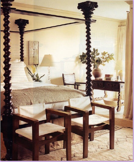
For this Hollywood movie producer and his wife, Smith found an unusual four poster wood bed. Smith used this Moroccan rug long before it became the hot trend it is today.
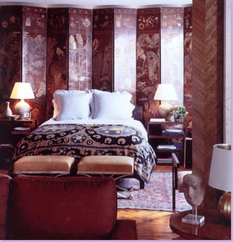
For model Cindy Crawford's New York apartment, Smith paired a beautiful antique screen with the causal Suzani bed covering. Smith is credited with starting the current suzani trend. Suzanis, long unknown by the masses are now being copied at Urban Outfitters.
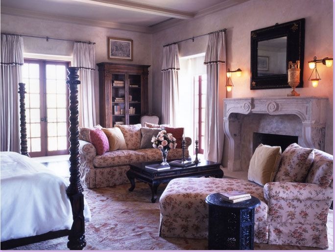
Smith uses a flowery linen print to cozy up this bedroom. White sheeting and four poster beds - both trademarks of Smith's.
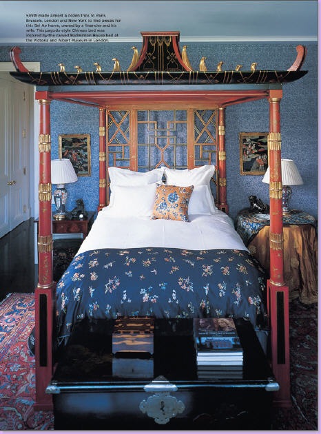
This pagoda styled bed is a copy of one found in the Victoria and Albert museum in London. Quite dramatic, this bedroom shows off Smith's ability to create any kind of interior - without injecting his own personal style into the mix.
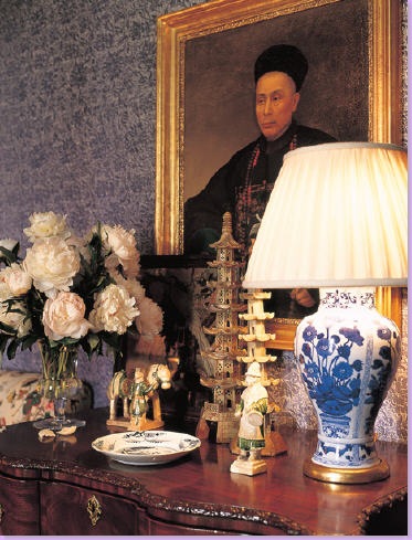
Another angle from the above bedroom shows a vignette styled with pagodas and an Oriental portrait, further playing up the Pagoda styled bed.
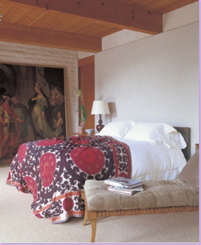
An early bedroom of Smith's - showing the antique suzani, long before the trend.
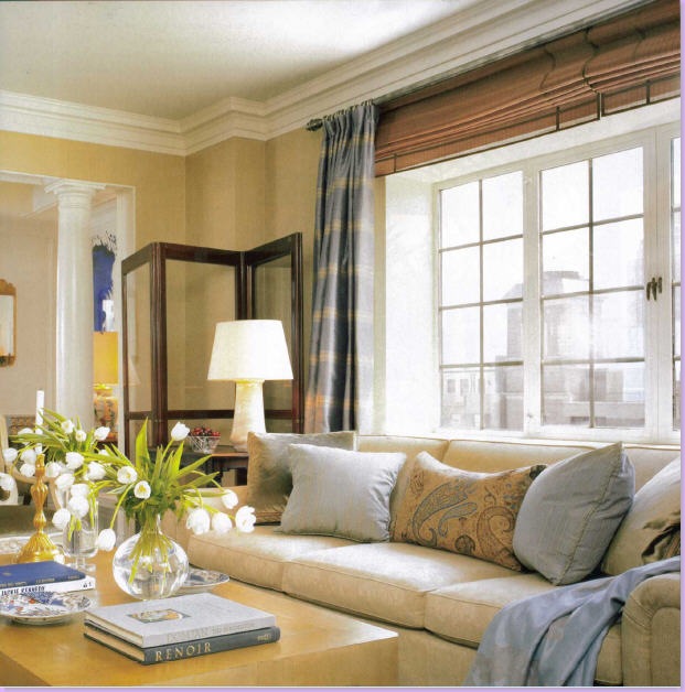
Smith was asked to decorate the penthouse suite of the Lowell Hotel in New York City. Here, the sitting area of the large suite.
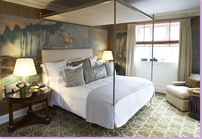
The main bedroom at the Lowell suite. Handpainted wallpaper was used along with a gorgeous patterned carpet.
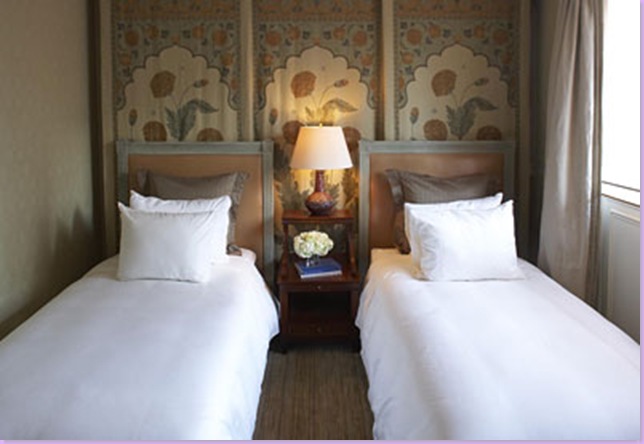
The second bedroom has a tent effect using the Moghul panel from the Jasper fabric line of Michael S. Smith, Inc.
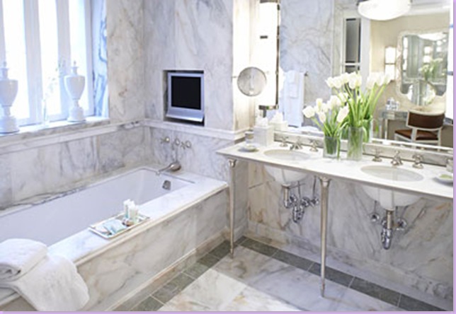
White marble was used extensively in the Lowell bathroom.
A James Nare painting hangs above the writing desk at the Lowell.

Another hotel that was completely redesigned and styled by Michael Smith is Shutters on the Beach in Santa Monica, California. One of the more popular hotels on the west coast, Smith designed the guest rooms in his own personal style: four poster beds, white sheeting, unique accent pieces.

At Shutters on the Beach - each room has Smith's famous blue and white checked fabric on the chairs and his favorite garden seat. Another California hotel just received the Michael Smith touch - which I'll soon profile!
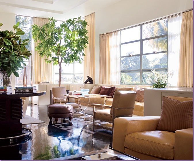
Smith also does contemporary. Recently, Architectural Digest published his work on this period art deco home in California for a movie producer (of course! who else can afford his prices?) Gorgeous caramel colored leather mixes with a Donald Deskey table in this total remodel of a classic Moderne Style house.
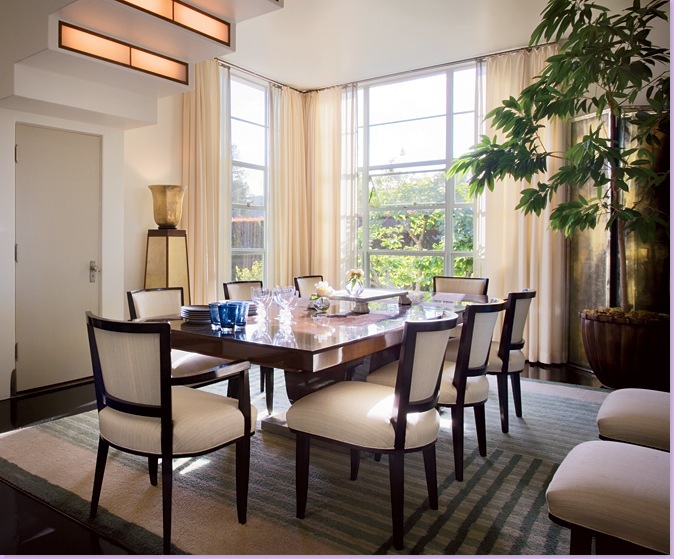
The dining room in the Moderne house: contemporary at it's finest.
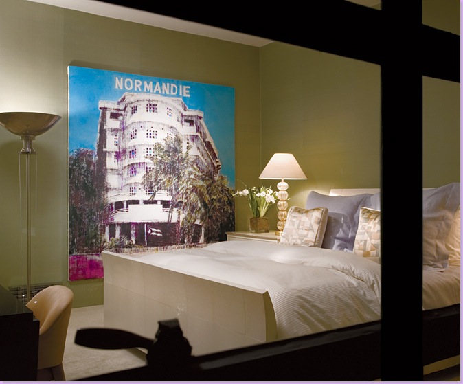
The bedroom with it's 1930 Adnet torchère and Enoc Perez’s 2005 oil Normandie sports green walls - a huge departure for Smith - as is the Moderne style.
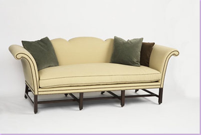
Michael S. Smith's Jasper Furniture line is designed by Smith with an eye to the classics. Here, a favorite sofa of mine from the line.
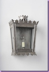
A sconce from the Jasper line.
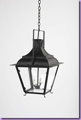
A French inspired tole lantern - one of my favorites of his lighting fixtures.
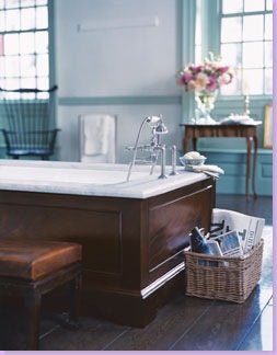
Smith also designs bath and kitchen fittings for Kallista. Here a wood encased bathtub of Smith's design.
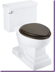
And a toilet from his line - could there be a more gorgeous toilet ever!??
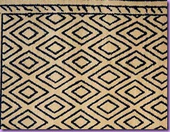
Smith designs rugs for Mansour - the above is one of his designs that I particularly like. It is available in different colorways.
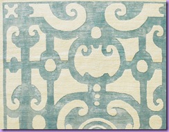
Another favorite rug design from Smith.
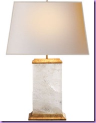
Finally, Michael Smith just launched a lighting line with Houston's own Visual Comfort aka Circa Lighting. This wonderful lamp is part of the line.
AND TO ANYONE STILL READING THIS:
All these wonderful pictures came from either Smith's web site or the many publications he has been featured in, along with some borrowed from the blog Stylecourt (thank you Courtney!) I hope you've enjoyed my Cote de Texas Top Ten Designers #9. Please watch for the rest of the list shortly, as soon I get my energy back after this post!!!








0 comments:
Post a Comment